
Today we’re delving into one of the key elements of design — colour! We’re constantly getting reader requests for tips on how to apply colour to the home, best paint colours to use, and tips on how to build a colour palette for a room. So in this article we’re discussing the fundamentals of colour so you can unleash the power of colour in interior design!
Keep reading for advice on how to develop a colour palette, where to find inspiration for your design palette, top dos and don’ts, and so much more. We’re here to help you achieve your desired goals.
Related article: Colour and emotion: How to select colour for the mood you want to achieve in your home
Related article: Interior designers share their expert tips on how to add colour to a Victorian style home
Why is colour in interior design so important?
Ever heard of the elements and principles of design? In essence, they are the various relationships of visual composition and include line, texture, tone (elements), and balance, contrast and repetition (principles). Interior designers combine these elements and principles to create well-balanced, visually appealing, and purposeful interiors. Rather than thinking of these elements and principles in isolation, they need to work in conjunction. Ultimately, interior designers apply these to create designs that meet a client’s needs while reflecting their aesthetic preferences.
Colour is one of the elements of design and plays a major role in how we feel in a space. That’s because colour tells a story and sets mood, creating an instant response. It isn’t just the colour itself, such as red or blue, but also whether it is a cool or warm colour, in a light or dark shade. There quite literally is a whole spectrum of colours and each selected shade contributes to the nuanced tapestry of interior design.
So when selecting a colour palette for your space, and then materials and finishes, it’s necessary to start by deciding on the atmosphere you want to create. More on this below!
How can you develop a colour palette?
Because colour sets mood, we suggest starting your colour palette by reflecting on how you want to feel in your space. Do you want to create a cosy environment? If so, warmer colours such as yellows, oranges and reds work well. Or are you wanting to give a modern refresh to a kitchen or bathroom? Then cooler colours including shades of purple, blue and green generally work well. However, it’s important to note every colour can have both warm and cool variants. We delve into all the colours and the mood they create in this article.
It’s also popular to use an entirely neutral colour scheme, using hues of grey, brown and beige. This is ideal in large open spaces, traditional style homes or for people who prefer a more restrained colour palette as you can add pops of colour through artwork and decor.
Once you decide on the mood and a hero colour you want to use, you can develop your colour palette. A colour palette will generally include 3-5 colours that can be used across your space. For example, wall paint or wallpaper, joinery, carpet, and all your decorative accents.
3 main ways to develop a colour palette
1. Complementary colour scheme
One of the most popular colour schemes in contemporary homes is to use complementary colours — aka two colours that sit on opposite sides of the colour wheel. For example, orange and blue, green and red, yellow and purple, and so on. While these may not sound like the most appealing colour palettes, it’s important to remember you have free reign with saturation (the intensity of the colour) and tone (lightness and darkness).
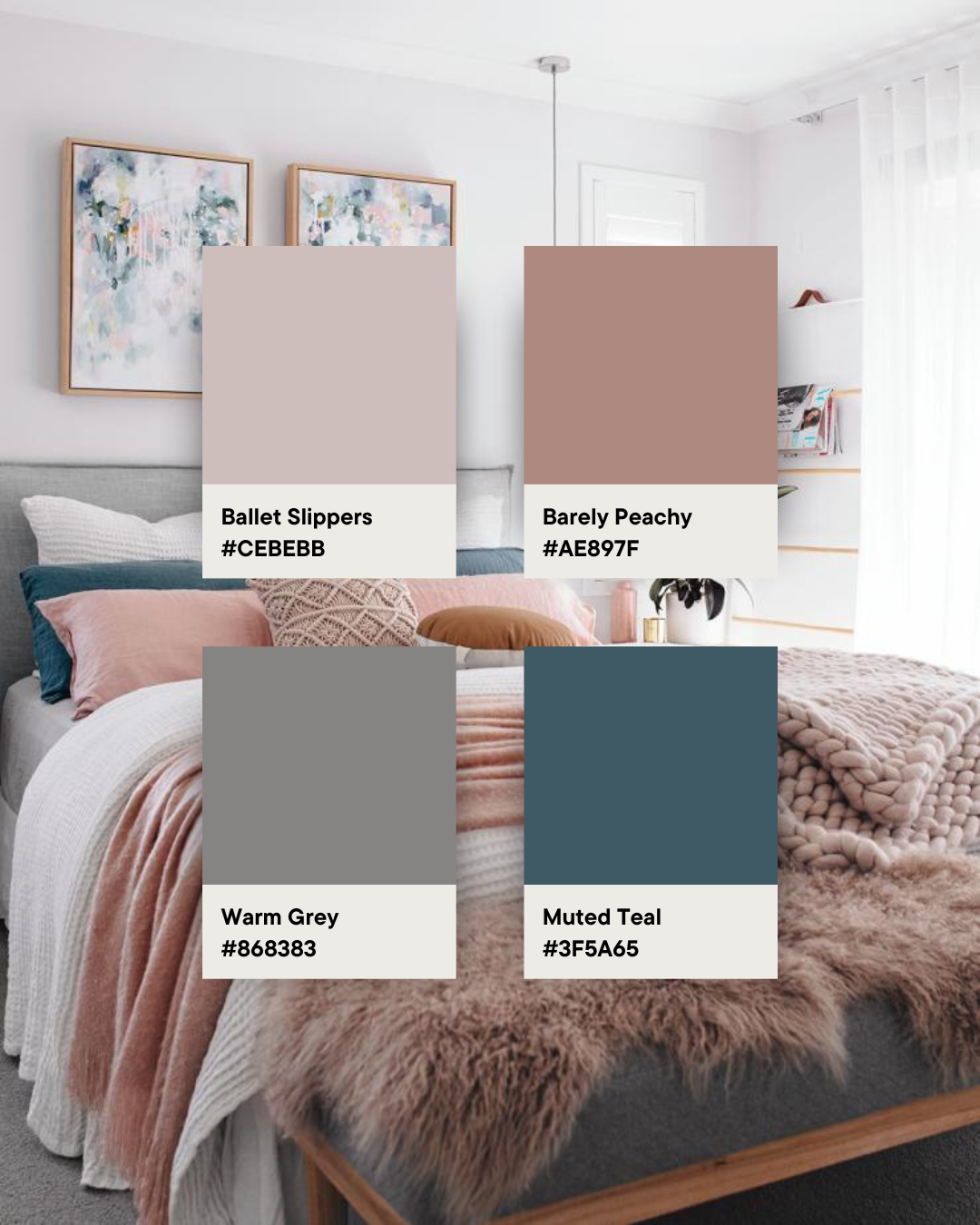
The bedroom below is a fabulous example of a complementary colour scheme, using muted tones of peach and teal. It’s common to also incorporate 1-3 neutral tones into a complementary colour palette. The stylist behind this bedroom used white bedding and a grey upholstered bench seat to break up the pops of colour. Remember, neutrals create breathing room and temper strong colours.
2. Monochromatic colour scheme
Despite popular use, monochromatic does not mean black and white — rather ‘single hue’. So a monochromatic colour scheme literally uses one base colour in varying tones and intensity. You can add endless variations of the colour in your palette but at least 3-5 shades, tones or tints is ideal. The tonal effect of a monochromatic colour scheme achieves an enveloping, cosy, relaxed feel.
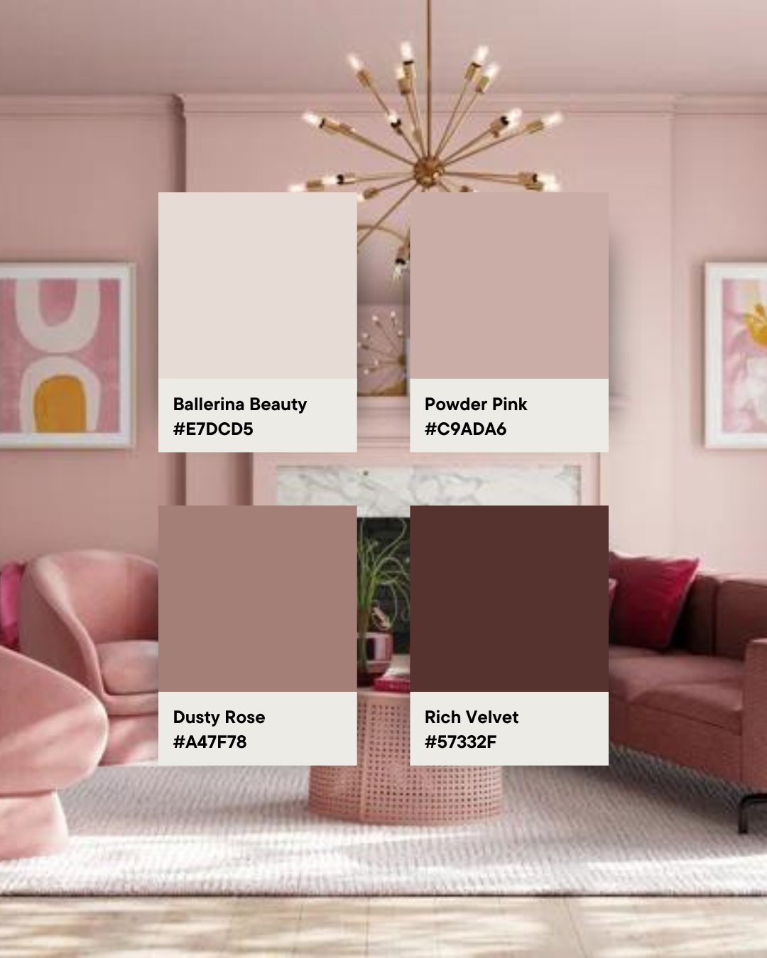
Using a single colour of pink, the tonal pink living room below is a dreamy example of how well a monochromatic colour scheme works! Although all the colours are from the same segment of the colour wheel, the varying intensities and tonal contrast gives the space depth. A few neutral accents, like the light rug and marble fireplace surround, also give the space some visual relief.
3. Analogous colour scheme
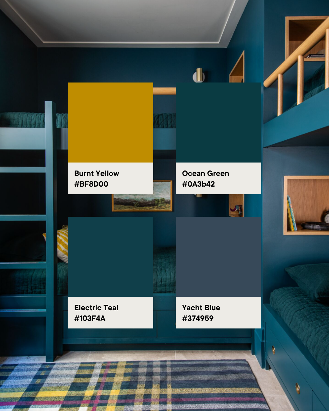
Another popular way to build a colour palette is to use an analogous colour scheme, which involves selecting 3 colours that sit next to each other on the colour wheel. The trick to making this colour palette work is to choose one dominant colour, and use the other two colours as accents. For example in the bedroom below, it is primarily teal with accents of deep green in the bedding and blue in the rug.
You can also add a contrasting accent colour, like the splash of burnt yellow on the cushion, to break up the intensity of this colour scheme.
This is an incredibly versatile way of creating a colour palette that generally results in a harmonious atmosphere. Consider creating a warm colour palette of red, orange and yellow, or tranquil colour palette of greens and blues. The options are endless! Bold, vibrant paint colours can make a striking impact in your home, but achieving a flawless finish takes skill — that’s why we recommend a professional painter to get those crisp lines, even coverage, and a polished result.
Where can you find inspiration for your design palette?
Now that you know the basics of how to create a colour palette, it’s time to let your imagination run wild! When designing any space, we suggest gathering inspiration and creating a mood board.
Popular places to find inspiration for a colour palette:
- in nature: in our opinion, no one does colour better than Mother Nature! Take your camera and go for a walk and we guarantee you’ll find dozens of beautiful colour palettes amongst the pics you snap. Best of all, you can also edit the images you take and turn them into large scale art for your room
- magazines: who says print media is dead?! When creating a mood board, we always pull out our scissors and magazine stack. You can also find free magazines, like the Bunnings mag, or store catalogues
- design blogs: call us bias but this is also one of our favourite sources for all design inspiration, including colour inspo
- Pinterest: a search engine just for images, Pinterest has to be one of the best places to gather colour palette ideas. While you’re there, be sure to give us a follow!
- artwork: one of our favourite ways to build a colour palette for a space is by selecting a focal artwork and then selecting 3-5 colours from the artwork across the room
- rugs and textiles: similarly, you may prefer to find a statement rug or bedding and draw out colours to develop your colour scheme.
Interior designer dos and don’ts on using colour
Don’t use all colours in equal measure
Long-time readers of the blog would have heard us share the 60-30-10 colour rule before. While you don’t have to strictly conform to this ratio, it is an easy and helpful guide on how to develop a colour scheme. Essentially, there’s one dominant colour (used across 60% of the room), one secondary colour (30%) and one accent colour (10%).
If your room is looking imbalanced, it may be that you’re using the colours in equal measure which creates the sense of them competing against one another. Try adding more of one colour to create a clear dominant colour or removing some of a different colour to use an accent colour more sparingly.
Do test colours before going all-in
What looks good on the small scale of a paint chip may not necessarily work well en masse. The more you apply a colour in a space, the more intense the colour appears. So what may look like a soft ballerina pink on a paint chip can become a sickly sweet lolly pink when painted on all walls. Add to this that different lighting conditions can dramatically affect the appearance of colour and it becomes all the more important to take a considered approach.
Don’t think of colour in isolation
As we mentioned earlier in this article, colour is just one of the elements of interior design. It’s also important to think of the relationships between space, line, form, light, texture and pattern. If you’d like an expert to guide you on developing an interiors scheme, consider partnering with Jo Taylor who understands the artistry of interior design.
We hope these tips on using colour in interior design have given you confidence to be bolder with colour in your home. If you have any questions or would like more info on an aspect of colour, pop a comment below and we’ll get back to you asap.

