Supported by The Reject Shop
It’s beginning to look a lot like Christmas! This week I gave my entry some festive cheer thanks to my latest collaboration with The Reject Shop (you won’t find any defect or second hand products there, just a great selection at seriously low prices!).
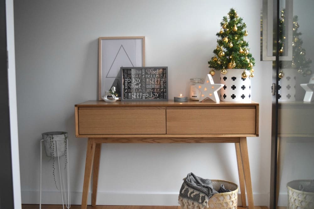
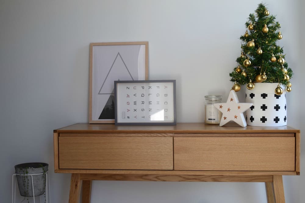
I was inspired by their white ceramic Christmas pieces and cross pot plant bags so decided to take that style direction and create this Scandinavian style Christmas entry. If you’d like to create a similar look, here are some key things to consider.
Soft and neutral colour palette
The Scandinavian style is known for its restrained, light and airy colour palette, so I used a grey, white and light timber palette with accents of green and gold.
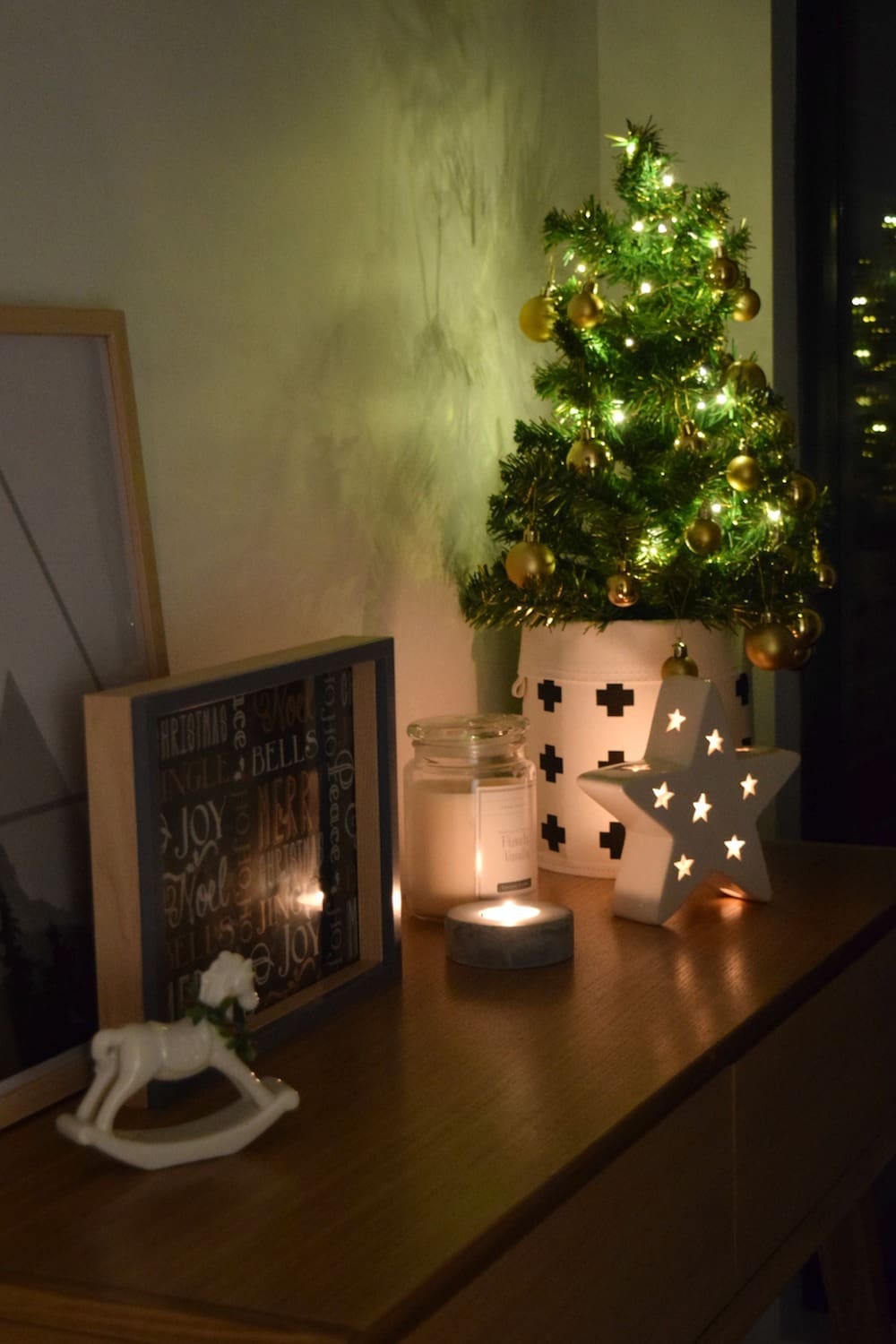
Ambient lighting
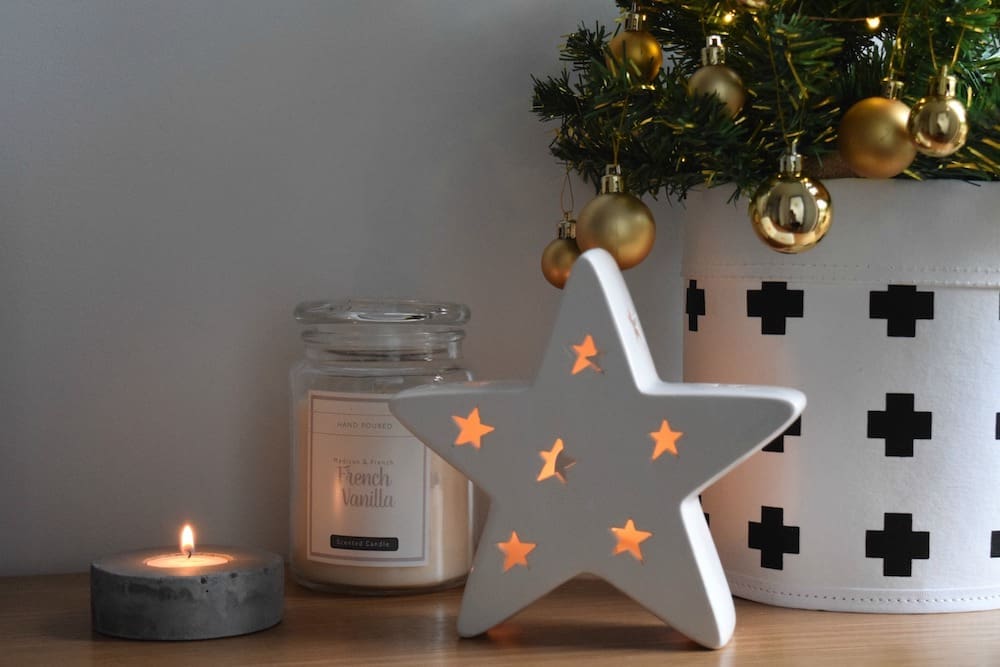
There’s something about fairy lights and the glow of candles that instantly reminds me of Christmas. You can find a range of candles and candle holders at The Reject Shop starting from $1 so try mixing a few styles.
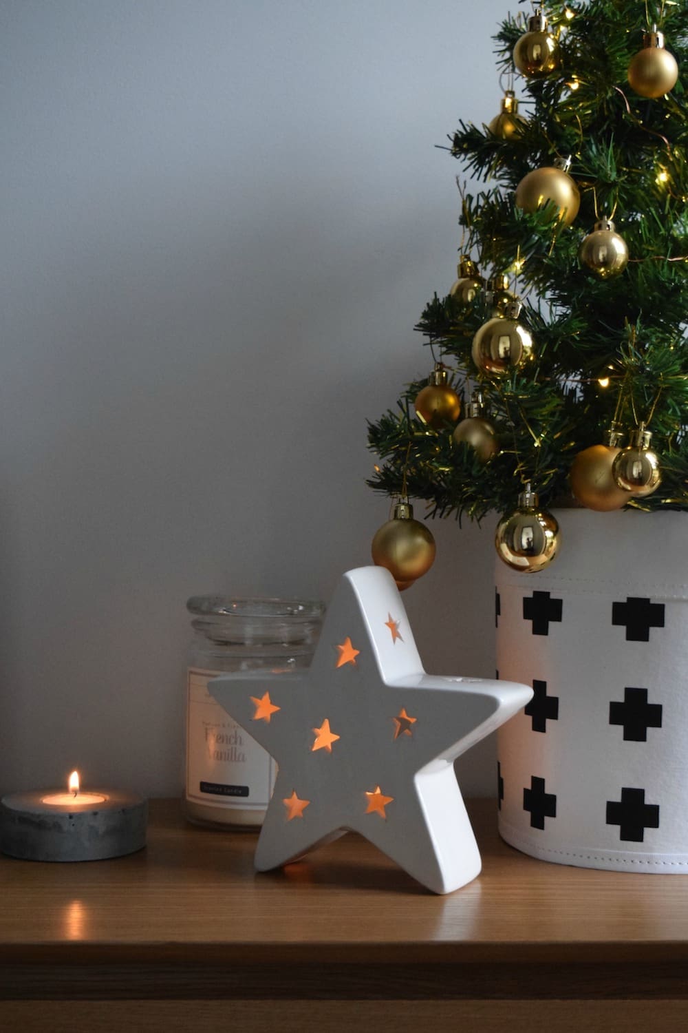
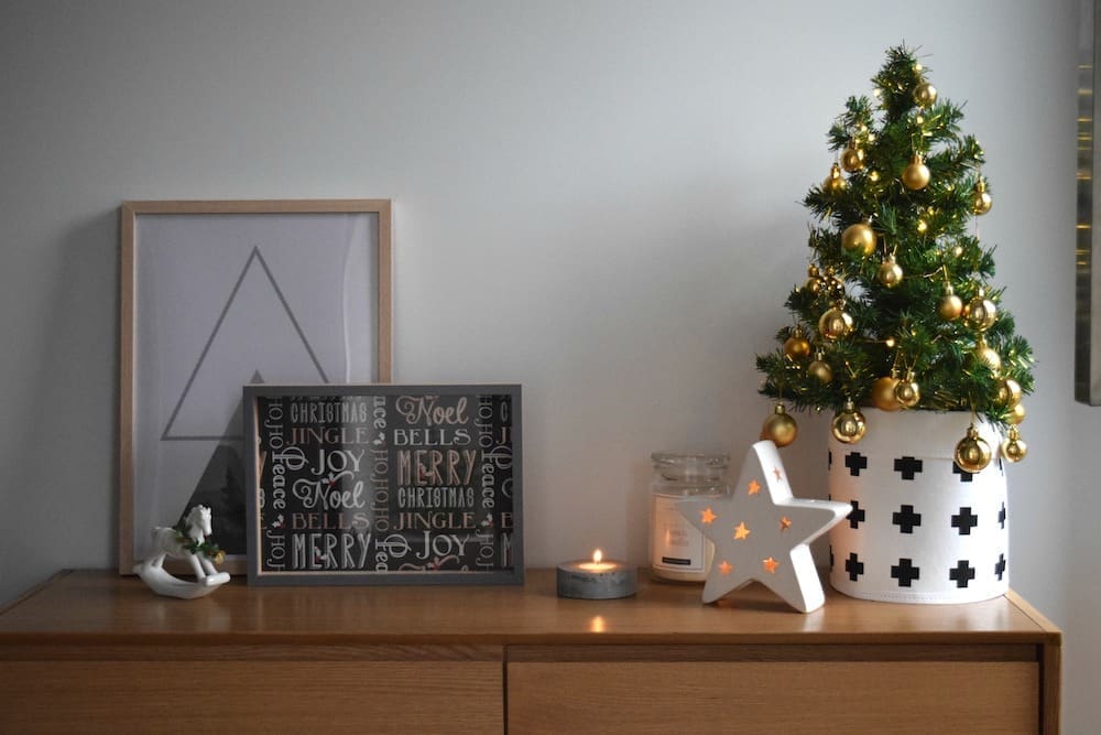
Here I’ve used a concrete tea light holder, ceramic star tea light, large candle in jar and a string of LED lights around the Christmas tree. They also have a range of half concrete, half timber look candle holders, and loads of other Christmas lights. I suggest incorporating at least 3 sources of light to make your entry sparkle and shine at night.
Simple décor and ceramic pieces
So much Christmas decor is OTT and while there’s a place for it, it isn’t in a Scandinavian style Christmas entry! Instead, look for pieces that have a clean design or white base. This star tea light holder is my fave find and just one of the white ceramic pieces in store.
Customise pieces to suit your entry
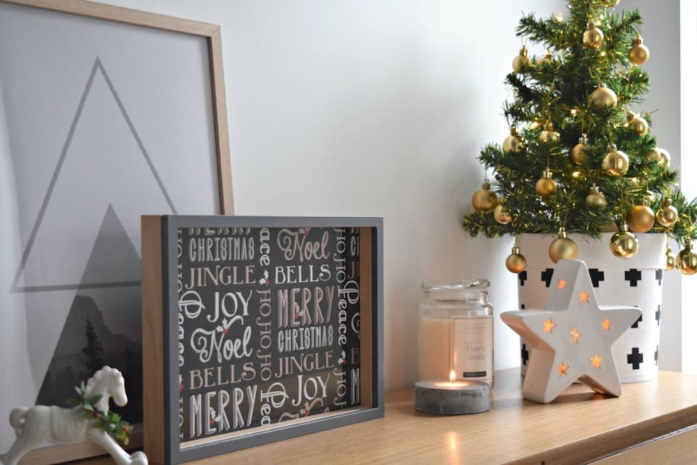
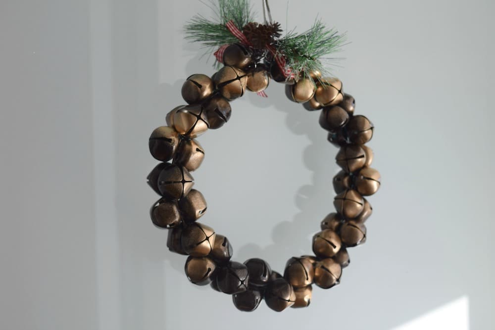
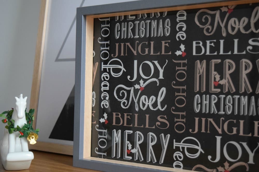
I found some pieces I loved and wanted to include in my entry like a bell wreath but the blue and white colours would have clashed so I simply sprayed the bells black and added some gold accents. Likewise, I found a fab box frame picture frame but the print inside was oriented a different way to how I wanted to display the frame so I changed the image by cutting some black Christmas wrapping paper to size. You could leave the frame with the Christmas paper or print off a family photo to place inside, leaving a festive border around the picture.
Non-traditional decorative items
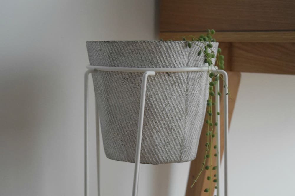
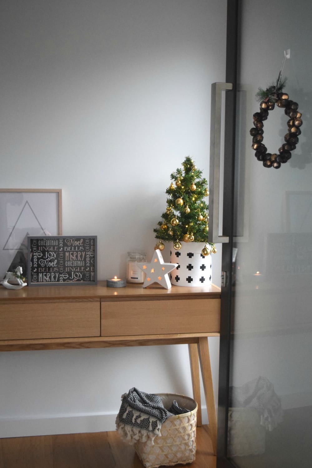
As much as I love Christmas styling, I always suggest adding some non-Christmas items into the mix. The woven basket, pot plant and stand, and wall print all reference that Scandinavian style and bring more warmth to the space.
Top styling tips
Here are my top tips for creating an arrangement you’ll love.
1. Group items in odd numbers
Items place in arrangements of odd numbers (1, 3, 5 etc) are more appealing to the eye. If the balance isn’t quite right, count how many pieces you have and consider adding or removing some to get to an odd number.
2. Consider height and scale
A focal piece, in this case the Christmas tree in the basket, breaks up the height and moves the eye along the surface.
3. Use the depth of the space
It’s OK if some pieces are hidden behind others, such as the frames rested on top of each other, as it will create depth and interest.
4. Get the colour ratio right
You might have heard me talk about the 60-30-10 rule before but it’s an easy styling tip to keep in mind and get your colour ratios right. Essentially, 60% is one colour (in this case white), 30% another colour (light timber) and 10% an accent (grey).
5. Stand back and edit
Always the final step, stand back and ask yourself — is anything missing? Is it too busy? Does anything look out of place? Originally I only had 5 items on the table and while I wanted a restrained look, it was actually just looking bare. So I went back to The Reject Shop and found two more pieces, the white rocking horse and small concrete tea light, to go up to 7 items and this small adjustment helped to fill and balance the space.
Will you create a Christmas entry in your home? What style direction will you take? I’d love to know in the comments below! Check out The Reject Shop for loads of other Christmas styling and inspiration.


