Today we’re taking a look at a terrace townhouse that has been given a new lease on life.
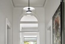
What was once a drab, tired ’90s interior has been transformed, undergoing a full architectural makeover. Now we visit a light, bright more liveable townhouse with clean lines. Even better, this interior has a Scandi twist, all while still celebrating its heritage protected charm.
We take a walk through with Bo Chu, Creative Director at Pitch Architecture and Developments, whose team was brought on board to revamp this Melbourne heritage townhouse.
Related article: Sophisticated, clever home storage in a suburban townhouse
Related article: 12 genius ideas for awkward under-stair space
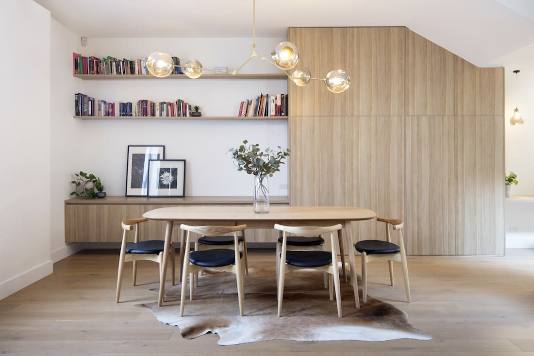
“This project was big, but the brief was really quite simple — to completely redesign the interior of this family home. We wanted to maximise the natural light,” explains Bo.
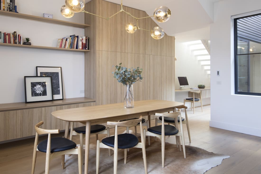
“Our aim was to improve the efficiency and practicality of the home. We reconfigured the layout to achieve open plan living.”
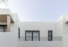
This double storey townhouse features 3 bedrooms, 2 bathrooms and single car garage, tucked down a quiet laneway in the Melbourne suburb of Fitzroy. Being partially heritage protected meant caution had to be taken during the renovation.
“The home is on a narrow block. The existing conditions of the property threw in a few challenges during both design and construction.
“We had to take extra care when working with the rear portion of the home. As it is a heritage building we had to retain these features,” says Bo.
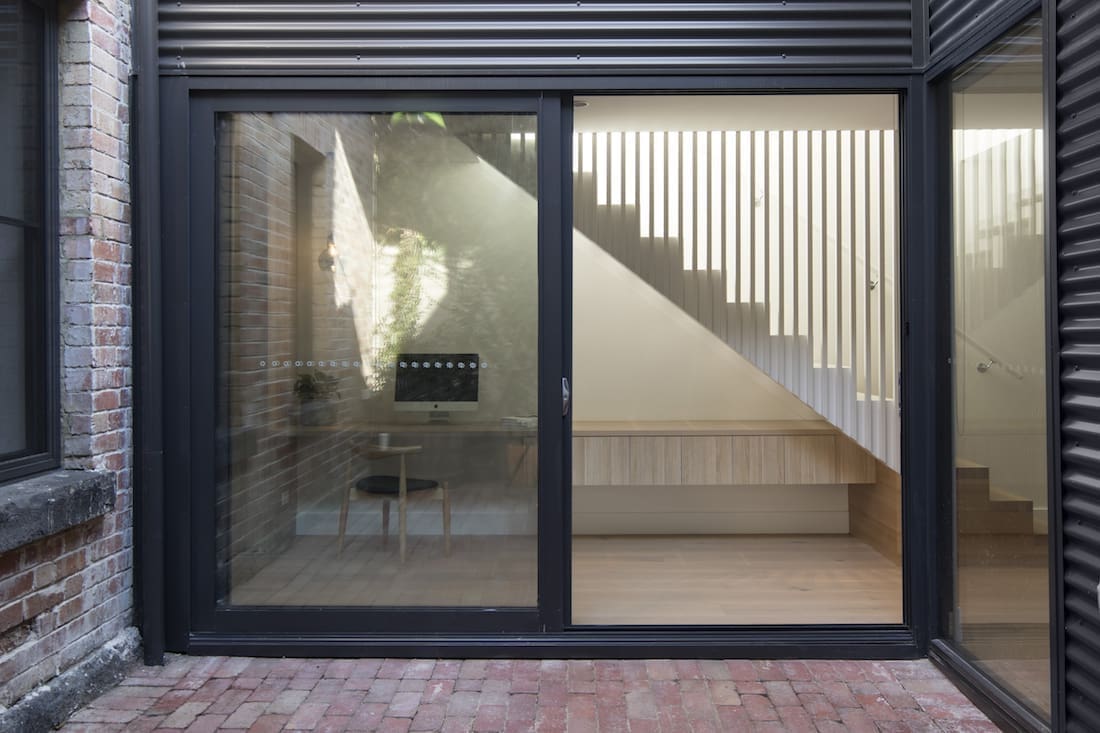
An abundance of natural light flows throughout the home, but it was a tricky one to get right for the design team.
“As the orientation of the block faces east-west, we were restricted on how much natural light was able to be received internally throughout the day.
“In order to maximise the natural light, our strategy was to focus on reconfiguring the spaces. We focused on the areas surrounding the courtyard,” Bo explains.
The owners were keen to make the central courtyard a key feature of their newly designed home. This allowed more natural light to flow.
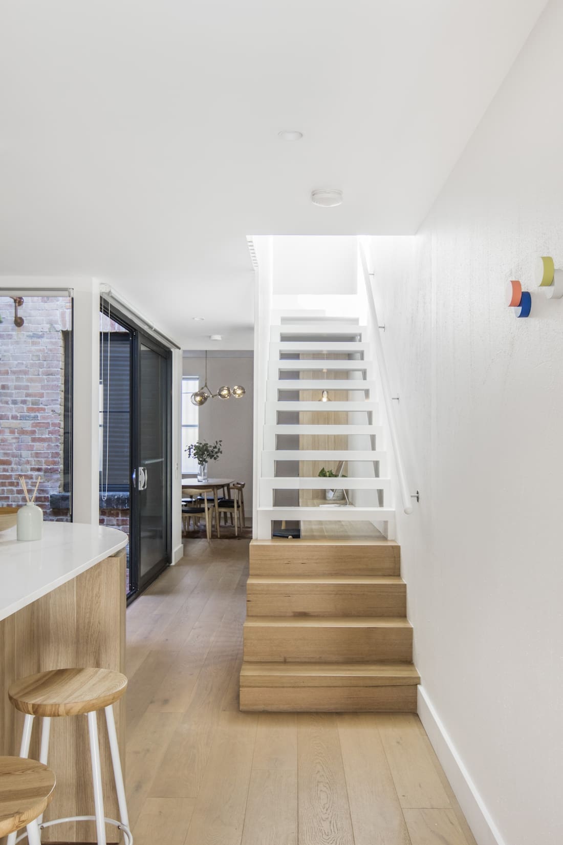
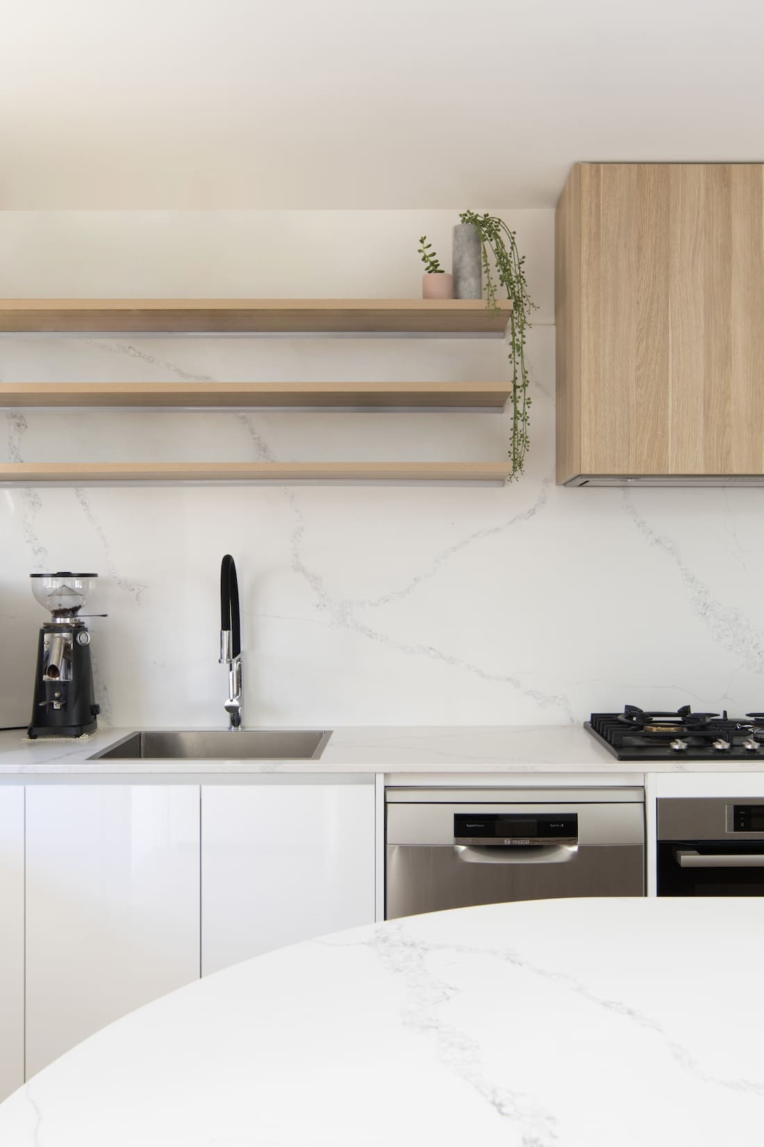
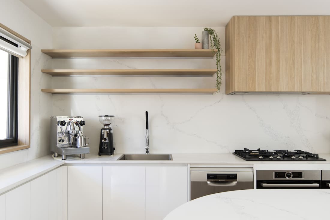
“The existing floor plan had to be reshuffled, allowing the addition of another bedroom and bathroom, and opening up the kitchen to the living areas.
“Creating the new open plan kitchen meant there was now an immediate visual connection to the courtyard the moment you enter through the front door of the house.
A lot of emphasis was placed on the existing courtyard to make it a central part of the home.
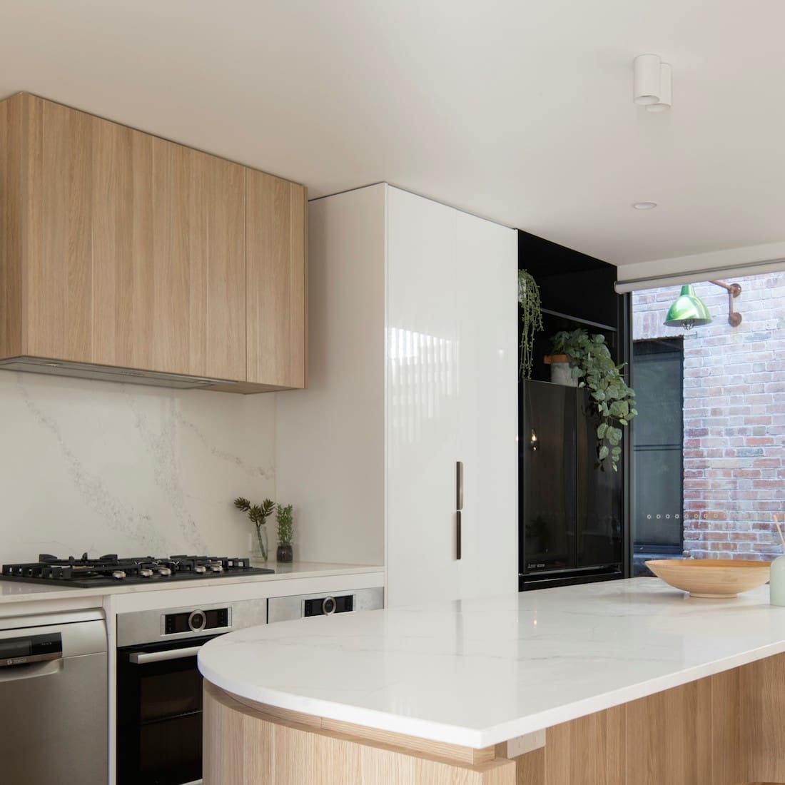
“The new kitchen and staircase are definitely my favourite spaces. Both areas have significantly improved the quality of the space.
“What was once a narrow and enclosed foyer, kitchen and corridor have now been transformed into a series of connected, free-flowing spaces filled with natural light.”
“The battened stairs balustrade allows light to flow between the stairs and corridor adjacent to the courtyard, again bringing it back in as a key focus of the home,” Bo says.
We reflected the home owner’s Scandinavian roots by using natural materials and creating light and generous spaces. This also freshened the old areas, achieving a greater sense of spaciousness.
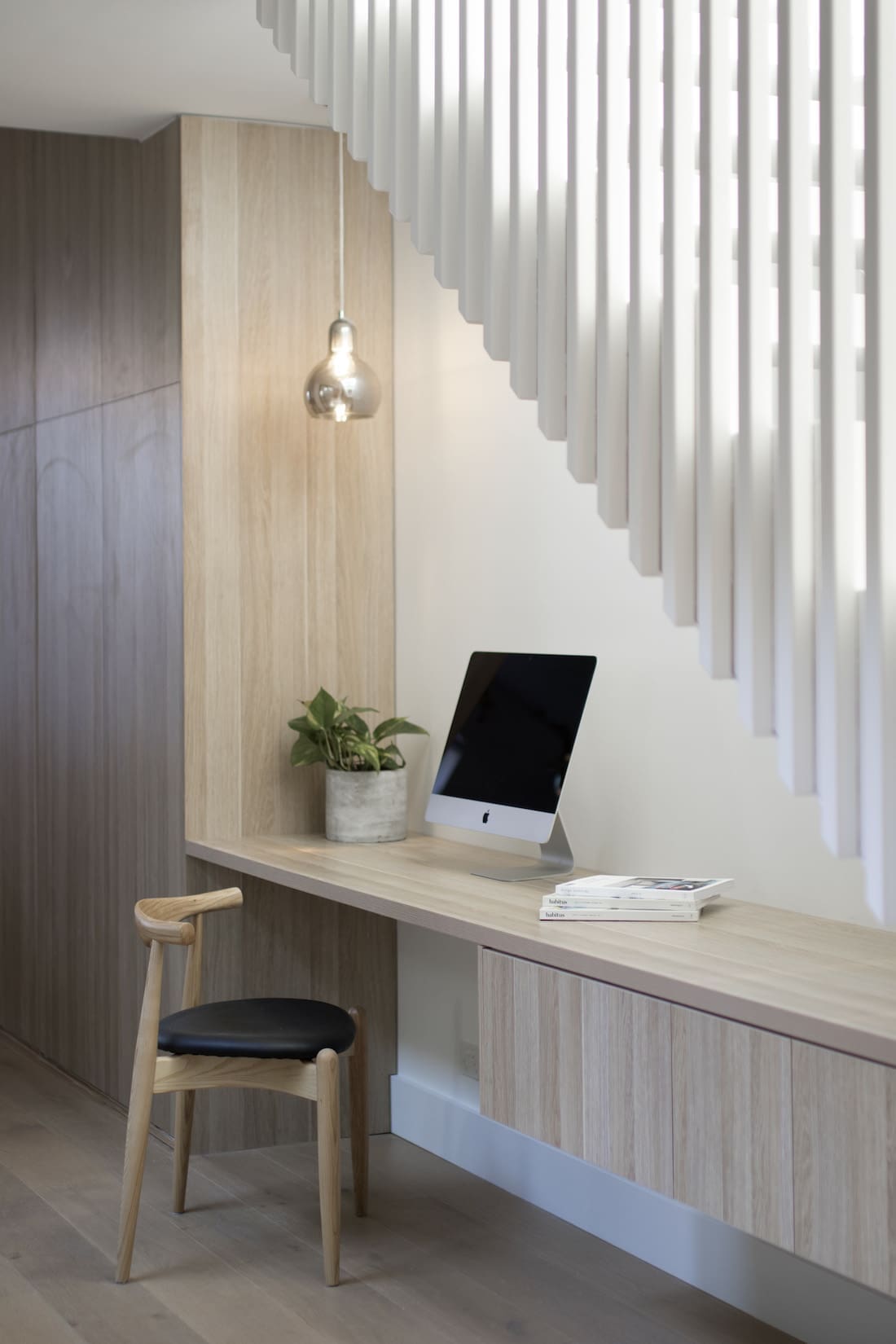
Another architectural feature we love is the cleverly designed study nook. Tucked under the stairs, it transforms an otherwise wasted space into a bright and functional home office.
“The under-stair study nook was a nice touch to the overall design. We removed the old, cramped powder room in lieu of an opening to allow more of that natural light to flow.
“To maximise efficiency and utilise the space under the newly opened tread staircase, we added the study nook which looks great and is super useful, too,” Bo says.
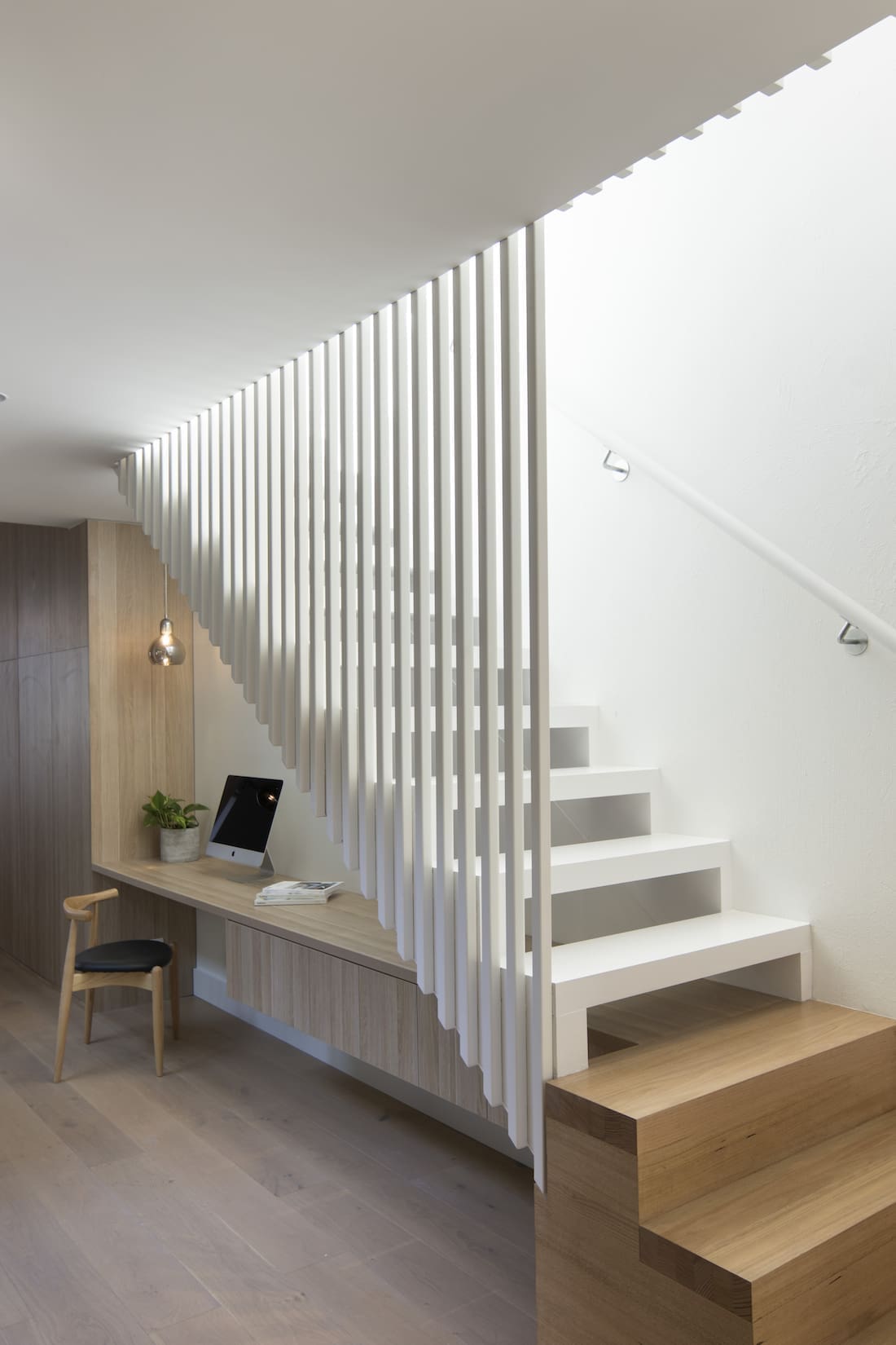
To maximise space, the team used clever design methods throughout.
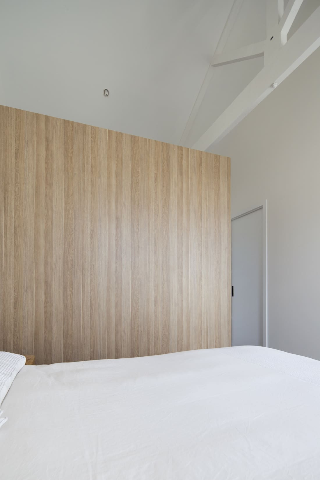
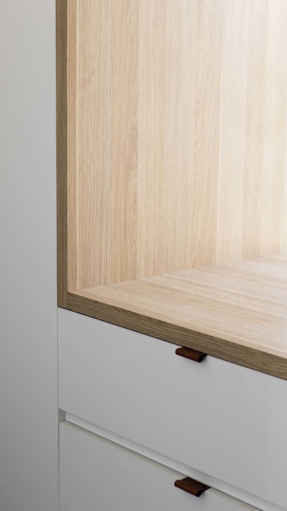
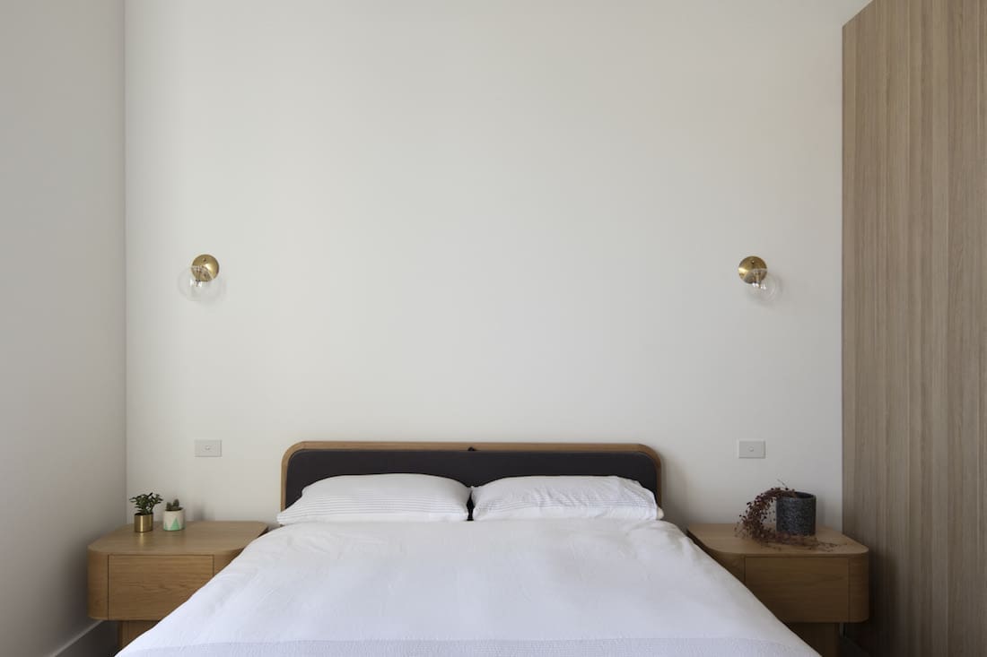
“The walk-in robe in the master bedroom is also a design feature. Instead of building a separate room with walls, we used the robe itself to create the separation.
“A ‘hole’ was then added into the robe to reveal the existing window.
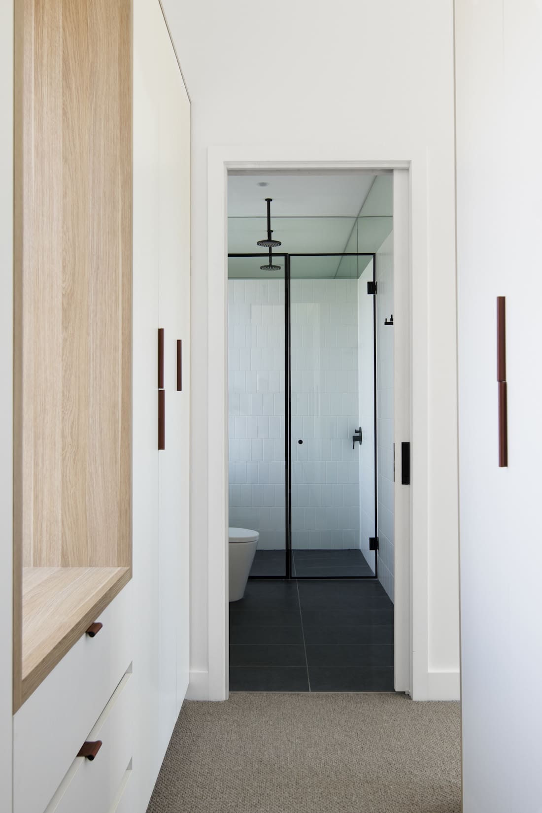
“It was a fun project to work on, we’re really pleased with the final outcome — and most importantly, so is the client!” Bo says with a smile.
Thank you to Bo and the team for sharing this beautiful heritage townhouse renovation with us. Visit Pitch Architecture and Developments website to see more of their stunning design portfolio or check them out on instagram.
More home tours here
