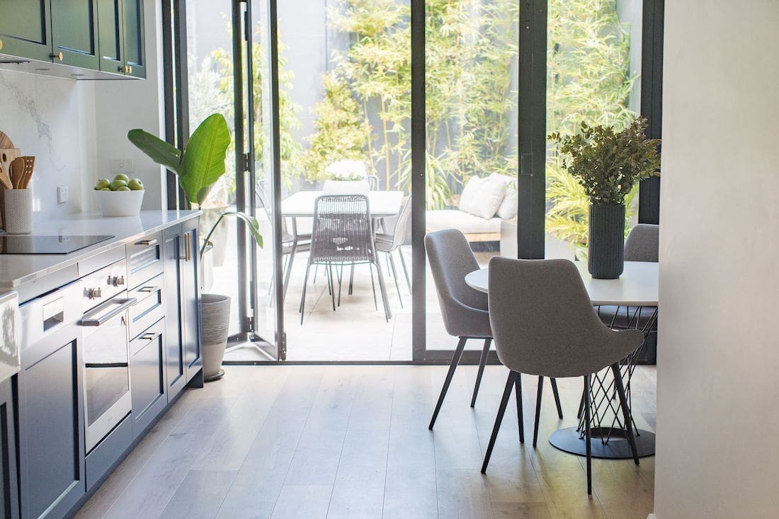
The biggest transformation of our Erskineville project was the kitchen/family area. The homeowners are a young couple who love to entertain so we turned the small u-shaped kitchen and undersized family room into a larger, open plan kitchen and dining space that flows to the outside courtyard. Here’s how we took this old, brown and poky kitchen and turned it into a luxe navy blue kitchen!
Related article: Darren Palmer shows how to keep your kitchen organised with the right storage solutions
Related article: Stylish handles to refresh your interiors or update tired furniture
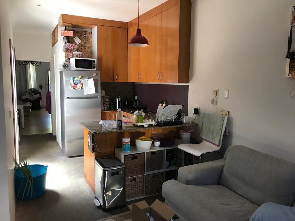
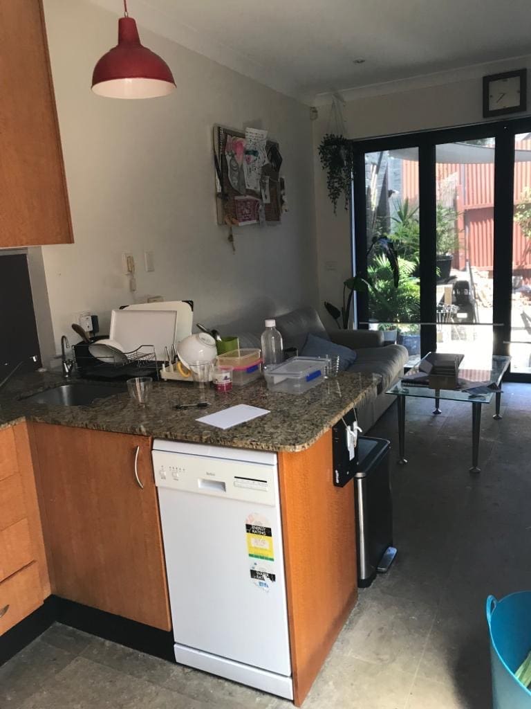
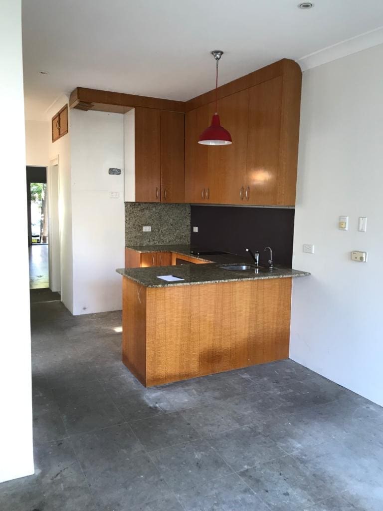
Kitchen before
There was a long list of ‘issues’ with the existing kitchen, including:
- it didn’t suit the era of the home (the ’90s style kitchen had no original features)
- there was limited bench space
- there was no pantry…
- it was so small they couldn’t comfortably work in here, let alone have guests in the space
- the overhead cabinets felt like they were coming down on them (the space needed more balance).
Design inspiration
We explored a lot of options for this space, including all sorts of kitchen layouts, design ideas and materials. It was an incredibly fun and collaborative project between the clients, myself and the kitchen company Cafe Kitchens.
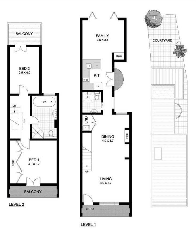
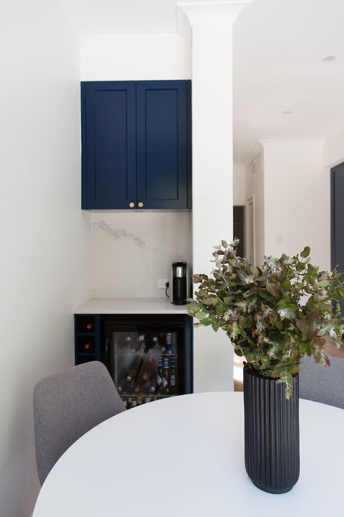
From u-shaped to galley style, the inclusion of built-in bench seating or not, we played around with all sorts of kitchen layouts before deciding on a simple and clean single wall of joinery. The desk space (shown on the floor plan below) was turned into a bar.
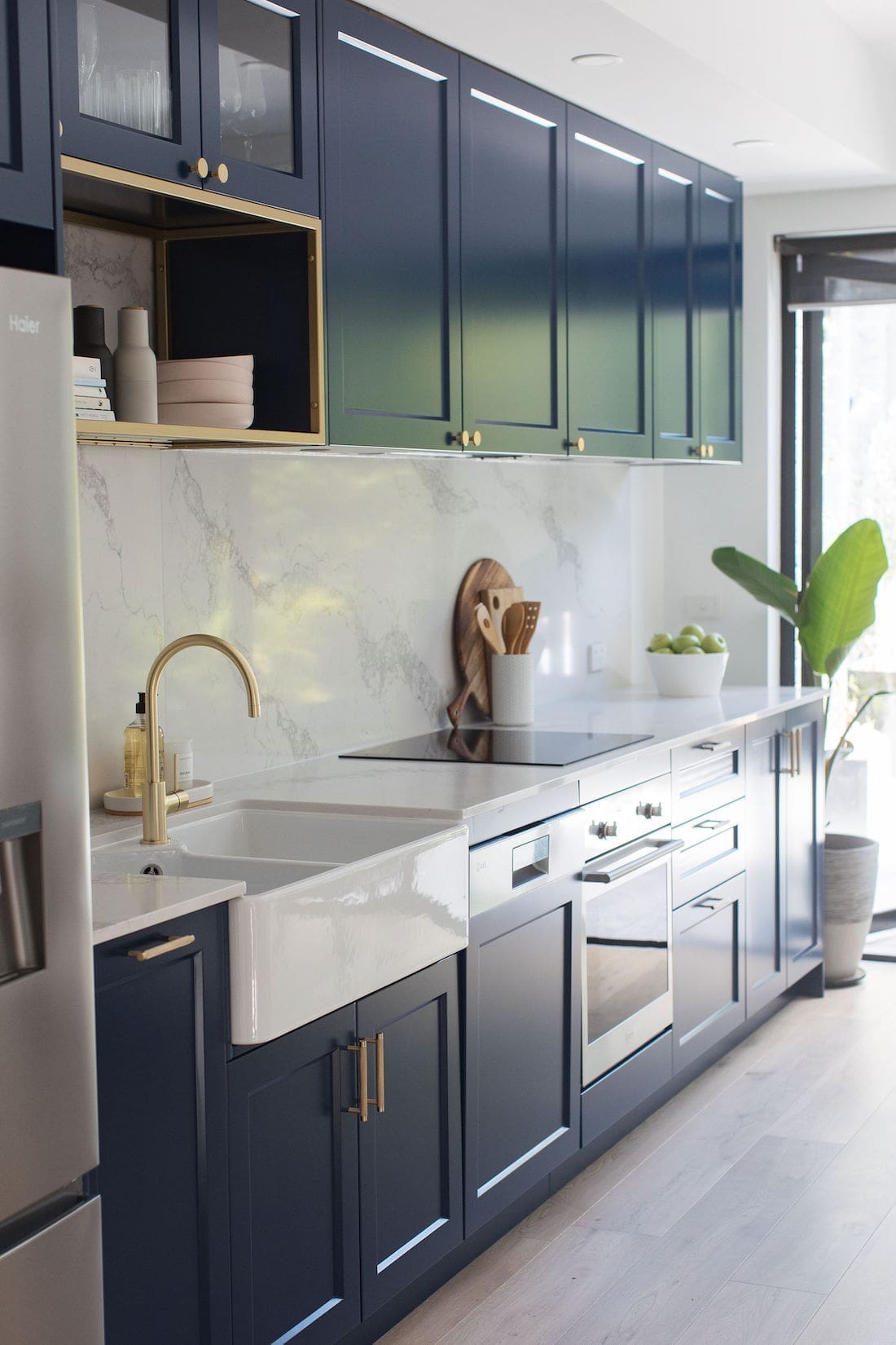
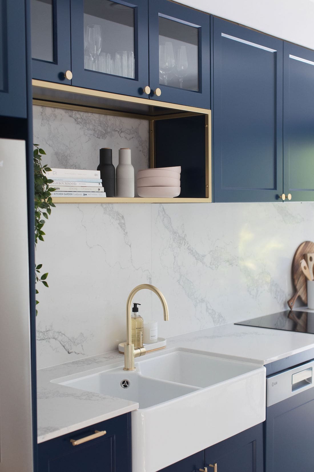
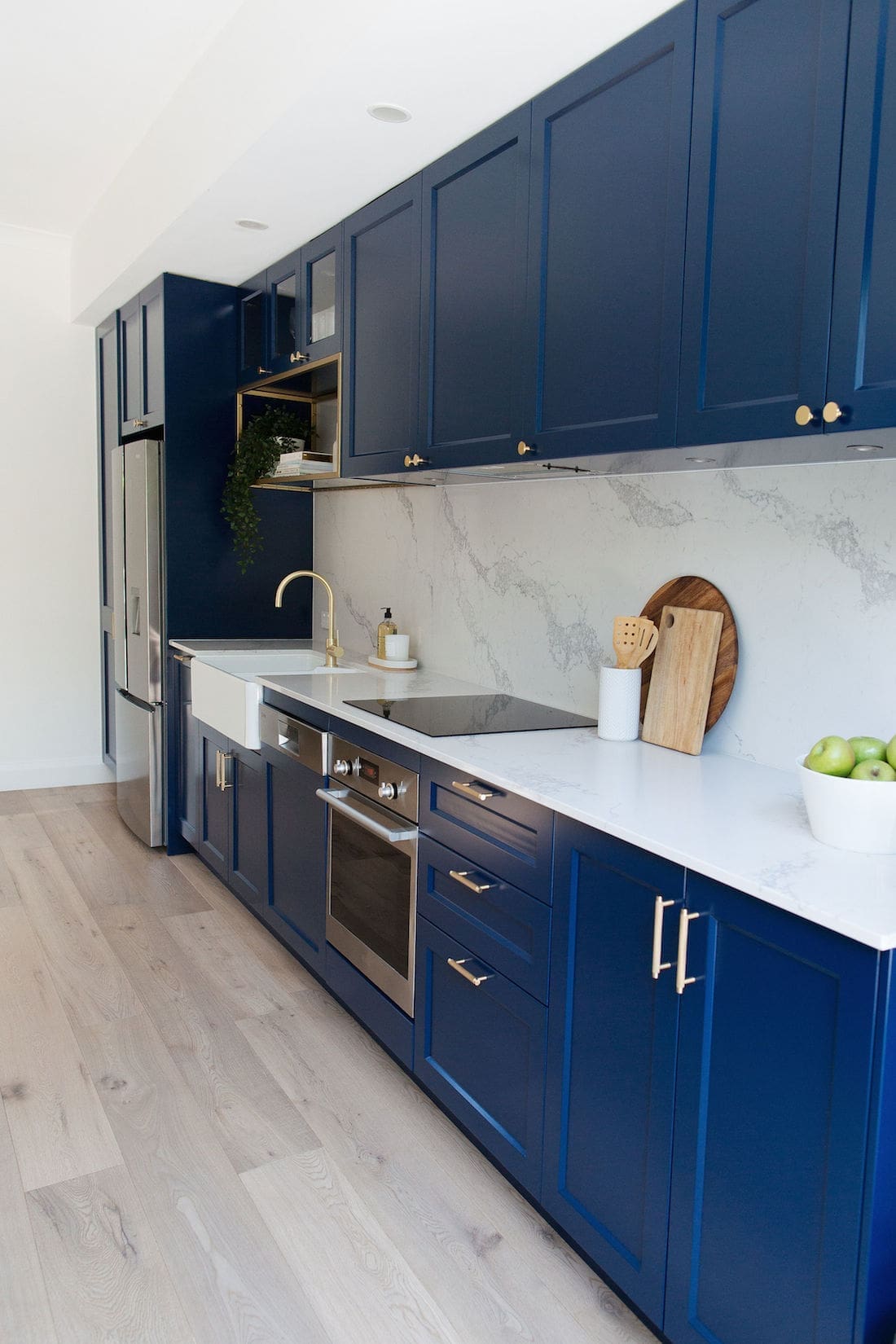
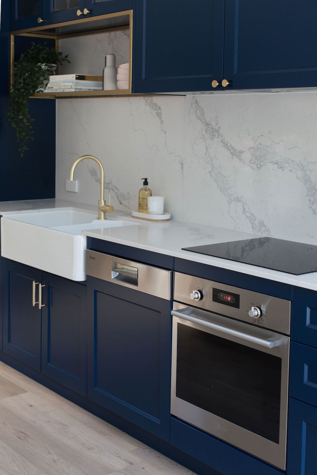
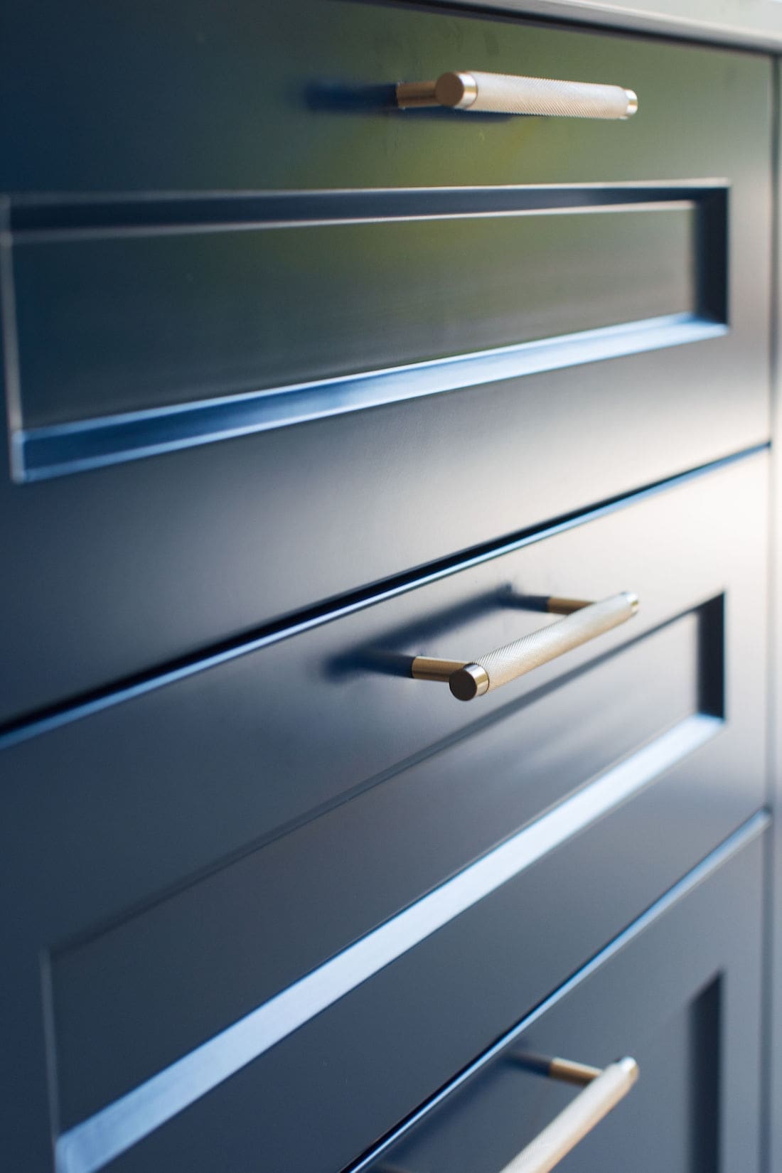
And what joinery to use? While white felt safe, I managed to convince the client to embrace a bold colour. My heart was set on a bottle green but I was outvoted for this shade of navy blue (Kara Sea by British Paints). I’m not complaining though — I mean, how gorgeous is it?! The shaker profile provides a nod to the Victorian era while the brass handles with knurled detailing add a modern edge. Some glass front cabinets and open shelving break up the navy blue kitchen joinery and add interest.
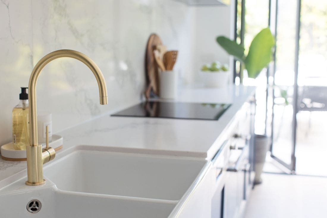
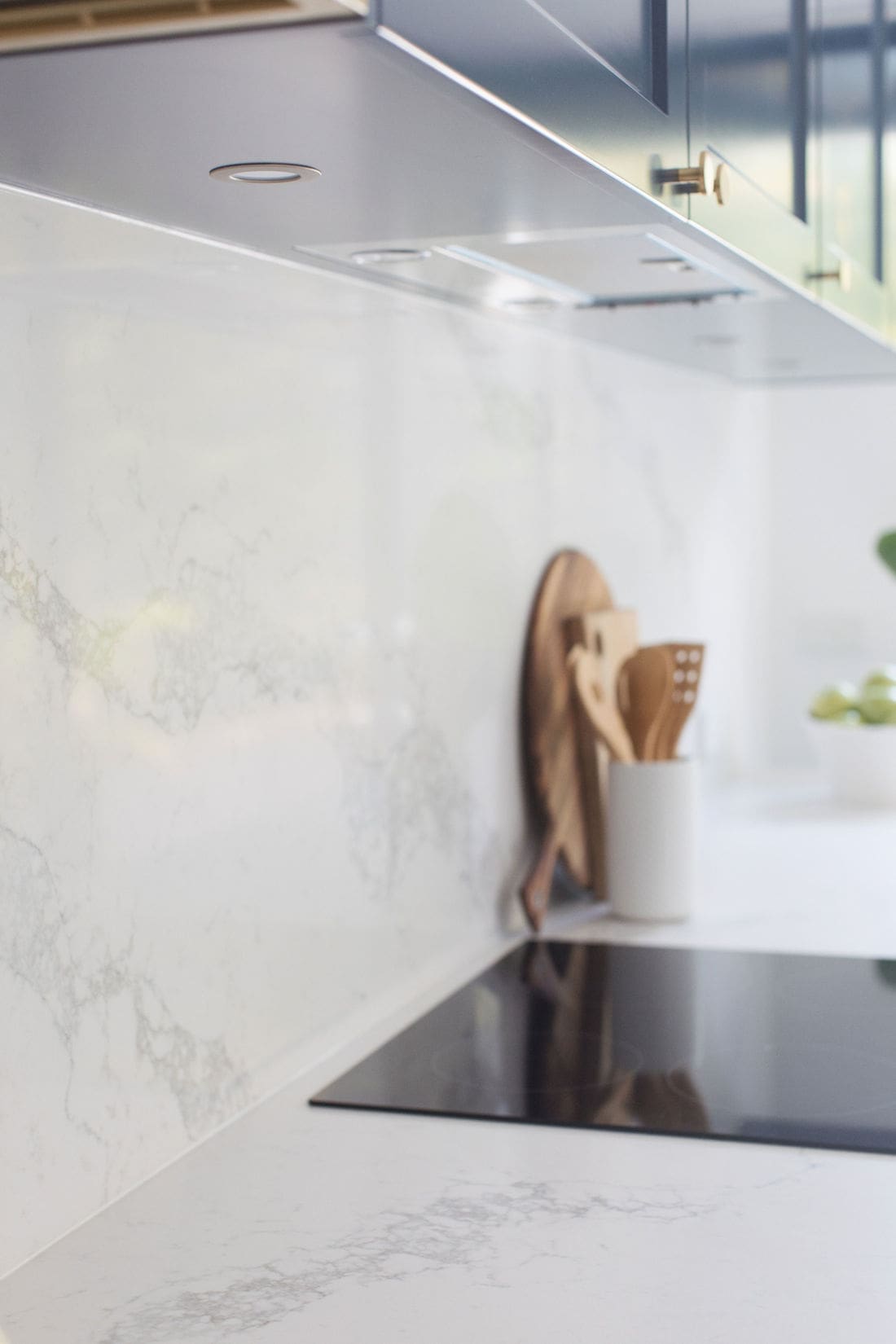
For the benchtop and splashback, we wanted to bring in marble accents. Natural marble is divine but is a more sensitive material that become damaged without proper care. The client wanted hassle-free so we opted for a Caesarstone Maximus bench top that carries up as the kitchen splashback. And a double bowl butler’s sink with sleek, curved brass tap finish the space.
Kitchen after
We’re so thrilled with the kitchen. It feels bold yet timeless. The space is more functional, balanced (a bulkhead reduces the height of the overhead cabinets) and fitting with the character features of the home.
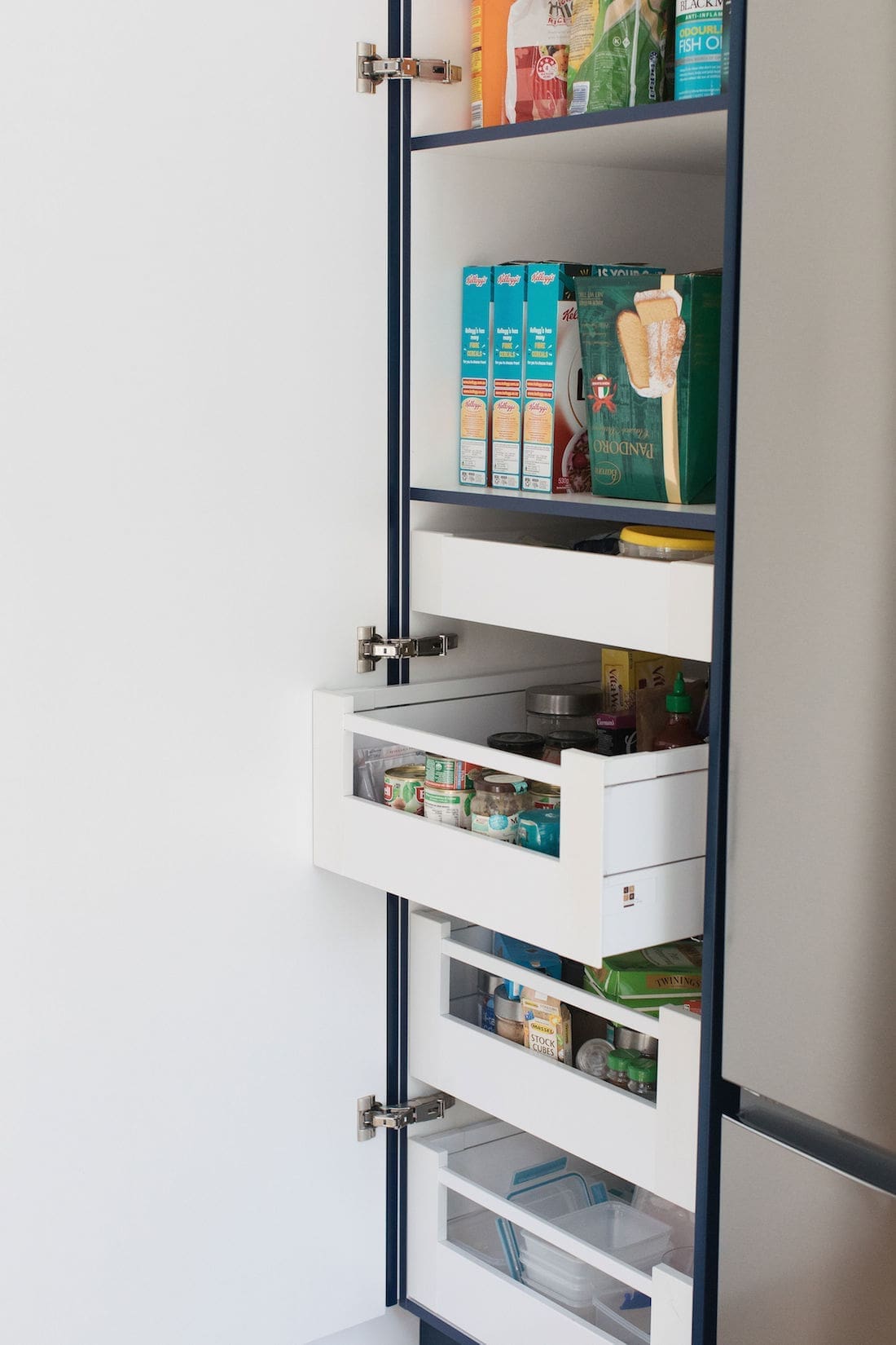
We ticked off every item on the wish list including more bench space and a full height pantry. By changing the configuration to a single wall, we opened the space to allow easy flow through the kitchen and for more people to be in the space without feeling cramped.
Smart inclusions
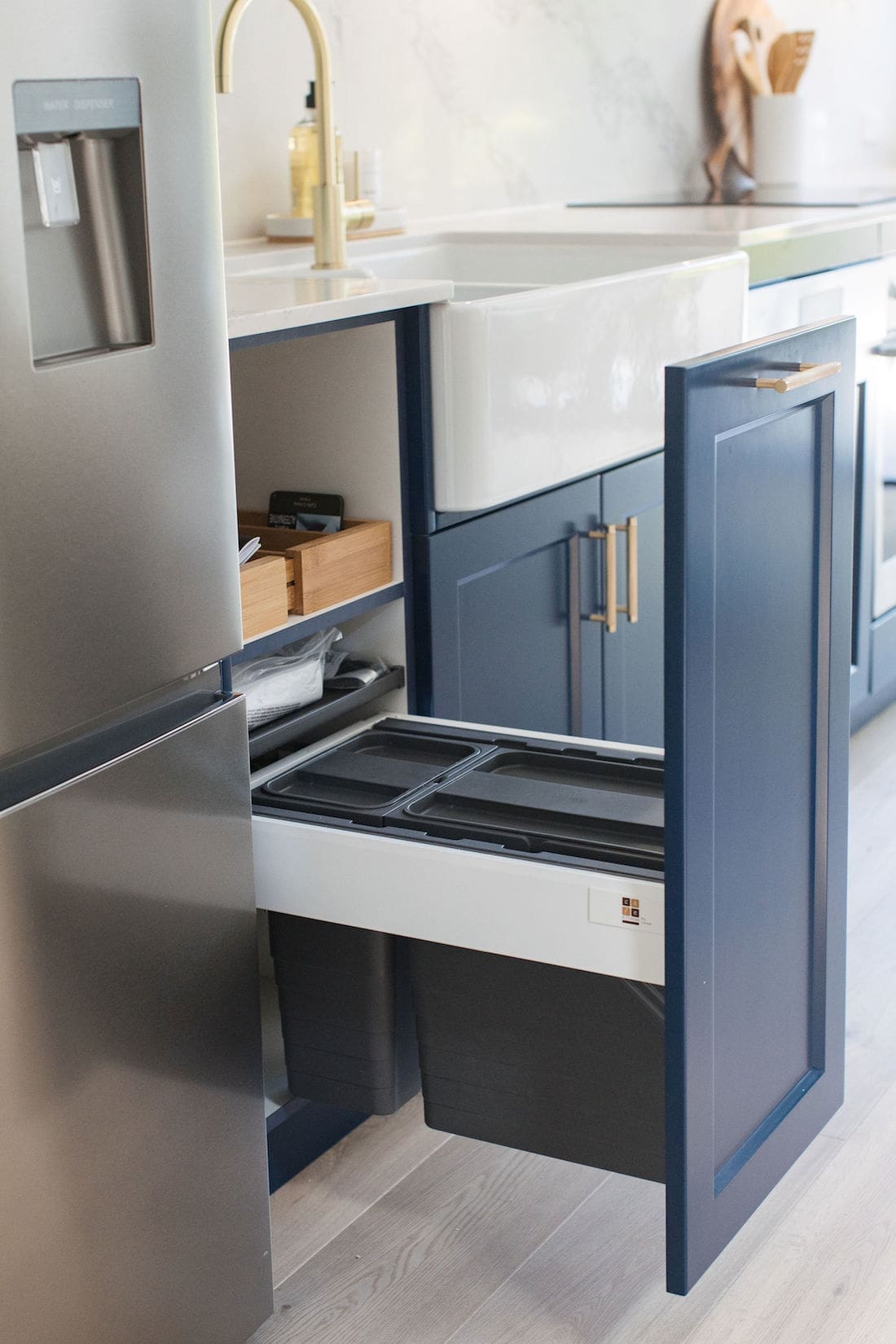
Of course, it isn’t just how a kitchen looks. There are a lot of smart kitchen inclusions in this space, such as a pull out rubbish bin, functional lighting and plenty of drawers which maximise space (including in the pantry).
Read all of Darren Palmer’s tips on the inclusions you need in your kitchen.
Dining and bar area
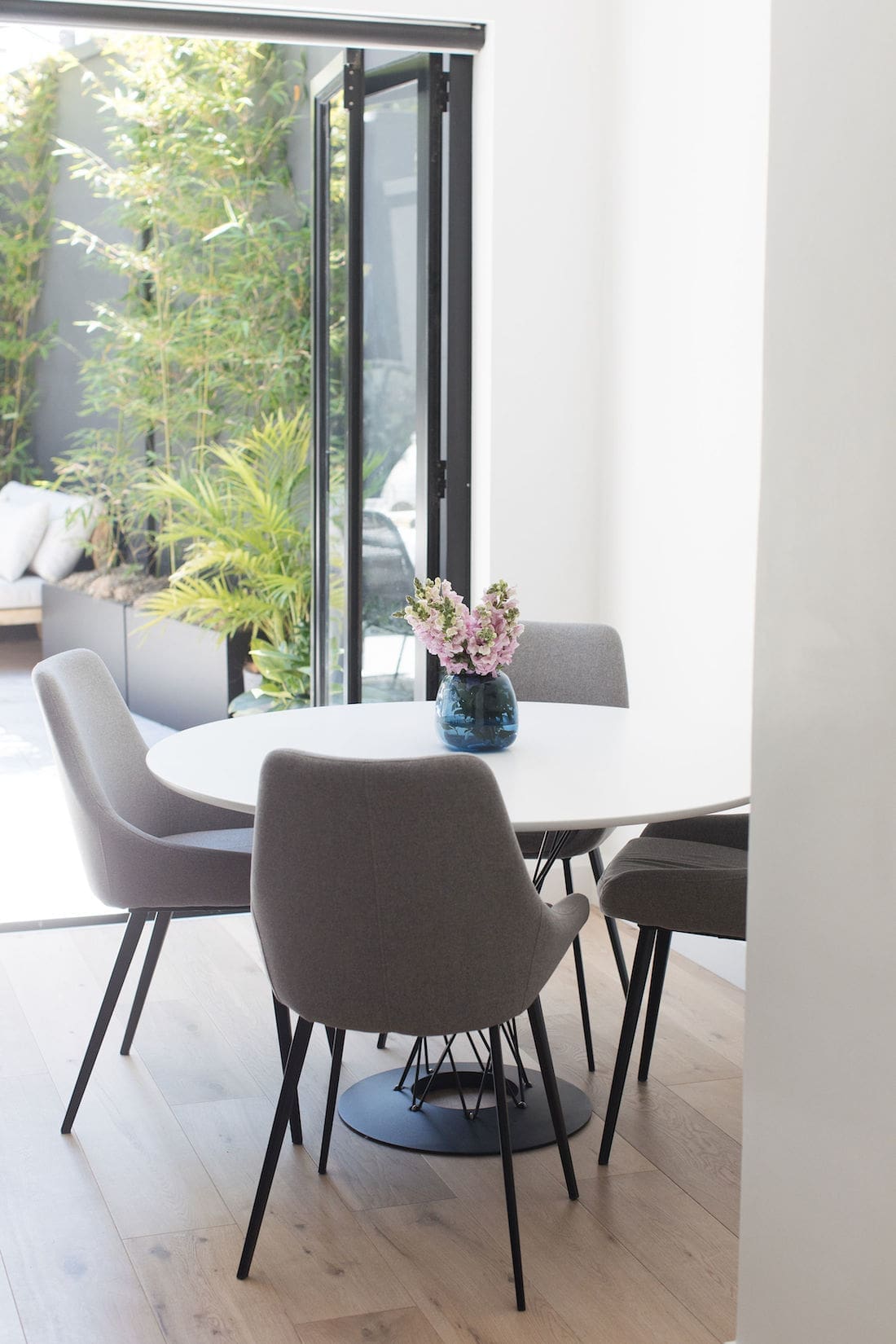
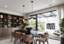
We moved the dining area from the front room to create an open plan kitchen/dining space. It’s a better use of space and fits the couple’s lifestyle.
Give the tight space, I suggested a round dining table which is easier to move around. We picked a dining table from Interior Secrets and these grey upholstered dining chairs from Temple & Webster.
The bar area we tucked into the space is more usable than the awkward desk that was there before. Plus, the clients were able to fit in that wine fridge they always wanted!
I hope you found some ideas and inspiration from this navy blue kitchen remodel for your next project. If you have any questions about this kitchen renovation, just post it below and I’ll answer it asap.
Check out more kitchen inspo
Photography by Thorson Photography



Hi Gina. Browsing blue kitchens I came across your blue Erskinville kitchen makeover. I love the kitchen but particularly love the bifolding doors leading out into the courtyard. These are exactly what I want but have been told by two separate door companies that they are not possible and I have to have 1 fixed panel on one side and 3 folding panels on the other side. Do you by any chance remember which company made these doors and do you know if a similar door would be available in Newcastle NSW
Hi Sally, apologies for the delay. I’ve sent an email to the client of this project as they sourced the doors directly. I’ll let you know if they recall the company 😉
Hi Gina, The blue combination looks beautiful. Do you think if we swap the white ceaserstone with Buttermilk stone, it would still maintain the charm? The buttermilk is in the standard range so would be more economical.
Hi Apurv, thanks for your lovely comment. I can see that ‘Buttermilk’ is quite creamy so the overall look would be different. Is ‘Organic white’ available as this has similar undertones as the stone we used in this kitchen?
Hi this kitchen looks fantastic. What is the name of the counter top/back splash? It’s really lovely.
Hi Laura, thanks for your lovely comment. The splashback and benchtop are ‘Statuario Maximus’ by Caesarstone and you can find out more here https://www.caesarstone.com.au/colour/5031-statuario-maximus 🙂
Hi, we are about to install our kitchen in a few weeks time and opted for Kara Sea too. Cannot wait to see what it will look like. Absolutely love your kitchen and hoping ours will look at least half as good! Can you recommend a white for the walls and ceiling to compliment this amazing blue? Thanks, Jo
Hi Jo, thanks for your lovely comment 🙂 We’re so happy with how this kitchen turned out and so is the client! I selected ‘Marble Mist’ from Haymes as the paint colour for the walls and ceiling as it still looks bright white but has a slightly warm base. They work beautifully together 😉
Thank you!
Hi! I was wondering if you painted the cabinets and if so which paint did you use? 🙂
Hi Myesha, we use ‘Kara Sea’ by British Paints 🙂