It was a while in the making but I’m so excited to share my completed master bedroom makeover with you! From grey and dull to a warm, minimalist modern bedroom. Let me share with you details of all the changes I made.
Related article: Gina’s alfresco makeover: Taking my front balcony from drab to fab!
Related article: How I built a ledge wall in our bedroom: Convex wall panel shelf with terrazzo top

Wall colour and half height ledge wall
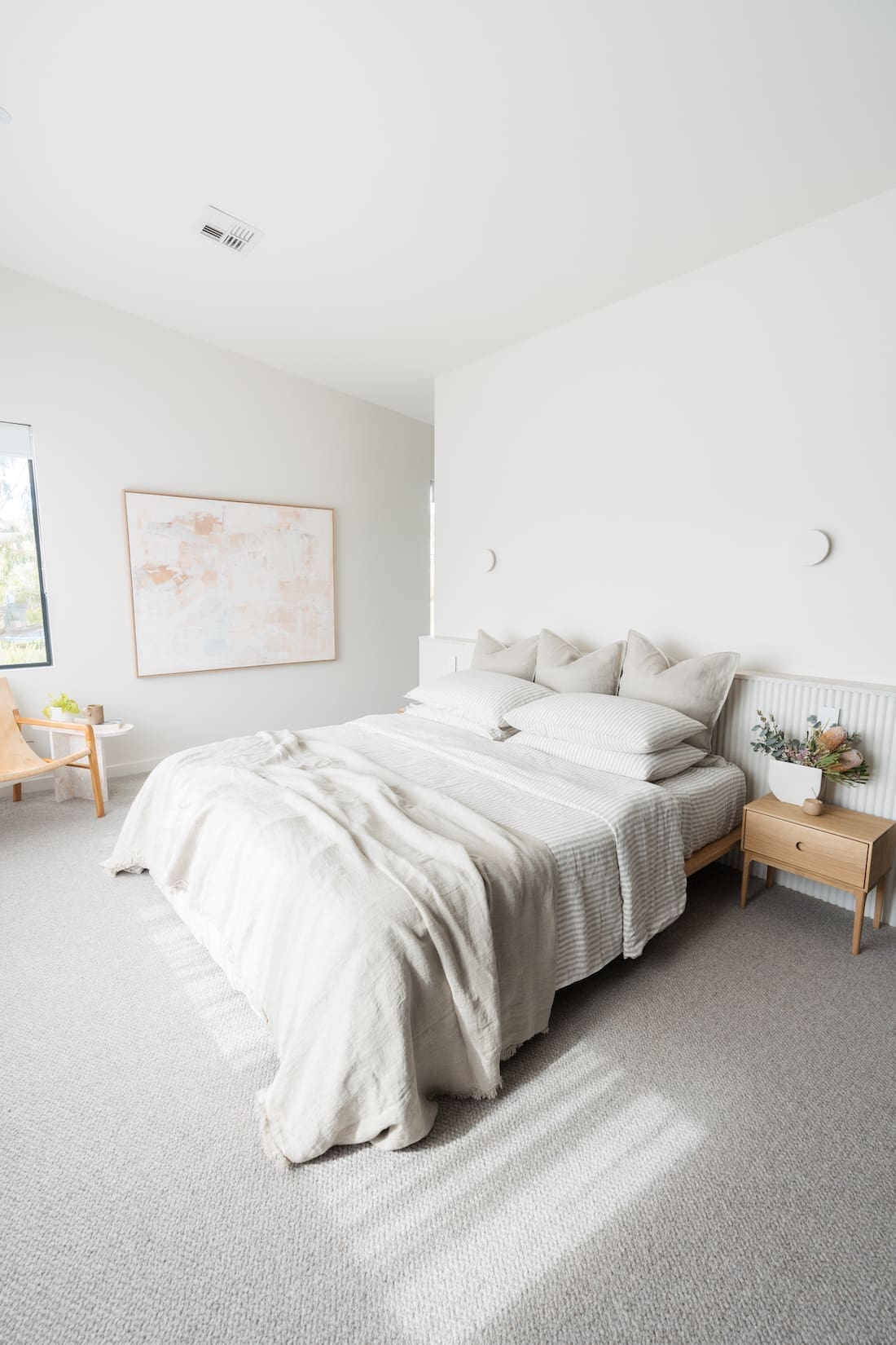
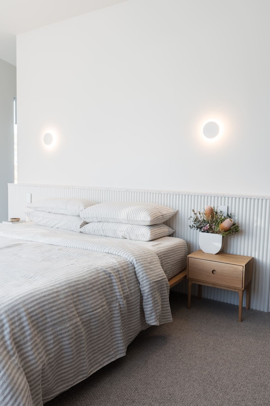
The most dramatic change was probably switching from a mid-grey wall colour to this lovely creamy-white called ‘Organic 2’ by Haymes. It’s a colour I’ve specified a few times for clients and I always love the result. So when I was looking for the perfect shade of white paint for my bedroom, I didn’t have to think too hard!
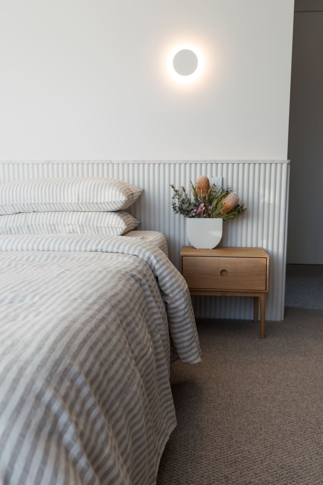
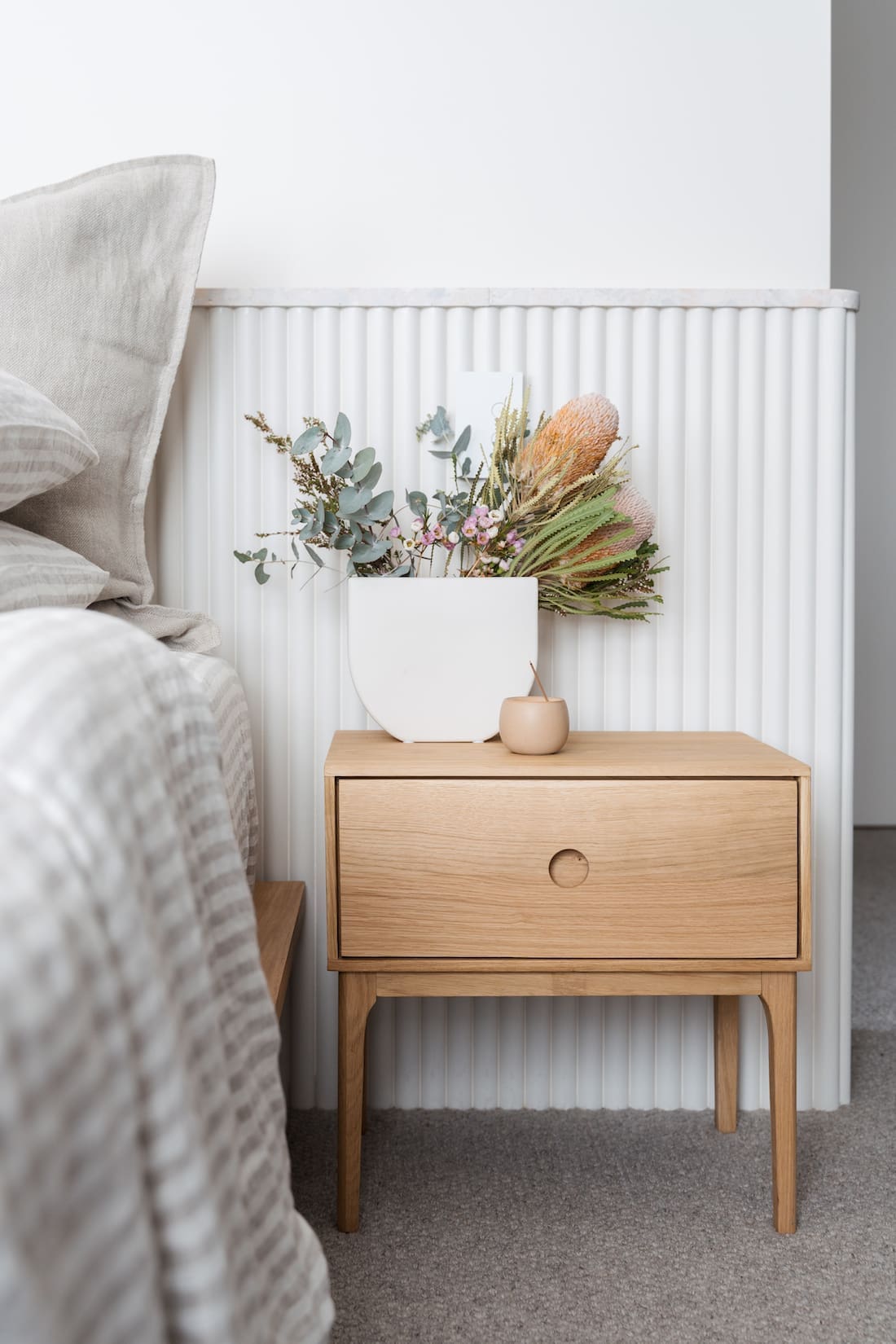
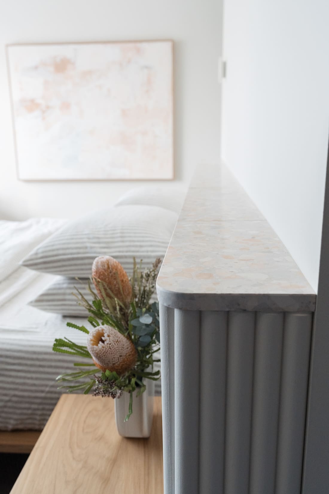
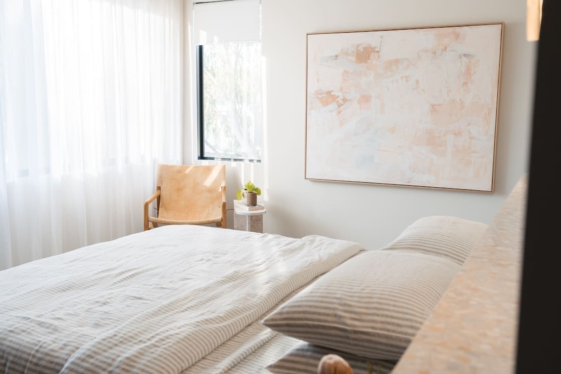
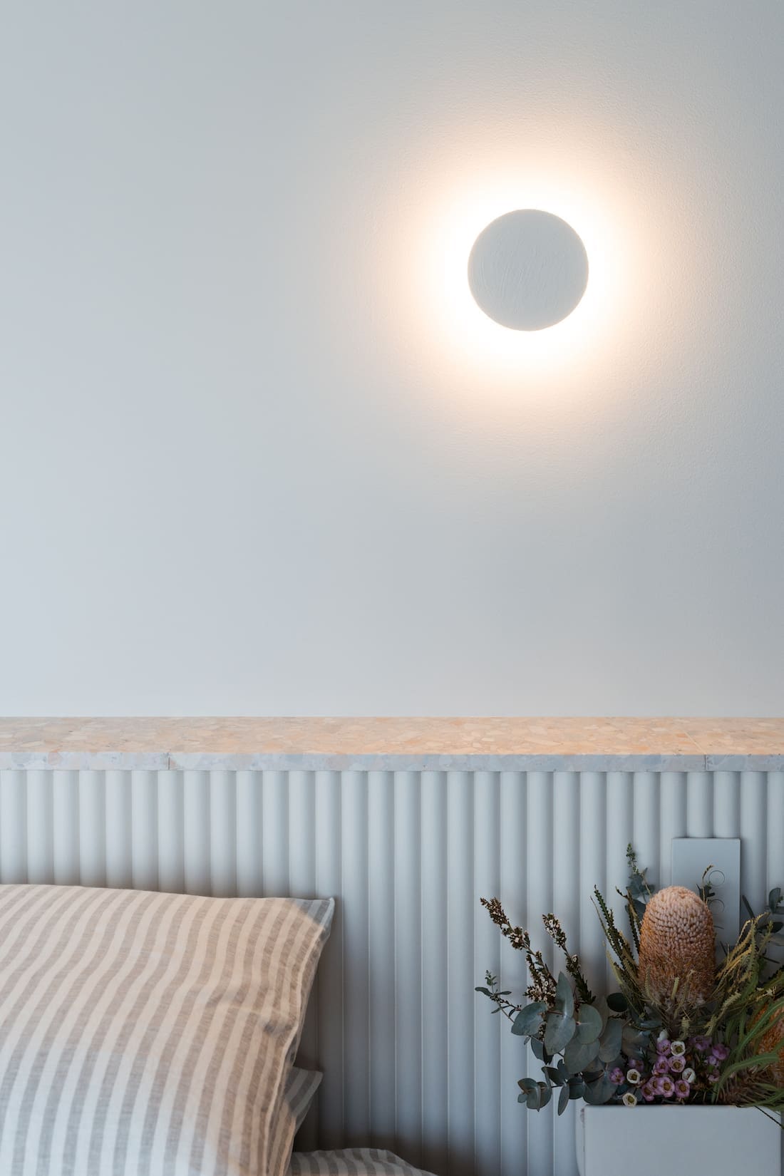
Building out the ledge wall or half height wall behind our bedhead also transformed the room. Made from the new Easycraft Convex MDF decorative wall panel with a natural terrazzo tile top, it adds texture and depth to the room. I love how the undertones of the stone work harmoniously with the wall colour while the stone chips add subtle pops of colour.
I couldn’t be happier with the paint colour and how this bedhead feature turned out… especially as I had no idea what I was doing while building it. Find my how-to (or how-not-to) tutorial to build the ledge wall here.
New bedroom furniture
With a new colour palette in the space, I sold our old grey bedroom furniture on Facebook Marketplace and got some gorgeous new pieces from RJ Living.
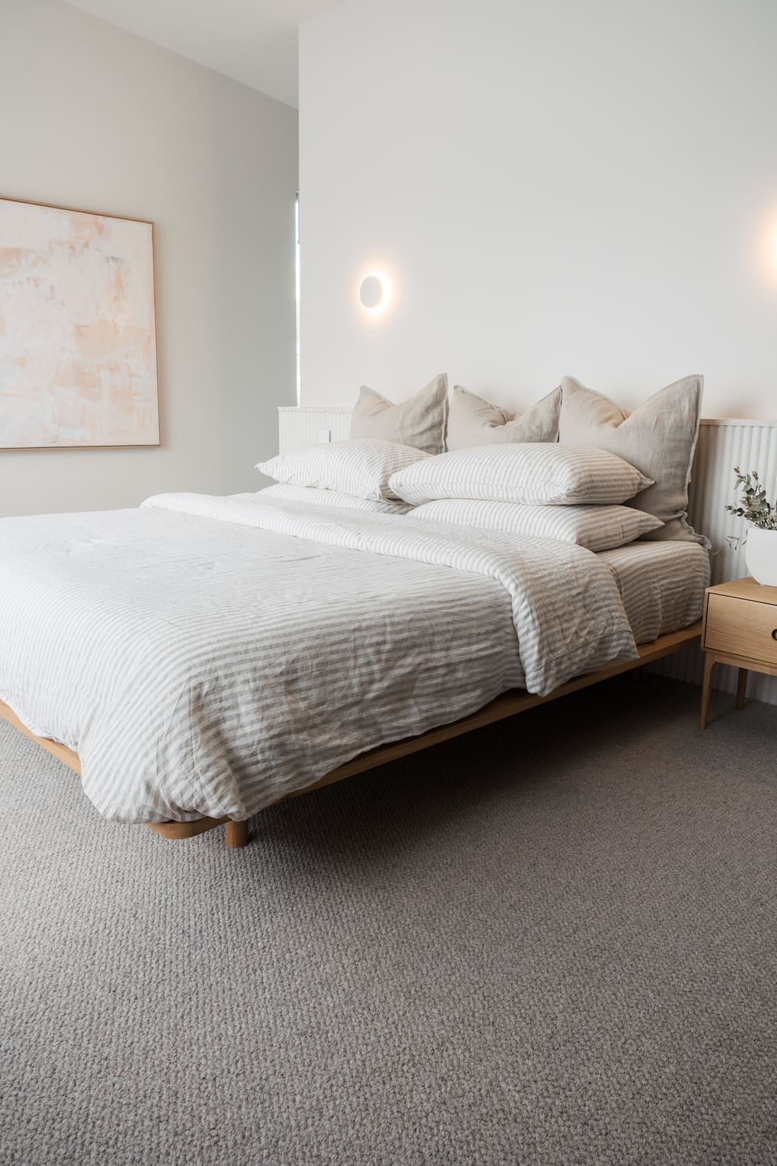
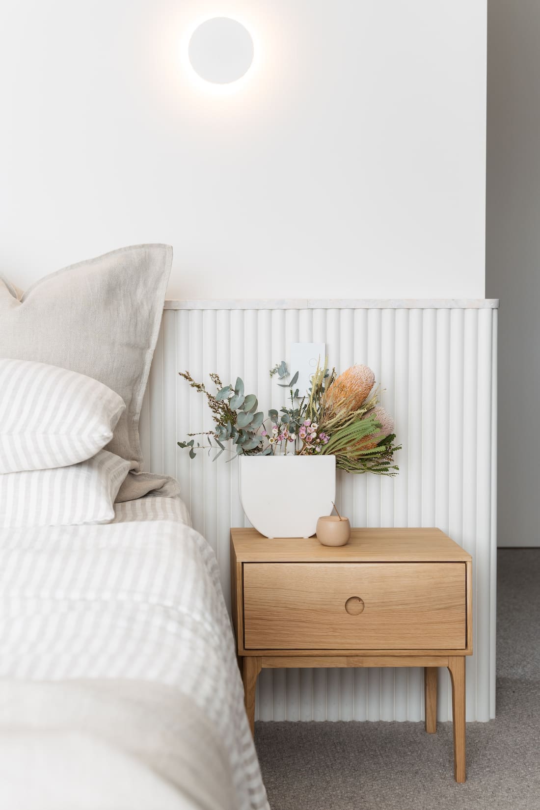
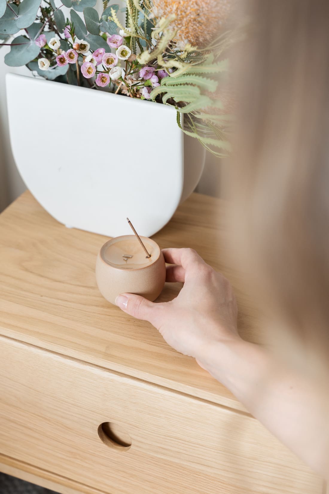
The floating style timber bed base is called ‘Serene’ and it suits the minimalist aesthetic of this space to a T. And I also selected two ‘Ambience’ bedside tables from RJ Living, which pick up on the oak timber accents yet aren’t match-matchy. The craftsmanship of these pieces and solid oak construction means they’ve been designed to last.
Bed styling
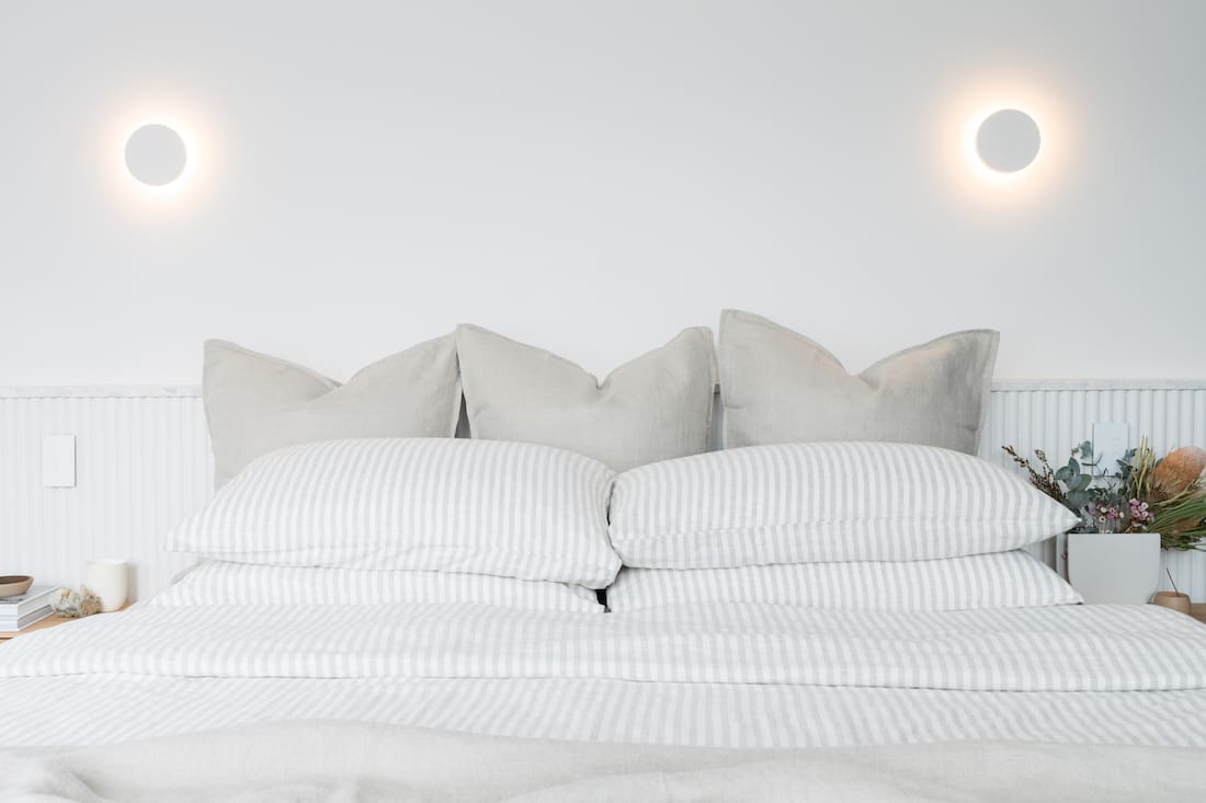
Of course, a gorgeous bed needs gorgeous bedding. So many of you complimented this stripe linen bedding when I shared it on Instagram. It’s a splurge buy but so worth it. I’ve had this sheet set on repeat… like wash, hang, remake the bed, repeat!
It’s called ‘Ticking stripe’ in colour natural from LinenMe and I paired it with their natural linen Euro pillowcases and throw.
Dreamy knotted wool carpet
After walls, the largest surface area in a room is the floor. And boy did our old carpet need an upgrade! I selected this divine knotted wool carpet called ‘Native Elegance Applewood 150’ from Flooring Xtra and am OBSESSED! It’s so soft and luxurious underfoot and the lighter colour makes the room feel so much larger.
Luxe terrazzo side table
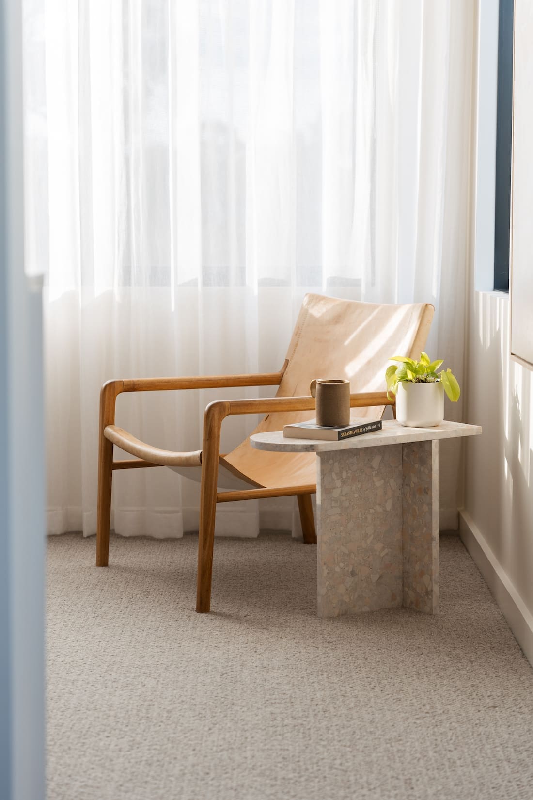
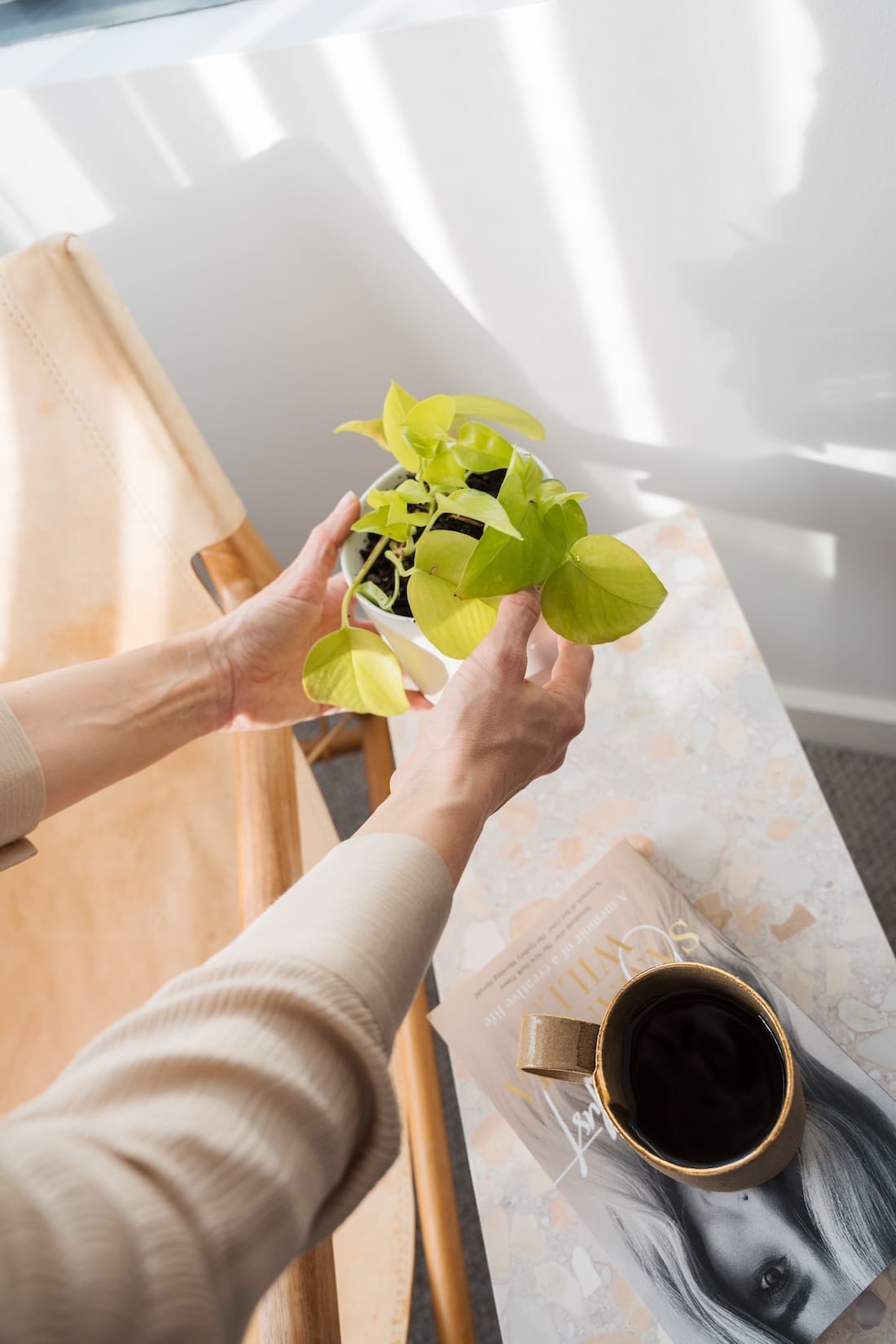
As well as a new bed and bedside tables, I also made this terrazzo side table using offcuts of terrazzo from my bedhead wall. It was ridiculously simple to make (although I had someone cut the tile for me) and is one of my favourite pieces in the space. Check out the tutorial I shared on how to make this terrazzo side table.
Upgraded window coverings
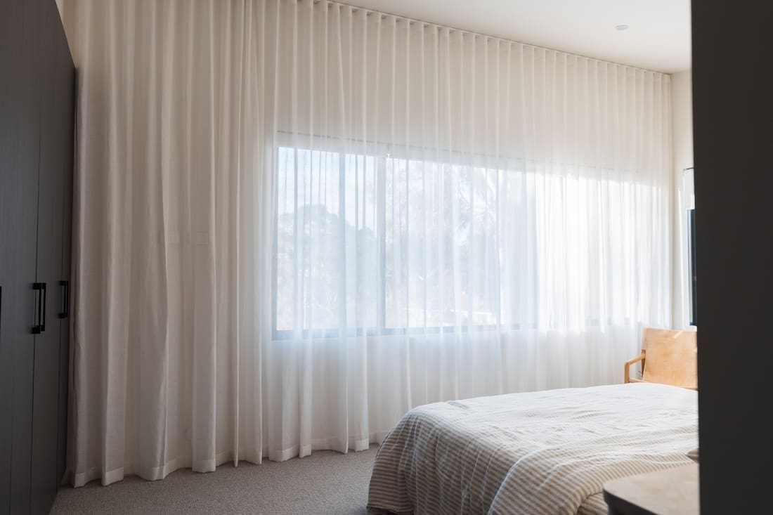
Another big change was upgrading our window coverings. Our old blockout honeycomb blinds had broken and could no longer move up or down. I also felt the room was drowning in fabric from our old sheers. So I decided to pare things back and installed recess fit blockout roller blinds in all the windows and dressed our main window wall in a wavefold sheer curtain from dollar curtains + blinds. The curtain fabric is called ‘Banksia’ in colour ‘Natural’ for those of you looking for a similar linen blend warm white curtain fabric.

Large abstract wall art
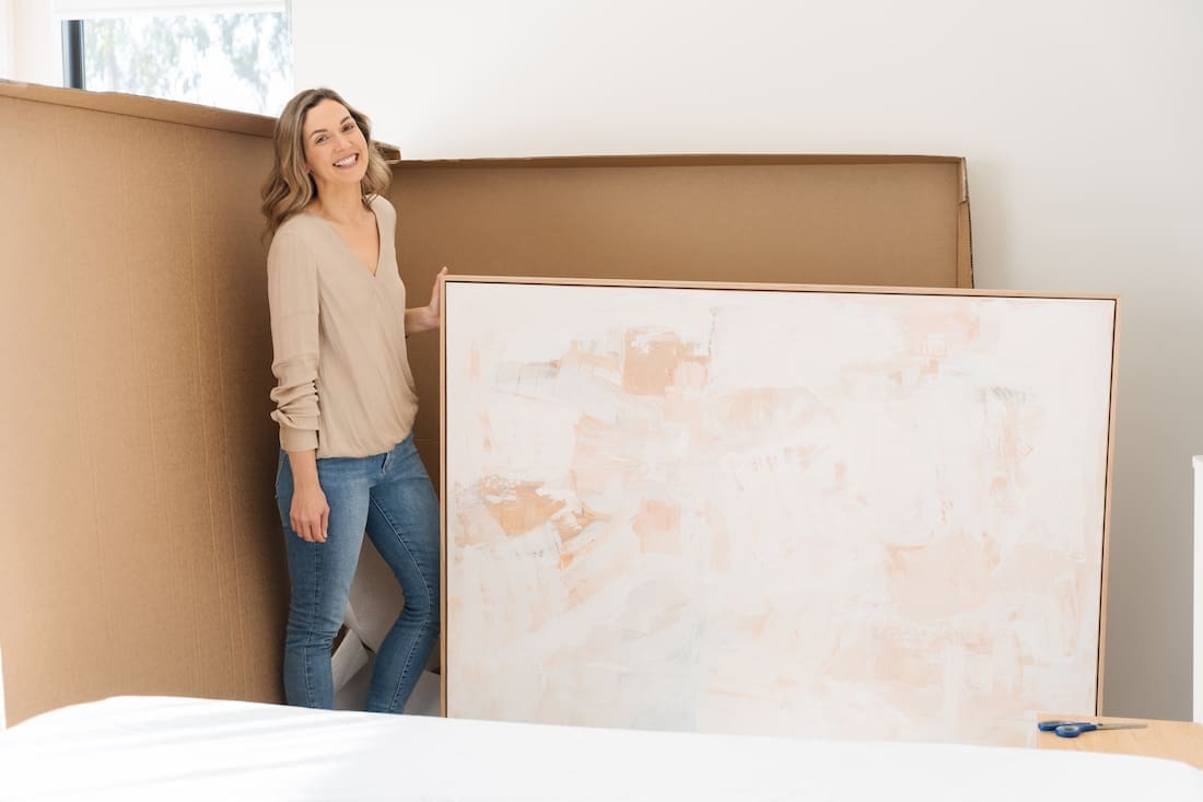
You guys know how much I love wall art and to set the tone for this room, I selected a gorgeous large abstract called ‘Coast to Coast’ by artist Serena Ella on Bluethumb. Framed in a box oak frame, this piece ties all the elements of the room together — and even perfectly matches the terrazzo stone I picked!
Ambient lighting
Keeping with the minimalist aesthetic, I also replaced our black hanging pendant lights with these backlit round wall lights from Beacon Lighting. They cast a much warmer, softer light, totally transforming the feel of the room.
Originally black light fixtures, I painted them in the same colour as the wall and added baking powder to the paint to create a clay-like effect. It’s such a simple DIY that completely transforms the look of the light fixture.
I hope sharing details of my bedroom makeover has offered you some design inspiration. I’d love to know what you think of the new look room. Or if you have any questions, feel free to ask in the comment section below and I’ll get back to you asap.


