OK, this is the space I’m finding the trickiest to commit decisions but I can’t put it off any longer!
You might have read in my bathroom planning post that it’s crunch time at our build and I need to lock in all the decisions for the wet areas and kitchen.
I started planning our kitchen months ago and many of you shared your tips and insights with me. Over the months I’ve collected and refined my inspiration and I think I might have finally got there…
Related article: Take notes: 7 great ways to style your kitchen
Related article: How to light your kitchen: Different kitchen lighting options
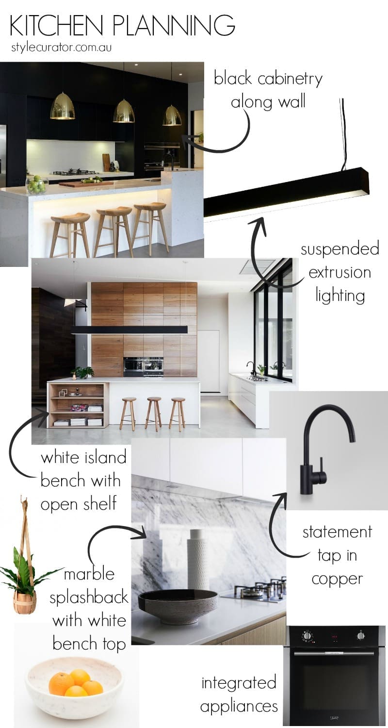
I’m going for a minimalist black / white / marble kitchen.
So it doesn’t feel too cold, the black cabinetry will have a timber grain through it and I’ve decided to only use the dark cabinetry along the kitchen wall — layout = fridge > gas cooktop with overhead cupboards > wall ovens. To break up the look, I’ll use a different colour on the island cabinetry and I’m 99% sure it will be white.
Benchtops were my biggest dilemma. I had my heart set on marble but when I heard some of the worst horror stories, like someone just washed a salad bowl in a sink and some beetroot juice splashed onto the marble and there were purple spots everywhere that couldn’t come out, it made me rethink if it was worth sacrificing practicality over style. I want to cook and entertain in our kitchen (who would think?) so I began exploring other options, like that matt black Fenix benchtop from The Block Glasshouse. I just kept getting pulled back to marble though… and then, Greg Natale came to the rescue with his clever use of a marble splashback and white quartz bench (see bottom photo above). I’m thinking of even carrying the marble along the back face of the island bench and some marble accessories can bring the look together.
We are going with our lighting expert’s suggestion of extrusion lighting over the island bench and will add a bit of bling with a feature tap in copper and some copper accessories.
What are your thoughts on this kitchen look? Would you change anything? Tell me in the comments below!


Sounds intriguing Gina! Looking forward to seeing it all come together :-).
My husband would like to have wood look plank tiles in the family bathroom. I think it would be nice for adding warmth in contrast to the polished concrete but I’m still a little bit unsure. Have you seen these in your design world? Any thoughts?
Deciding between herringbone marble tiles or mini hexagon tiles is such a hard one! Both would look equally stunning. I wonder whether the herringbone might be a little more classic therefore more timeless?? Just my thoughts.
I’m looking at a marble tile feature wall for our ensuite. The tile is a 200 x 45 rectangle and I’m considering a simple brick format.
Ohh that sounds gorgeous Anthea! Thanks for your thoughts on the tiles too… you wouldn’t believe it but there’s a chance we could be going with something totally different in the bathrooms now… we’ll see how the ‘negotiations’ go, he he 😉
Hi Gina, I finally made it to Melbourne to check out stone / engineered stone for my benchtops. I thought of you when I was talking to the stone mason about having real marble. So, he said straight away that he would advise against real marble in the kitchen due to all the reasons we know – marks easily, stains etc. But I thought it was interesting because we were also talking about the fact that in Europe real marble is used extensively and the marks and dings are just a part of it and add to the character. However, his opinion was in Australia we have a different culture and as a general rule we like our bench tops to be pristine and perfect. I actually love the real marble and would be almost tempted to go with it for my island bench but I still think I would be a bit precious about it and my kids don’t need that! Also, it would mean back to the drawing board as far as what to put of the back bench and also back to Melb again to choose a marble. So, I got to see the Silestone Lagoon installed and I am really happy with it. I was a bit concerned about the speckles in it but it just became a non-issue in a larger piece that was laid. I think I was noticing the speckles on the small sample because I was holding it so close but you just don’t do that once it’s on the bench!
How’s your decision making going? All locked in?
Hi Anthea,
So interesting what you say about the use of real marble overseas. I do love a bit of wear over time, thinking it adds character, but not Bruno, ha ha.
It sounds like you’ve made the right decision in your kitchen too – ultimately, you want to be able to relax in there and involve your kids in cooking rather than shooing them out of there, lol.
I’m so glad you loved the Silestone Lagoon – it sounds like your kitchen ideas are coming together!
My planning is all going well too… final decision I need to make in the wet areas is whether to have herringbone marble tiles or mini hexagon in the ensuite upstairs, thoughts? Other than that, I’ve got those areas locked in. Next I’ll need to think about the living room and what to do around the fireplace… but this week I’m working on site helping the painter and plasterer so the fun planning stuff will need to wait 🙂
Glad you like! Ooh. I really like origami/faceted designs. The ceramic seems a little bit ‘heavy’ to me. Or maybe it just doesn’t look very white in those images? I think Urban Couture had a similar pendant – not sure if it’s still around. I’m sure you could make it look amazing 🙂 Great idea to ditch the side walls. We have a similar layout and dimensions (3300) but with a side wall (which will have butlers pantry/integrated fridge/freezer and ovens) rather than a butlers pantry behind like yours. I was thinking of just having the cooktop on the right side of the back wall. The left side opens to the family room so I think it needs some floor to ceiling cupboards to ‘resolve’ that side. Plenty of time to work it out though as we had to resubmit our plans! We had to include a more detailed tree management plan as we have a few large trees on our block that need to be protected. I’m very impatient to start building – it’s torture!
Oh no Jane, sorry to hear you have to resubmit! We were in a similar boat – we needed to provide a detailed landscape plan (aka not just my pencil drawing) which had the common names, scientific names, exact planting quantities and all the types of ground cover we were going to use. Thankfully we have a landscape architect in the family who could help us 🙂 Hopefully it won’t be too much longer until you can start your build!
Thanks for the tip, there are very similar pendants on Urbane Couture, just a bit more asymmetrical. They have so many gorgeous choices though #icantdecide #firstworldproblems 😉
Lucky you to have that talent in the fam to come to the rescue! Hehe. It sounds like you’ve got a pretty solid plan… and then there will be the fun of choosing/putting together all the soft furnishings 🙂
Love love love! Your selections are gorge. How long is your back wall? I’m finding ours is a little on the short side to fit a decent splashback. It sounds like you’ve come up with a happy medium re the marble splashback. I’m completely in lust with suspended extrusion lighting (didn’t know it was called that though!). If you decide the black on black is too similar, maybe this is an idea to throw in the mix? https://www.etsy.com/au/listing/215157613/pendant-light-concrete-c1copper?ref=shop_home_active_11
Thank you Jane! And O-M-G that light is so hot, thank you for sharing! I think I just found the light for our powder room in his shop too – do you like this one: https://www.etsy.com/au/listing/190889402/porzellan-hanging-lamp-k1-lamp?ref=shop_home_active_4?
Our kitchen wall is about 3m long… our cabinet maker said it would be tight and wanted to save every millimetre we could so we removed the two little stud walls that were going to hug the kitchen wall and instead will cap the ends of the kitchen wall with the same dark cabinetry. Our splashback won’t be big though which is why I’m thinking of carrying marble along the front of the island bench too 🙂
How is your home build going? Did you get your approval?? xx
Oh yes, fab choices Gina! Great idea to use marble as a splash back and on the island face because marble is so soft, it’s not really practical for a bench top. The only thing I might change is having gold/copper/brass pendants rather than black because it could get lost against the black cabinetry… you know, not much contrast? All looks gorgeous though!
Hi Sarah
Thanks, I know what you mean about contrast and am a little worried the black could get lost against the black. I’m hoping to take a light out to site once the kitchen is in to see how it looks because the lighting doesn’t need to be done until the very end. Who knows, maybe we could get extrusion lighting in a blingy colour? He he 🙂
Oh wow. I’ve been hanging out for this post and it all looks amazing. I love the copper tap (as you know!). The open shelving under the island is beautiful and I also love that lighting. I’ve been looking for an alternative to 3 pendants over the island bench. And the marble splash back will be absolutely stunning.
Thanks so much Anthea! Even as I was writing this blog post I was thinking ‘Are you sure? Really…?’ so it’s lovely to get your positive feedback 🙂
This afternoon I went to a stone place and made a mini display of marble with white quartz and dark cabinetry and really liked the combo so I’m feeling good about that decision.
Yay that you like our extrusion lighting too – it’s not everyone’s taste but I’m keen to try something a bit new. And our dining is right next to the kitchen so I didn’t want to overload that space with pendants, he he.
Have you locked in all your kitchen decisions now too? I looked at your Lagoon benchtop today and I can really see it working 🙂
Doing the mini set up is a great idea. It makes such a difference to being able to visualise it all. I’m going to Melb later this week to see slabs of the stone as I can only get tiny squares of it here to play with. So my slab selection might well change yet! I’m a little bit worried about the small speckles in the Lagoon but the main reason I wanted to go with the Silestone is because they do a 3200 mm slab instead of just a 3000 slab and we really need the little bit extra length in our space (& I don’t want a join). The other thing I’m worried about is that I’m going with too much white. Arghh. But I’m hoping the timber bar stools and timber open shelving will add warmth and interest.
I really love the sound of what your planning Anthea and can totally see it working. A few pops of greenery too, like a hanging planter or some potted herbs on your island bench, and some other accessories will complete the space. Fingers crossed it all goes well 🙂