Earlier this year we ran our most epic competition ever! Offering a $5000 room makeover with Canberra Outlet and one-on-one styling help from me to develop a vision board for the space and also shop the look.
Boy did we get inundated with entries! Some rooms didn’t look like they needed a makeover at all. Others were also a hoarder’s delight. Generally, most people shared common themes of feeling as though their space lacked a ‘style’ but didn’t know how to achieve a cohesive yet layered space. And many were also hesitant about introducing colour into their home.
Related article: How to update your living room for less: Top decorating ideas to suit your budget
Related article: The power of paint: Living room makeover on a budget
The lucky winner of this competition was Milly as her room ticked all these boxes — as well as being an awkward shape. We felt it was the most relatable room that would offer plenty of inspiration to others.
We’re so proud of how this living room makeover turned out, here’s how we tackled the project.
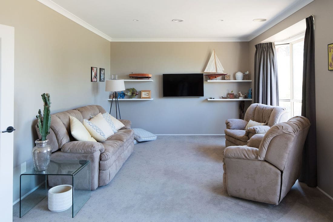

Living room before
Milly’s long and relatively narrow living room with two large bay windows was made to feel even more narrow because of the oversized and heavy furniture.
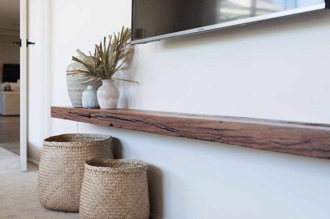
One of the first things I noticed about the room is how the TV was positioned prominently on the main wall (and much higher than needed). I felt that this wall should be reserved for a large piece of artwork or floating wall shelf where the family could display a mix of photos, art and even smaller decorative objects.
The key pieces that the room needed were a different sofa, coffee table and large area rug to anchor the space.
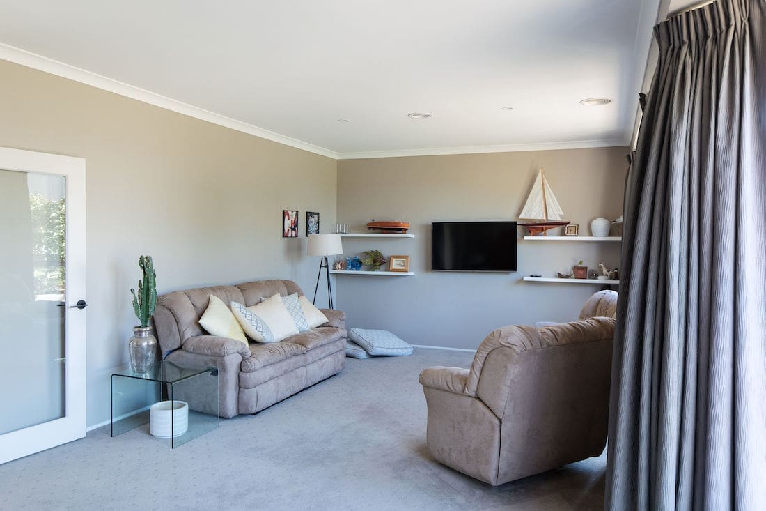
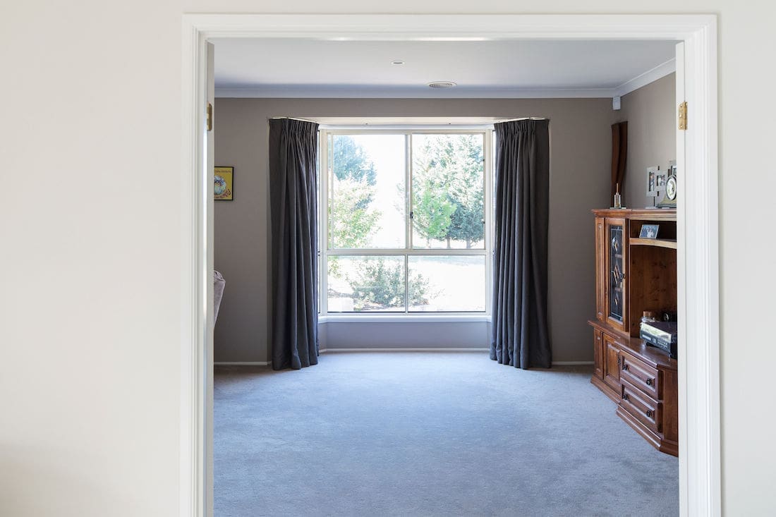
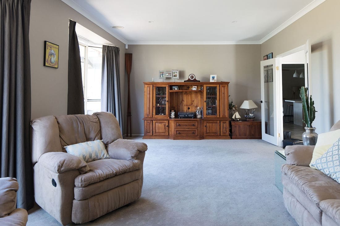
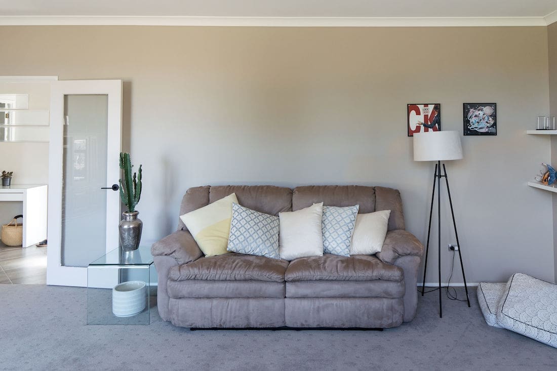
Our inspiration
Milly had her own ideas about the style of living room she wanted to create — in fact, she already had a more contemporary sofa to use in this space and had bought two rattan cabinets over a year earlier but they were still in the box!
She wanted to create a warm and inviting living room where they could proudly entertain family and friends. Milly is generally drawn to an earthier palette and wanted to embrace natural materials and textured elements.
But she felt ‘stuck’ and unsure where to begin to pull the look together. One of her biggest challenges was working out the best furniture and TV placement.
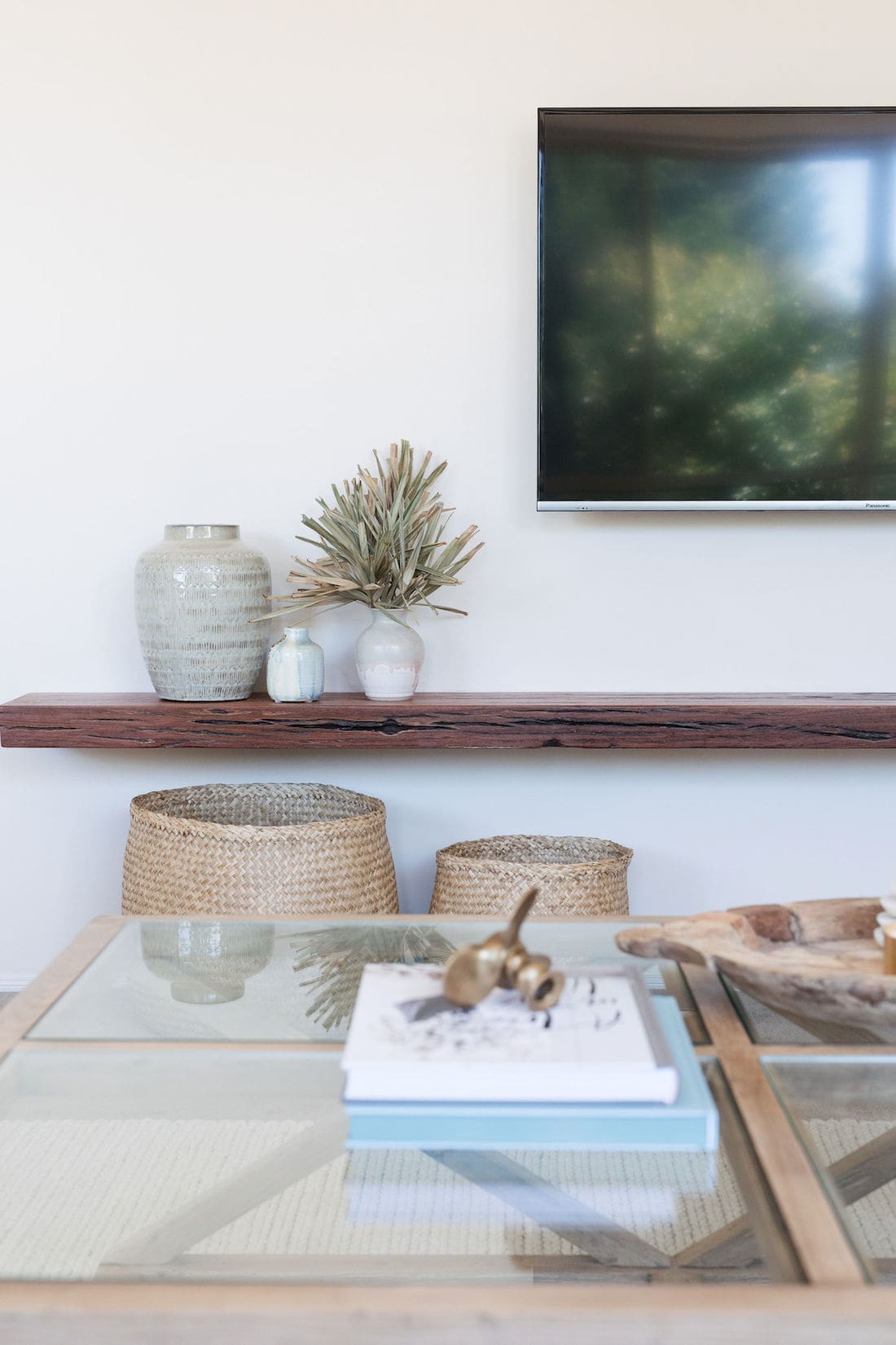
Firstly, I suggested moving the TV to the side wall (and just above eye level when sitting on the sofa) and running the sofa down the room. The room isn’t wide enough to accommodate an entertainment unit and the sofa comfortably. Secondly, I recommended adding a floating timber shelf below the TV. This would provide a visual anchor and also somewhere to display smaller objects. Milly loved this idea and had a piece of reclaimed timber planed and installed onto the wall.
Knowing the layout we would use, it was time to create a plan for the room. Now we need to prioritise! What items were the priority and what style of pieces would we use?
The best way to plan a styling project is to create a mood board. It’s a helpful way to see how your ideas work together. Generally, if it works on a small scale of a mood board, it will work in real life (and vice versa).
We began bouncing ideas back and forth before settling on the mood board I created below.
Colour evokes emotion and I was keen to push Milly outside her comfort zone of neutrals to inject a few pops of colour in the room. I developed an earthy colour palette of eucalyptus green, rust and deep blue tones. By using colour in smaller decorative objects and cushions, you can create impact while still giving yourself the flexibility to easily change the look in future. It’s much easier to change a blue cushion than a blue sofa!
If you’d like to create a mood board for yourself, check out our tips here.

Living room after
Just take a look at this light, bright and contemporary living space that feels luxe but oh-so-homely at the same time.
Milly repainted the room using a lighter off-white that’s definitely more fitting with the rest of the home. The heavy curtains were also removed from the bay windows with plans to install soft sheer curtains from Freedom soon.
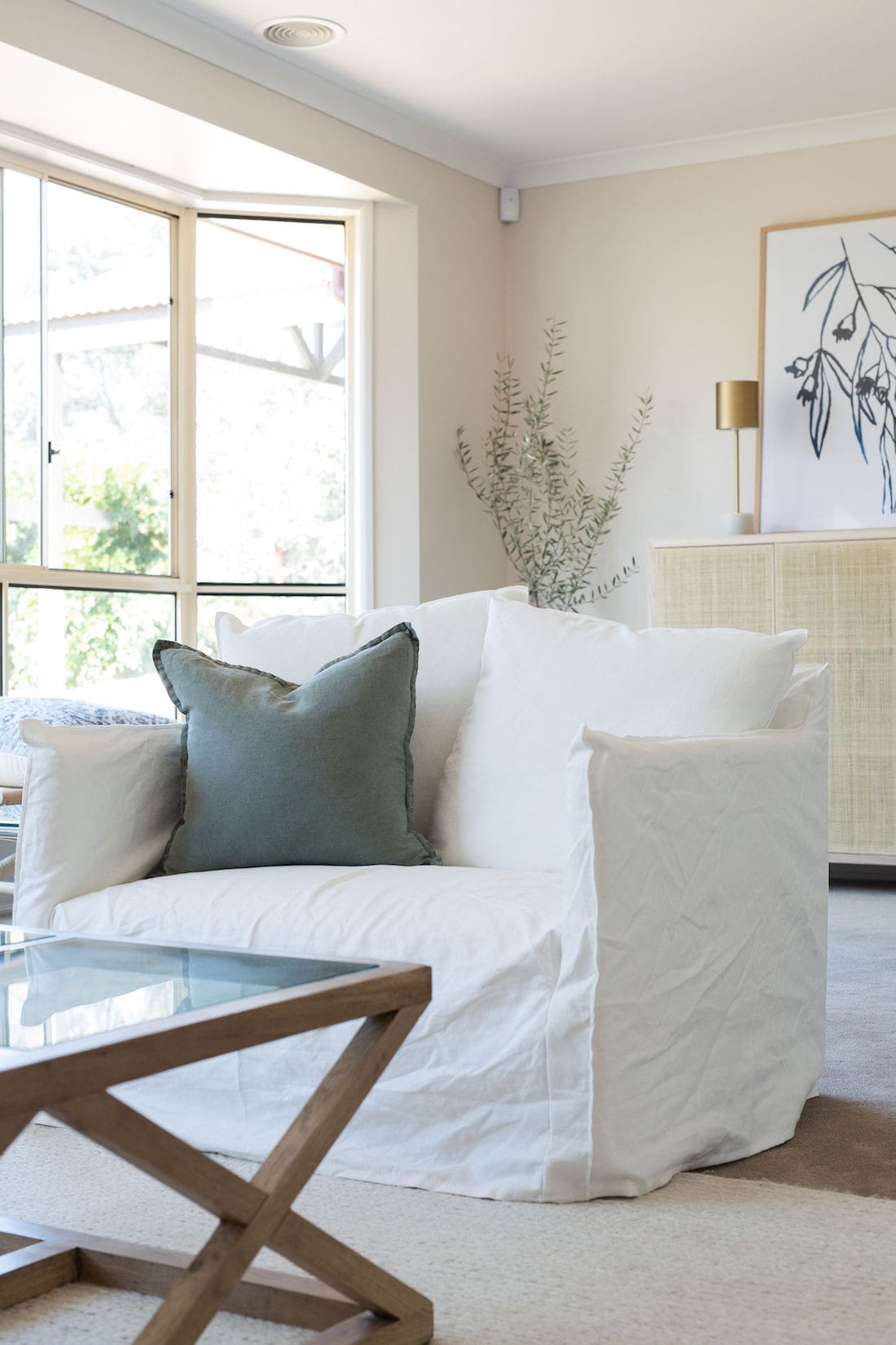
The biggest transformation has to be the orientation of the room. The TV no longer dominates this space. Further, the modern furniture is in scale with the room. Using a sofa with a chase and the large 1.5-seater armchair from James Lane extends the seating area to take advantage of the room shape, while the oversized rug anchors the space.
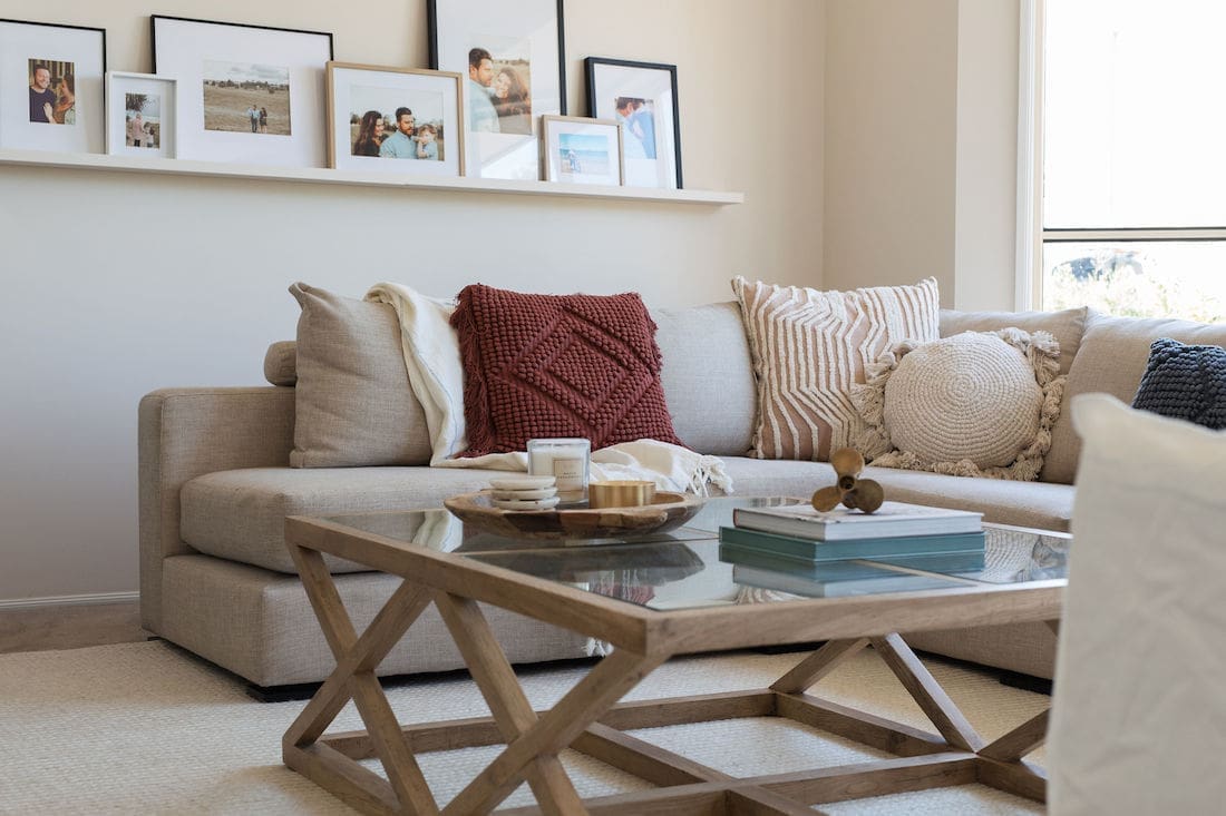
Indoor plants also add life and that welcoming feeling Milly wanted to evoke in the space. Personalising the room with the picture shelf of family photos placed in a mix of frames from Freedom adds to the homeliness of the room. You can find more tips on how to turn a house into a home here.
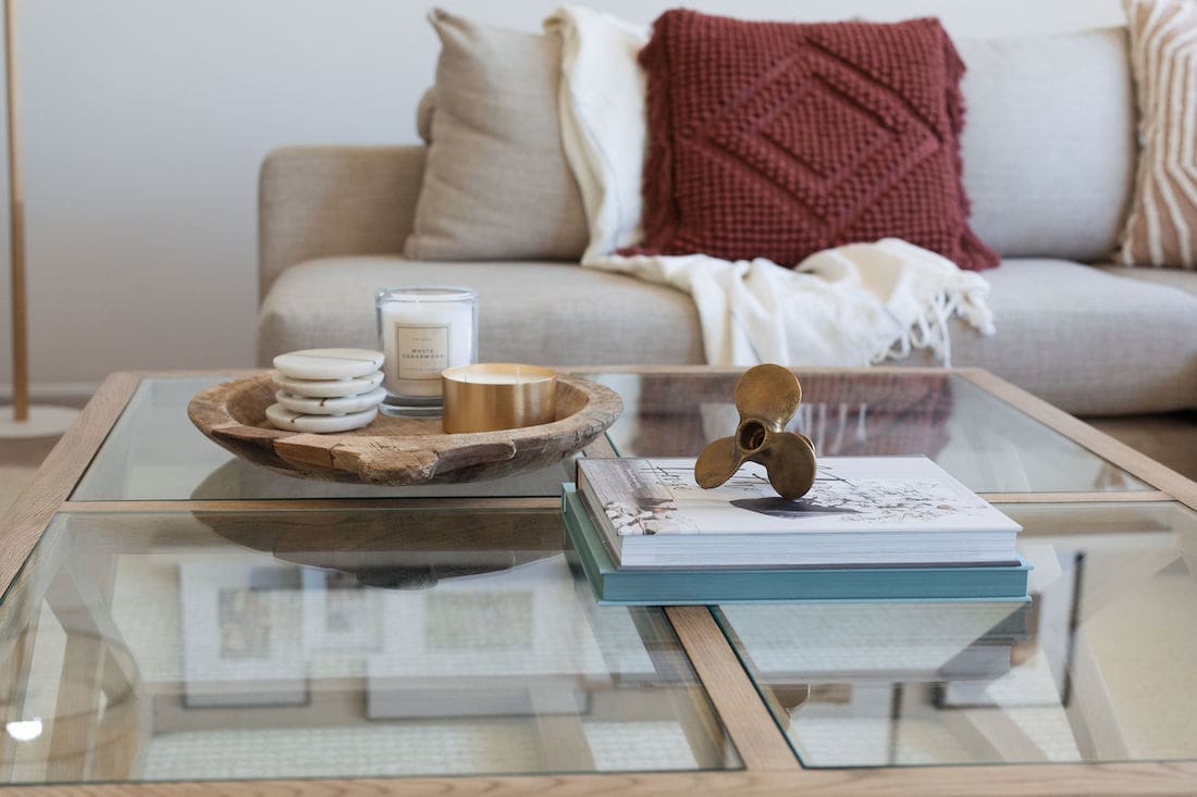
One thing you may notice is that none of the furniture ‘matches’ yet all the pieces complement each other. Generally speaking, the days of matchy-matchy furniture have passed. I suggest embracing a mix of materials for a more interesting space. That large coffee table from Focus on Furniture is my favourite as it just works so well in this room.
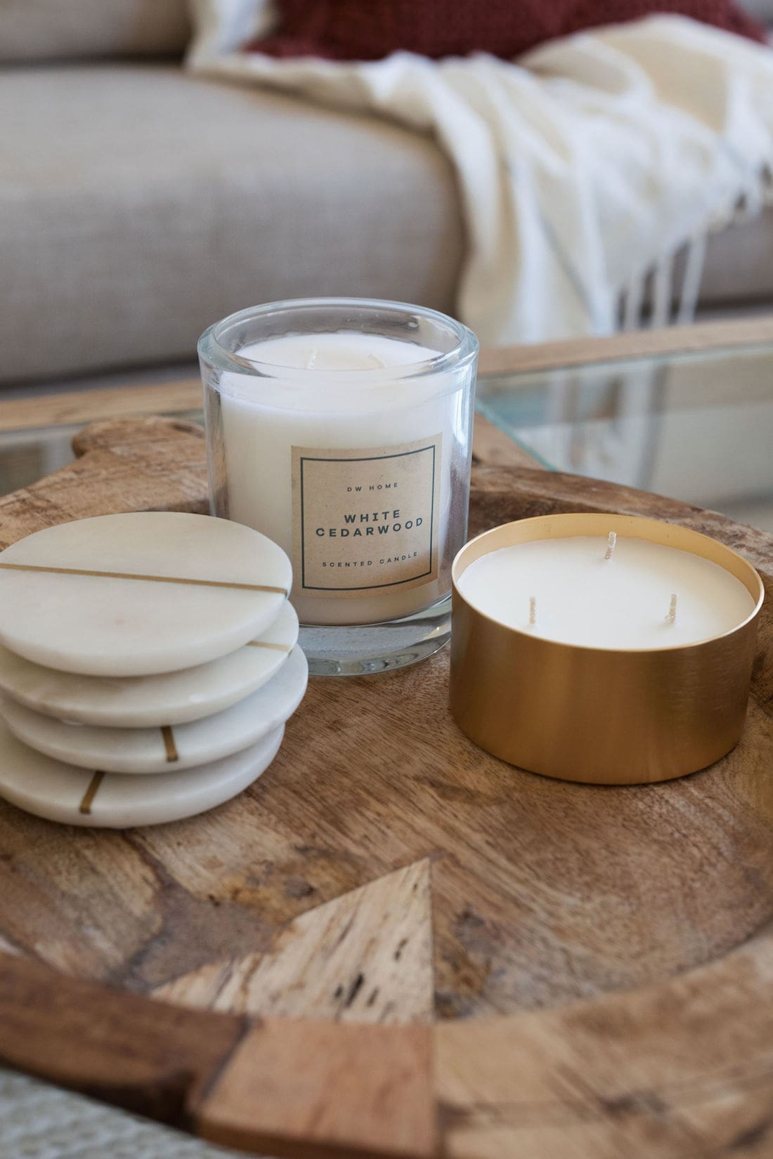
Further, for the final layer of style, we used a mix of cushions and smaller decorative objects from stores including Provincial, Freedom and Adairs.
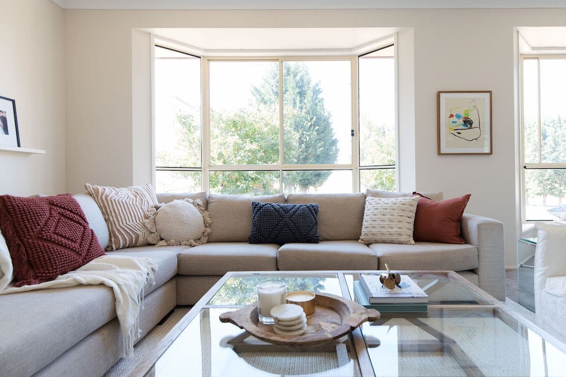

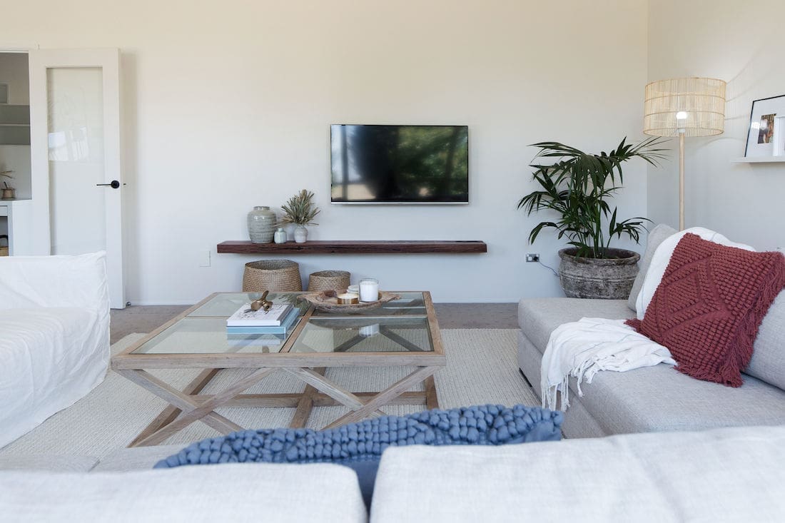
We had so much fun doing this room makeover! Stay tuned for another major room makeover competition with Canberra Outlet in the new year.
If you have any questions or would like details about particular products used, just pop it in the comment section below and we’ll get back to you asap.
More living room inspo




the makeover turns beautiful! Love all the colour combinations and the furniture. It looks brighter and fresher too.
Thanks so much Samantha 🙂
Love the transformation! What are the dimensions of your living room?! The new home we are moving to has quite a long and narrow living room and I love the way you arranged your furniture. Wondering if can copy you if dimensions are similar🙂
Thanks for your lovely comment Abra! The room is 8m long and 4.4m wide. Hopefully you can achieve something similar in your space 😉
Hi! How big is the TV here and how long is the shelf under it?
Hi Emily, good question! From memory, the shelf was 800mm wider than the TV and it was a 55 inch TV 🙂
Love love love the floating shelf under the tv. Do you mind sharing where this is from? x
Hi Feren, that’s a piece of reclaimed timber from a friend’s farm that we had planed and installed. Perhaps if you have a reclaimed timber yard in your area you could find something similar? Hope this helps!
What a transformation! Love your work Gina.
Thanks so much for your lovely comment, Bec 🙂
Hi may I know where the cubboard is from? It look so fresh. Thanks
Hi Helen, that cupboard is one Millie bought a few years earlier from IKEA called Stockholm. I believe it was a limited edition piece though so may no longer be stocked. Hope this helps 🙂
What a thoughtful, inspiring transformation Gina! Love what you’ve achieved here.
May I please ask where the pots and plants are from, and the wooden tray on the table?
Thank you so much!
Jess xx
Thanks for your lovely comment Jess. The large rusted pot near the floor lamp and the wooden tray on the table are both from Freedom. The pot stand with the olive tree in it is one Millie already owned but you can find one almost exactly the same at Adairs (the plants were also hers, I think she got most of them from Bliss). Hope this helps 🙂