Following on from what the judges called, the best kitchens The Block has ever seen, it’s living and dining reveal time!
So how did the contestants fare this week? Do you have a fave couple or house so far? We think we’re leaning towards Luke and Jasmin’s 1910’s curve-a-licious home taking out top prize come auction day. But what do you think? Tell us in the comment section below!
Related article: The Block 2020: Week 6 — Kitchen reveal
Related article: The Block 2015 week 8 dining room reveals
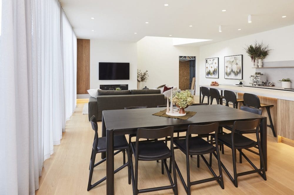
Harry and Tash
We feel like House 1 should be nicknamed the drama house. There’s always something going on (and aren’t the producers of the showing loving them for that?!) and this week, it’s a clash between Foreman Keith and Harry.
It’s to do with a $2000 bill that Keith has presented to Harry over their plumber ripping out the storm water drains. And Harry isn’t paying (or so he says).
There’s more drama about voids, scaffolding and paint but we won’t go into that. Just note that while there was talk of a huge scandalous walkout on this week’s episodes, it was really just Harry stomping off in a paddy. And sitting in his car, before returning to the site. Woah 😉 .
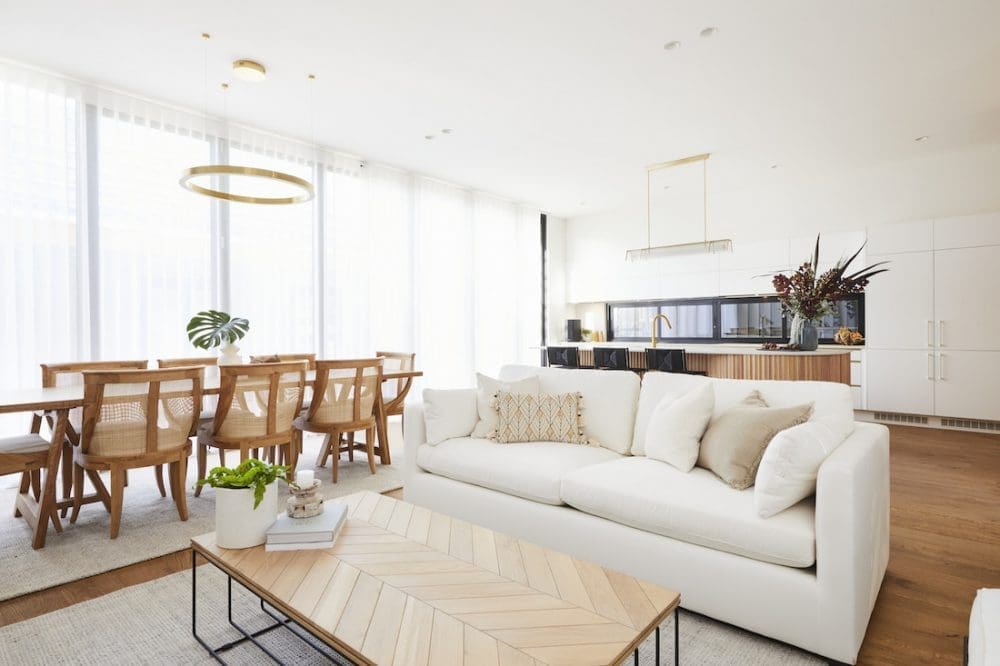
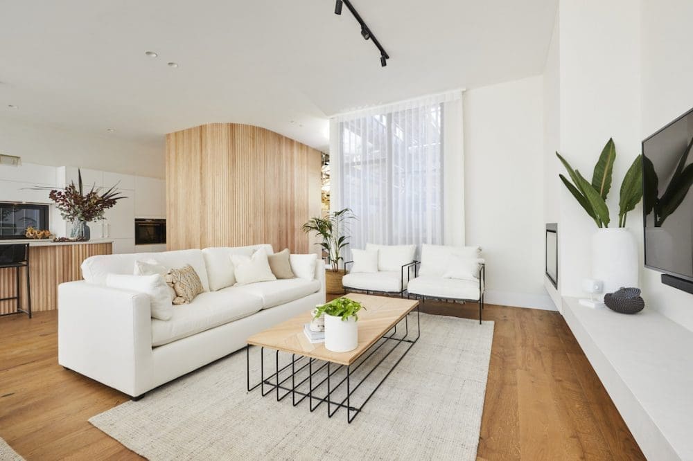
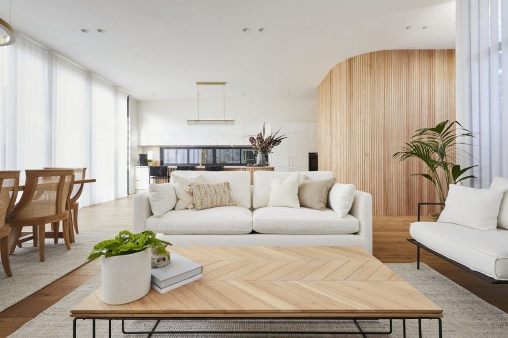
In the end, all the drama and painting issues were worth it with Harry and Tash taking out their second win of the competition. And we think this one was much better than their winning bedroom from week 3.
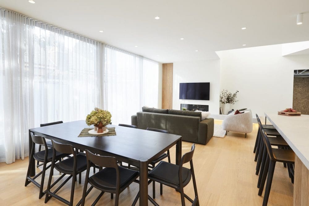
The size of the living and dining spaces was the standout with Tash’s choice of furniture, in particular the sofa, dining table and chairs winning the love of Shaynna. For us, we loved the plinth they designed and those floaty sheer curtains. That void was also pretty spectacular.
If we’re honest though, the rest of the room felt a little… boring. It was beautiful, and well executed, just nothing outstanding for us.
Harry and Tash are building (pun totally intended) their confidence week by week and we can’t wait to see how the whole 1920s house comes together.
Score: 28.5 / 30 (1st place)
George and Sarah
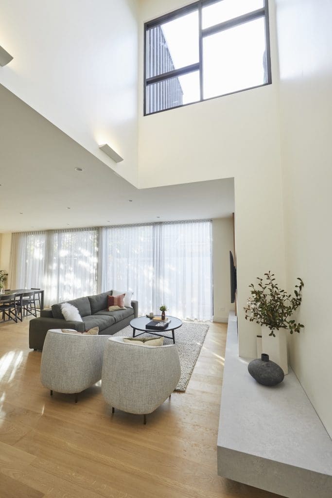
This week for their living and dining rooms, George and Sarah decided it was time to pull the hipages lever. You’ll recall from week 5 when Luke and Jasmin used it, contestants can take advantage of extra tradies to help out with their renos that week. They are only able to use it once during their time on The Block.
We’re pretty sure Team 2 were hoping this extra help would get them their first win of the season, but alas, it wasn’t to be (again).
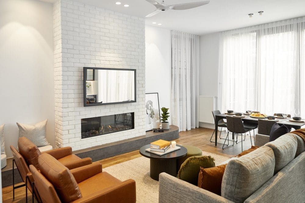
The additional help meant Team 2 could continue with their original big ideas which didn’t fit in their small weekly budget. They decided at add in-seat heating to their concrete bench which seems very luxe (read: OTT) and therefore very Brighton.
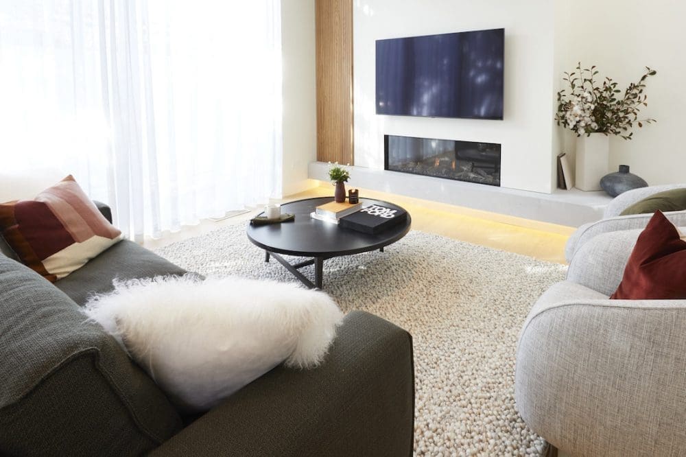
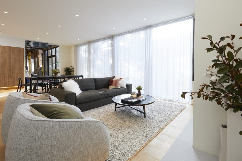
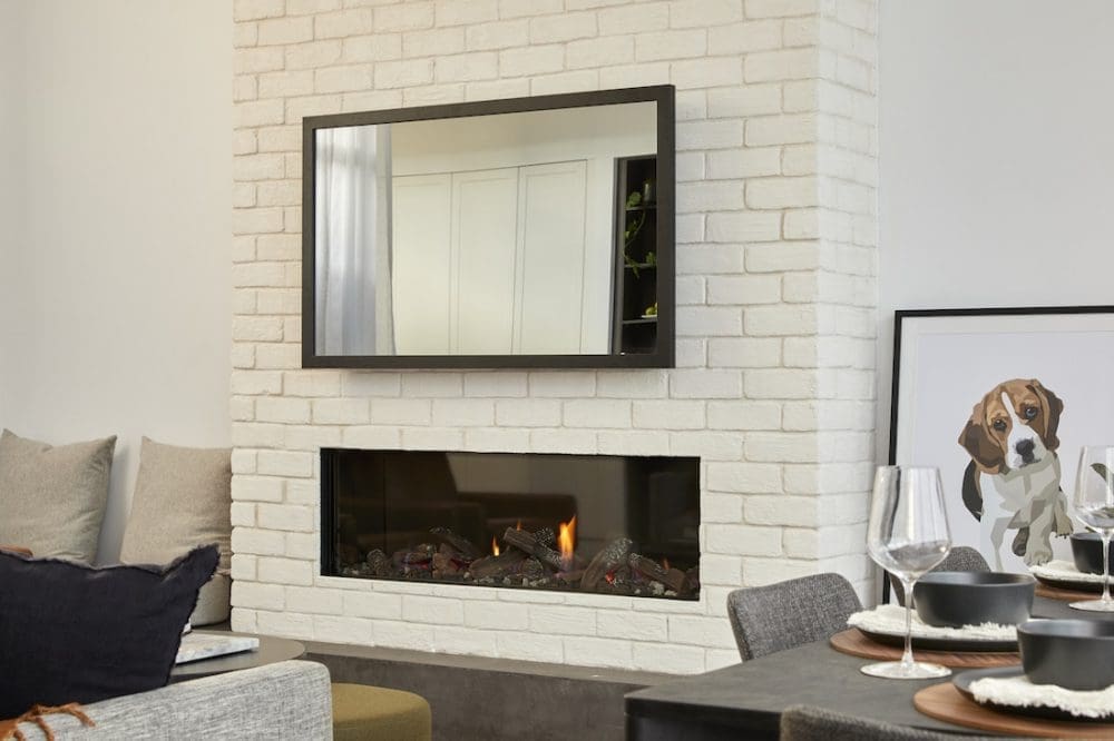
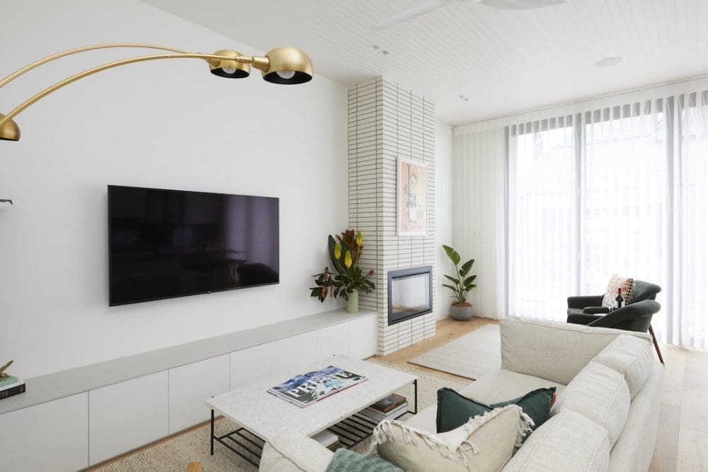
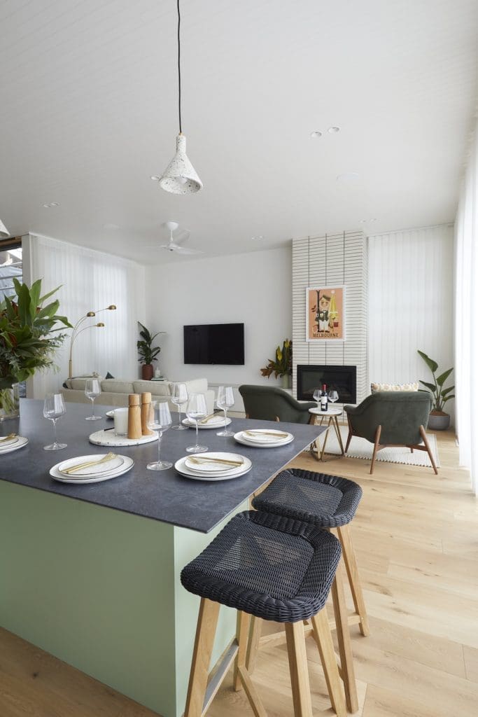
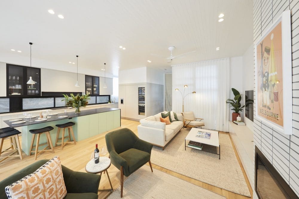
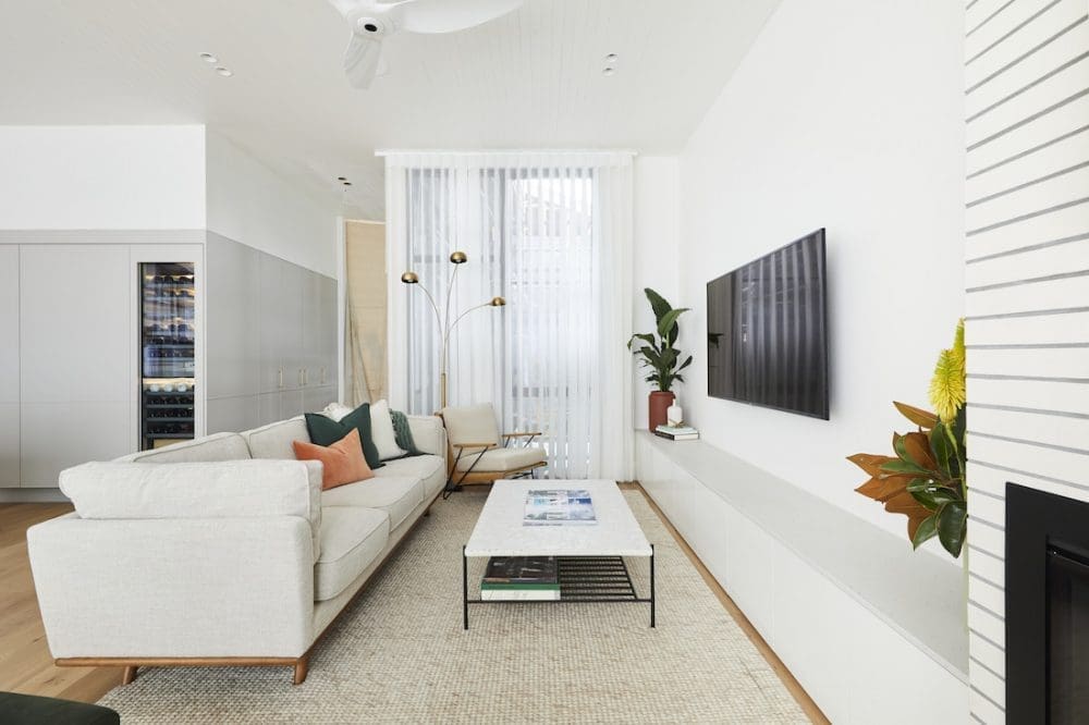
The judges loved the room, but had mixed feelings about the white washed bricks that Sarah absolutely loved. They also thought the fireplace was excellent but where they fell down was a ‘lack of emotional connection’.
Sorry… but this seems like a bit of a cop out to us. There wasn’t anything majorly wrong with the room and we don’t see how the other contestants rooms had more of an emotional connection than this one. Anything for the drama, we guess!
Overall the judging felt pretty fair on this room though as there wasn’t anything we hadn’t seen before. We would have loved to see some different artwork used and then drawing a few colours from the piece to carry across the rest of the space, which would have lifted it and perhaps created that emotional connection the judges felt were lacking.
Ohhh George and Sarah, we really feel for you guys! And we’re trying to remember if there’s been a week where Sarah hasn’t cried… We hope delivering consistently good rooms each and every week will pay off for them come auction day.
Score: 25 / 30 (3rd place)
Daniel and Jade
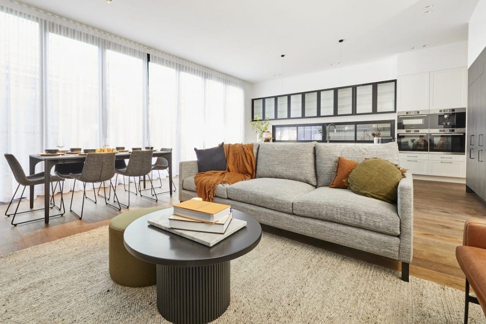
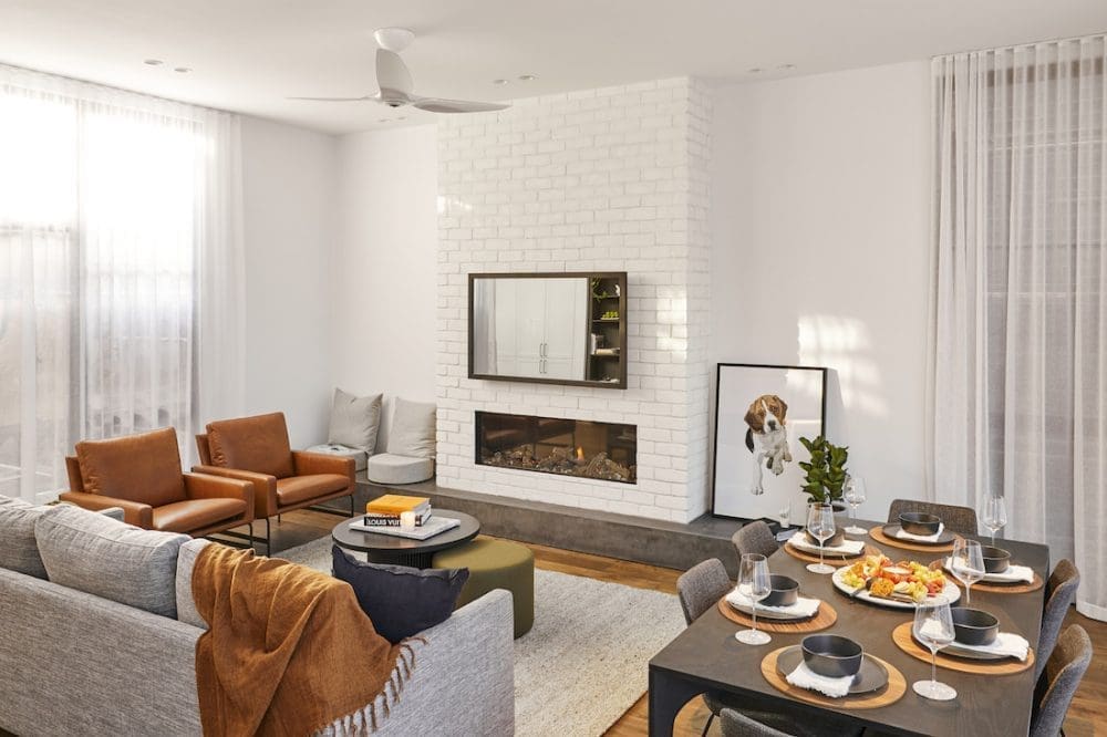
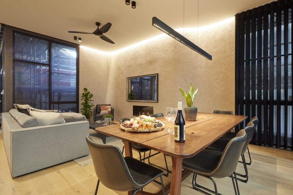
To compliment their custom made Christian Cole island bench from last week’s winning kitchen, Daniel and Jade went for another bespoke piece for their living and dining reveal.
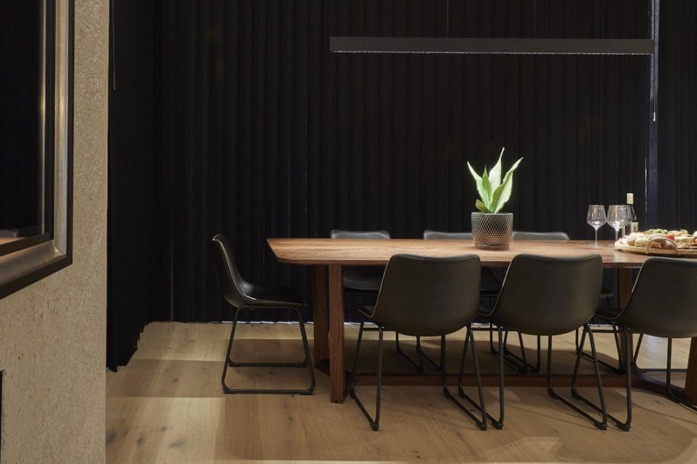
They had a dining table built and good goly is it a beauty! It has fossilised red gum running through it that’s 10,000 years old. And that my friends, is why Christian Cole furniture is so sought after (and so expensive).
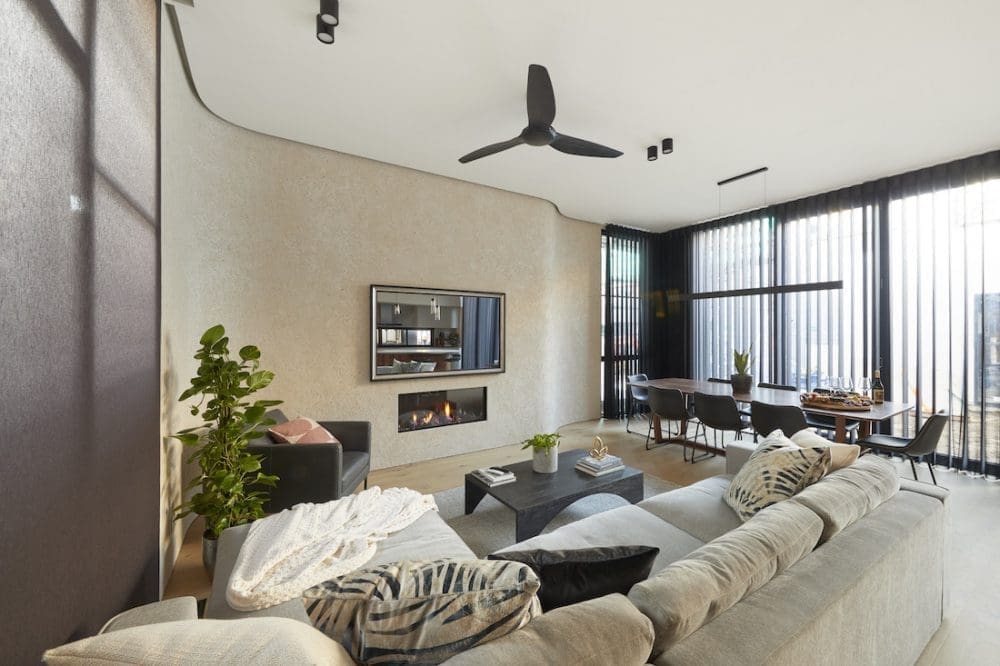
Keen to get in on the curved wall action, Daniel was pretty chuffed with his uniquely textured curved wall in their room reveal. We have to agree, it’s a stunning feature that sets this room apart.
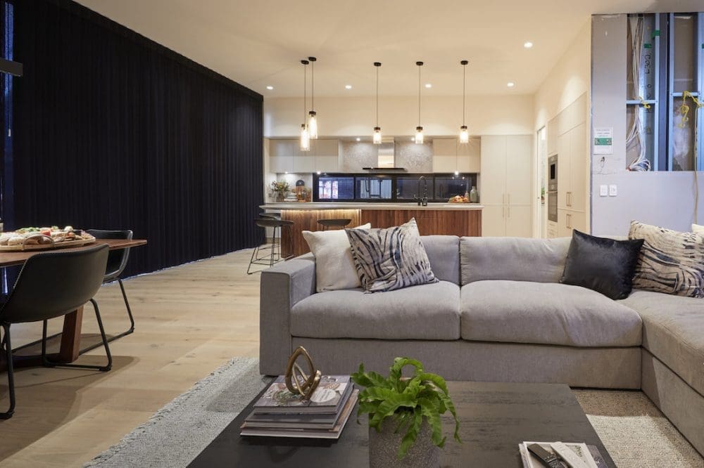
Daniel and Jade did a great job at creating a family-friendly space which perfectly mirrored their kitchen. Team 3 got high praise from the judges again this week but just missed taking out top spot.
We thought they totally nailed the transition from kitchen to living dining — it felt almost seamless.
Score: 28 / 30 (2nd place)
Luke and Jasmin
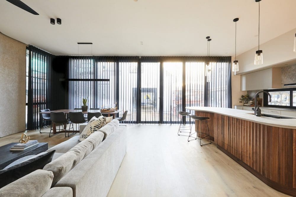
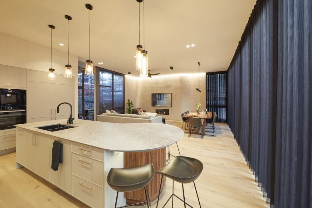
In our fave house (is it yours too?!) the beautiful colour combination continues into their living and dining room this week. But it wasn’t all fun and celebrations with Luke and Jasmin coping a bit of criticism for a number of elements in this week’s reveal.
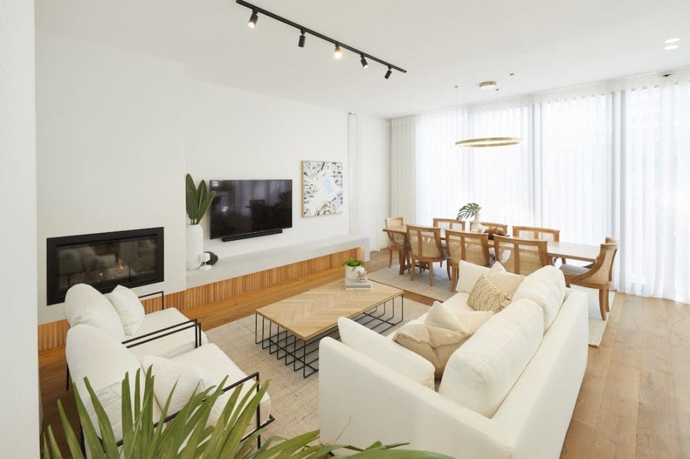
The judges were not fans of the fireplace in the corner of the room. And while they’re going for a specific look and feel, it’s hard to get past a white-on-white colour palette being overly kid-friendly (or perhaps it’s just our kids who only need to look at something white and it gets dirty!).
The stunning timber dining table and chairs got high praise and we’re loving how cohesive Luke and Jasmin’s house is feeling as it’s all coming together. For us, looking back through to the kitchen and that curved panelled wall… swoon!
We love what they’ve got going on!
Score: 24.5 / 30 (4th place)
Jimmy and Tam
It’s another challenging space for Jimmy and Tam this week, with their living and dining reveal needing to fit into the smallest space of all 5 houses. But just like in previous weeks, we all know they’re more than capable of working with a difficult space.
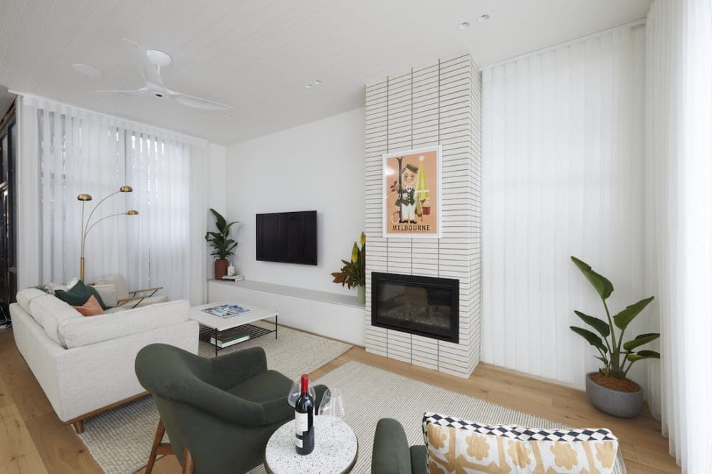
Despite it being living and dining room week, due to their lack of space, Jimmy and Tam made the bold decision not to include a dining table… in their dining room.
So let’s see what the judges thought of this big move.
It didn’t go well.
The judges thought the couple could have made better use of the space between the kitchen and the living dining room. They felt it was wasted space that should have been utilised.
We’ll be interested to see if they add a dining table in before auction day, as you’d think being in an affluent area such as Brighton, one would come to expect a dining table in the dining room.
We agree, thinking Jimmy and Tam could have made better use of the space they had to include an all important dining table. Perhaps a smaller, round style could have worked well, as we used in the Erskineville home which also had an open plan concept in quite a tight space.
Tam’s styling got high praise yet again — she nails it every single week. We note she’s already removed those offending bar stools from last week and we personally love their fireplace.
Score: 21.5 / 30 (5th place)
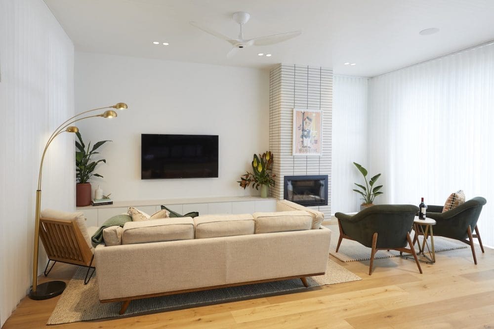
What did you think of this week’s living and dining reveals for The Block 2020? Did you agree with the judges (or us?!). Tell us in the comment section below!
Be sure to check out The Block Shop if you’ve spied something you love in this week’s room reveals. And you can catch all The Block 2020 goss on the official website.
All imagery by David Cook Photography


