Another week, another room reveal, another bedroom. This week was all about the master bedroom reveal and we had high hopes for what the teams would deliver.
We always share what we think of the rooms each week, but what did you think? We’d love to hear your thoughts in the comment section below. Let’s get straight into it, shall we?!
Related article: The Block 2020: Week 2 — Guest ensuite reveal
Related article: The Block 2015 week 3 master bedroom reveals
Harry and Tash
These guys are the team of ups and downs. Last week was a down but this week was (thankfully!) an up!
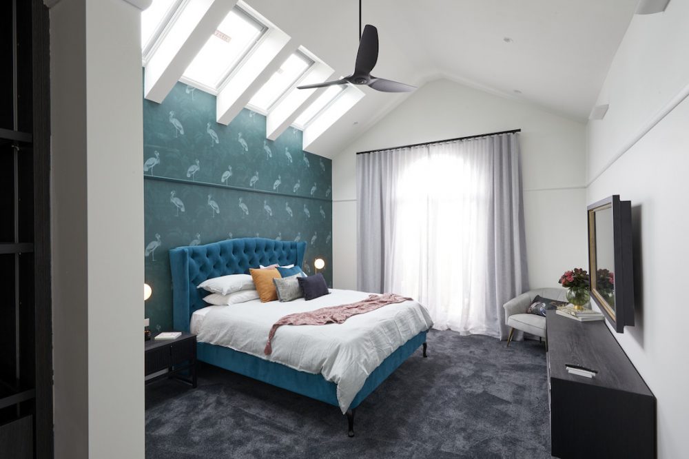
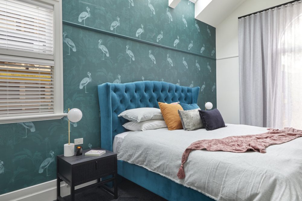
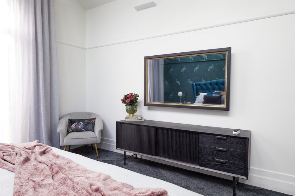
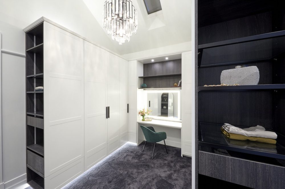
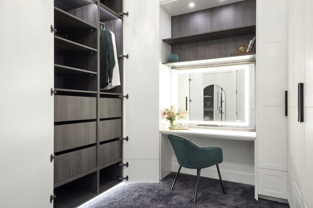
Working with an epic sized room, Harry and Tash were praised by the judges for making their master bedroom and walk-in wardrobe grand and glamourous. They loved the Grafico wallpaper and stunning light in the wardrobe.
The size of their walk in robe scored them extra brownie points and in the end, they went from worst (last week) to first as the winners of week 3.
While we agree it was a major step up from their bathroom last week, they wouldn’t have been our choice for first place. Some of their selections, such as their carpet and window coverings, didn’t have the same luxe factor as other rooms which we’ll get to in a sec. And the colour of the bed felt a bit off against the wallpaper.
Score: 25.5 / 30 (1st place)
George and Sarah
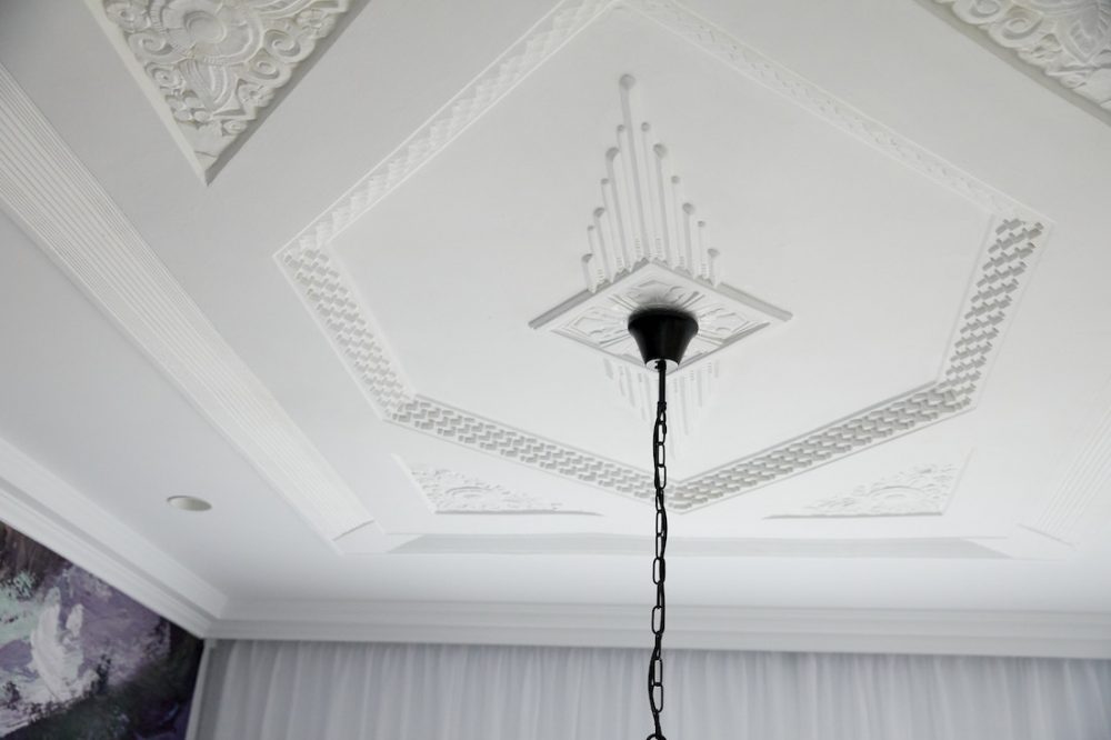
The standout in George and Sarah’s master bedroom reveal was their beautifully restored ceiling rose. And we’ve gotta admit, we giggled when George nicknamed it, Ceiling Dion!
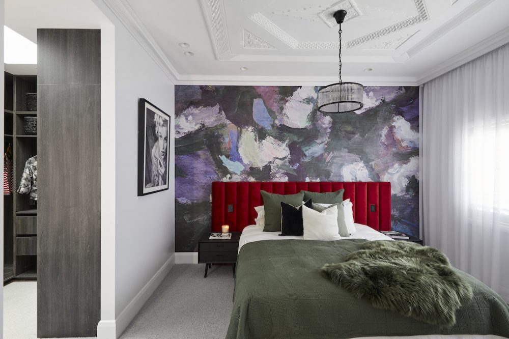
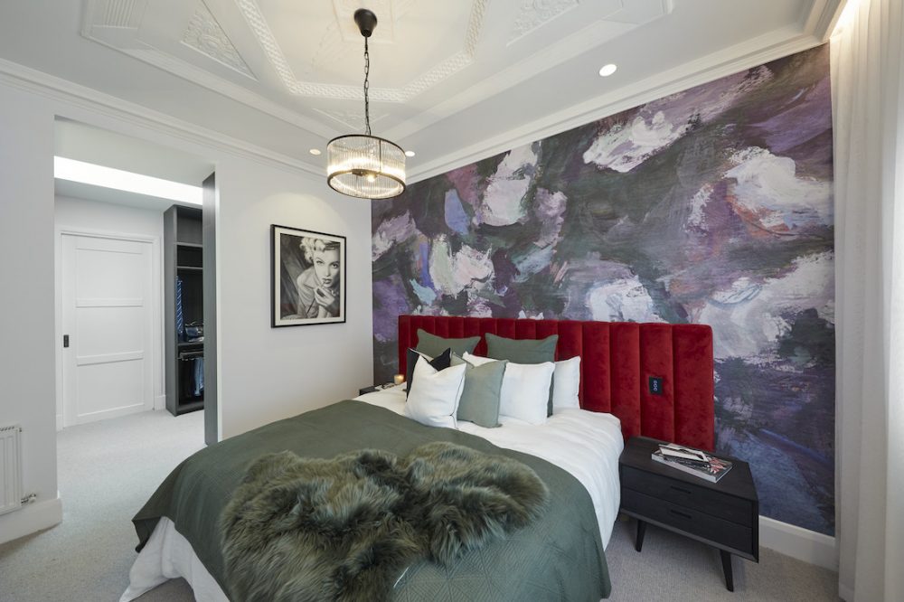
Also ones to use a wallpaper mural, it was beautiful, however the judges felt it overpowered the bedhead. We agreed. Separately, they were really cool, but together it was a bit too mish-mash for our liking.
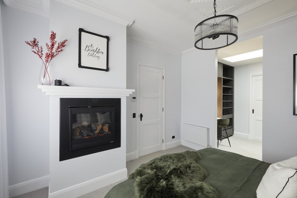
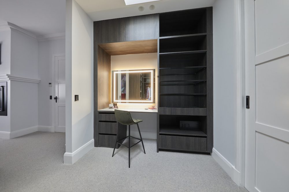
The judges said the walk-in wardrobe was a little underwhelming, especially in high-end Brighton and we thought the same, noting there wasn’t much to get excited about. The styling around the fireplace also left much to be desired (obviously they missed these tips on styling a fireplace mantel!).
Onwards and upwards guys!
Score: 23 / 30 (4th place)
Daniel and Jade
Described as pure Hollywood, it seems Daniel and Jade found their stride again for their master bedroom reveal. After a disappointing week 2, they bounced back taking out equal second place for their glamorous room reveal.
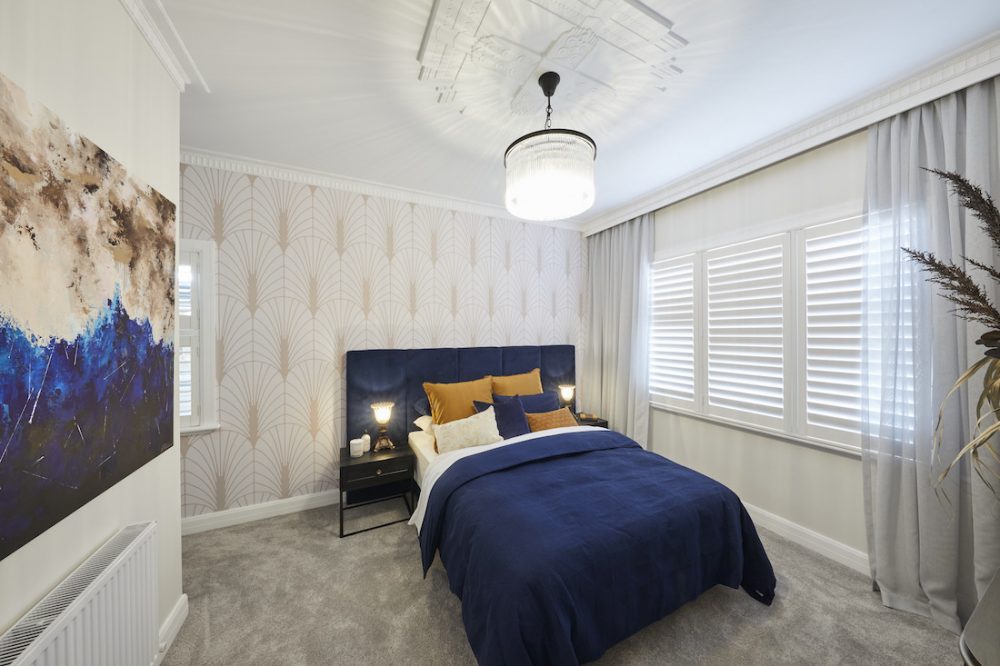
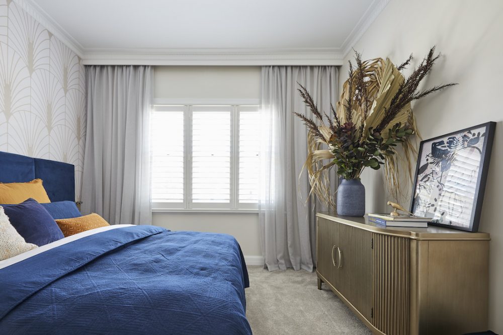
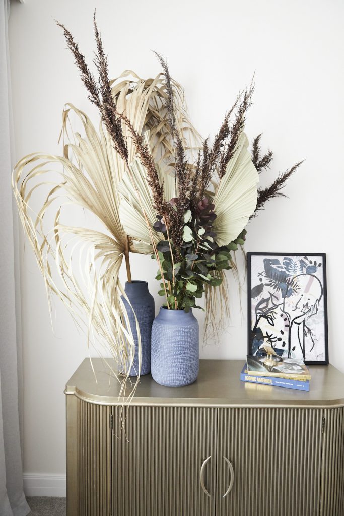
The judges loved the cabinet Jade chose and thought the floral arrangement was ah-MAZING. It was noted (and not in a good way) the couple chose not to include a king size bed, as would be somewhat expected in this affluent area.
Overall, we loved the colour palette of deep blue and brassy-bronze tones and thought their choice of wallpaper was bang on.
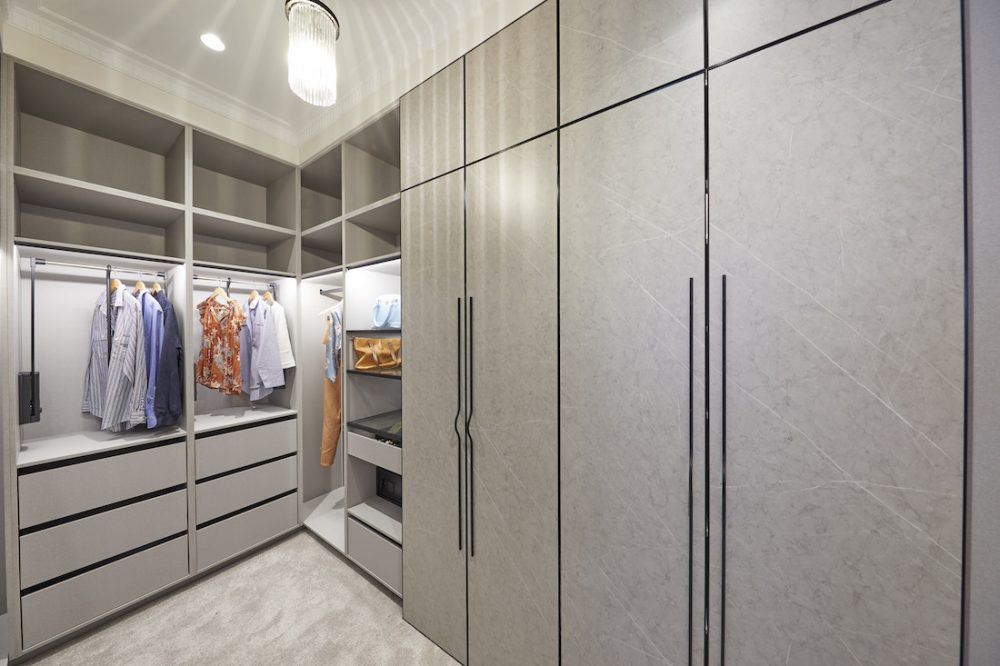
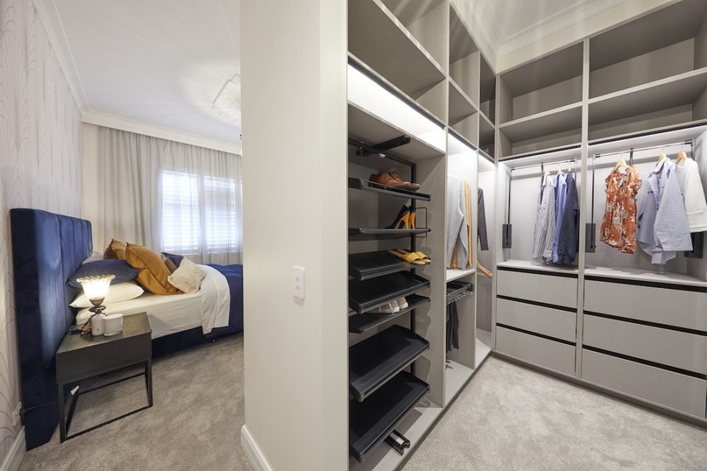
The walk-in wardrobe oozed that all important glamour, with beautiful finishes throughout the room.
Score: 25 / 30 (joint 2nd place)
Luke and Jasmin
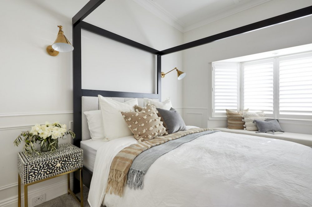
Another week where these guys really seemed to have gotten the hang of their 1910s style home. We thought it was a lovely room too and it would have been our choice for first place.
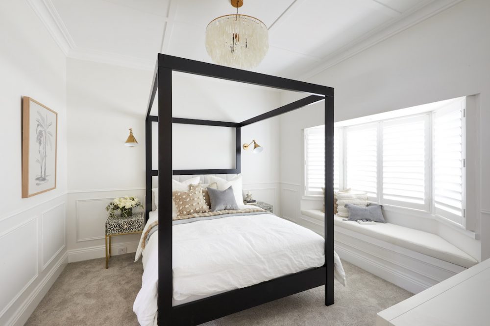
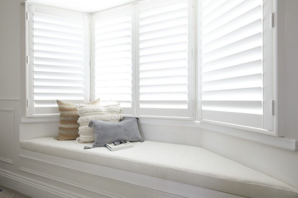
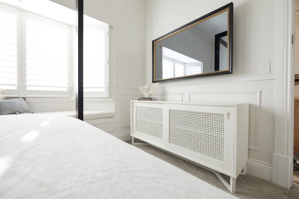
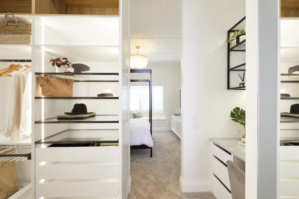
The bay windows and window seat were a big hit with the judges calling them beachy coastal Federation style. The four-poster bed got the judges tick of approval but they questioned why they hadn’t used a king size for the master bedroom.
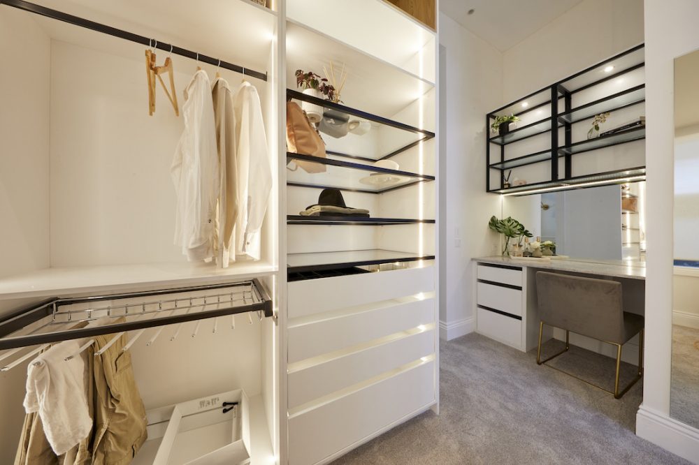
The walk-in wardrobe was where they lost most of their points, copping criticism for the lack of storage. We weren’t a fan of the black open shelving but otherwise loved the wardrobe.
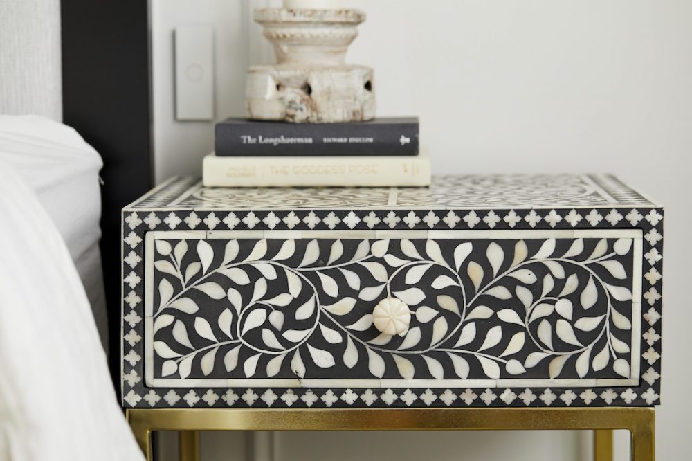
Jasmin upped her game on the styling front, getting the nod of approval from the judges (and us!) this week.
Score: 25 / 30 (joint 2nd place)
Jimmy and Tam
Front runners Jimmy and Tam had a fall from grace this week, going from first to worst. And while we thought the bedroom was stunning, we can see the judges reasoning for placing these guys 5th this week.
Oh how the mighty have fallen…
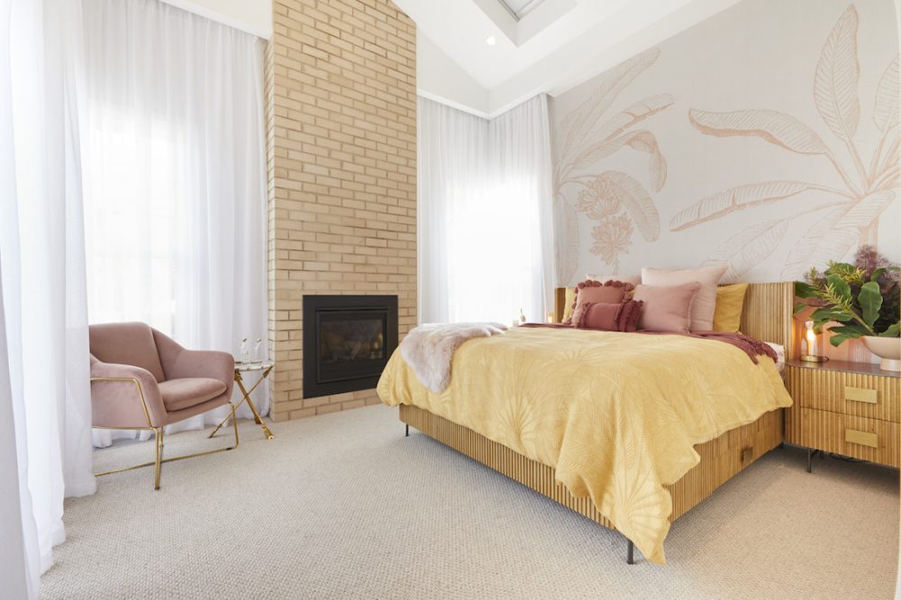
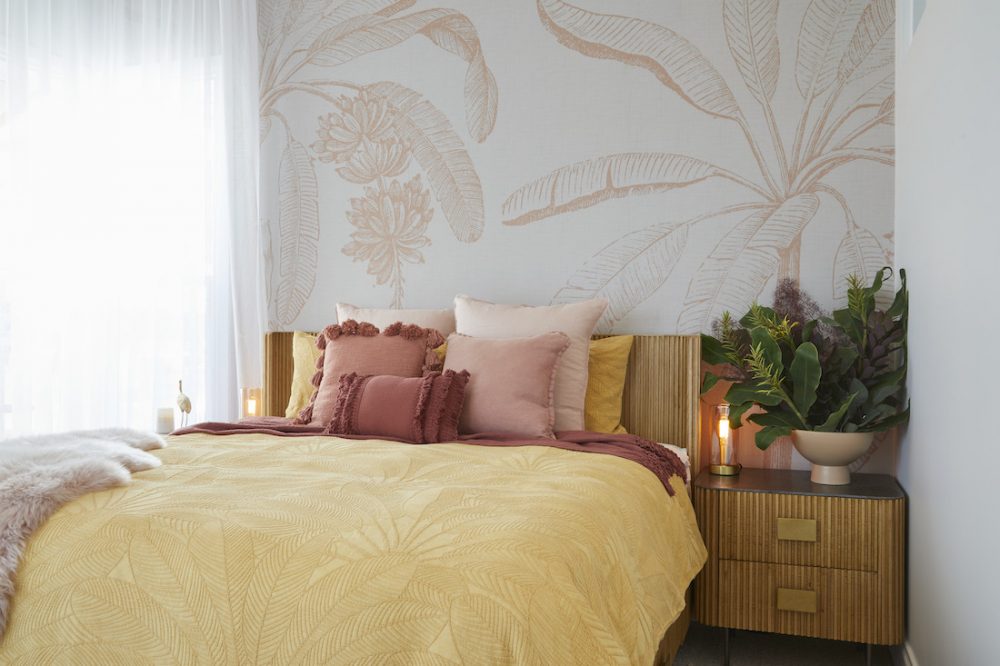
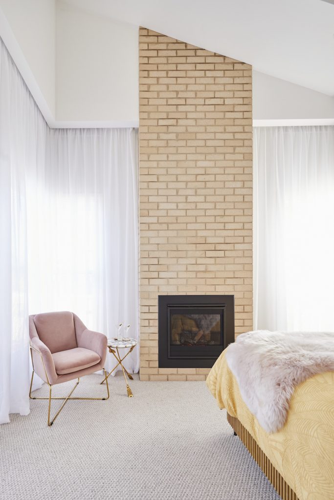
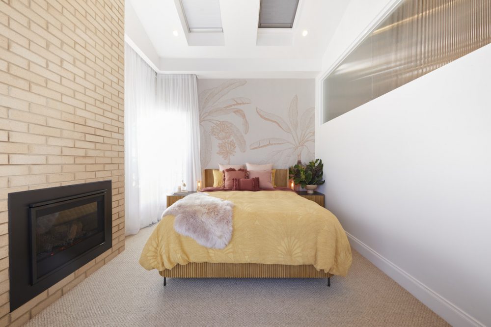
It was mostly layout issues the judges had problems with, praising the couple for hitting their 1950s brief yet again. They loved the stunning bedroom and the floor to ceiling fireplace, chimney and Palm Springs bed.
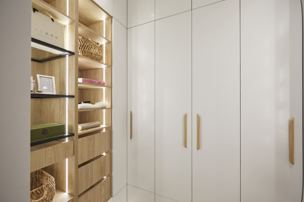
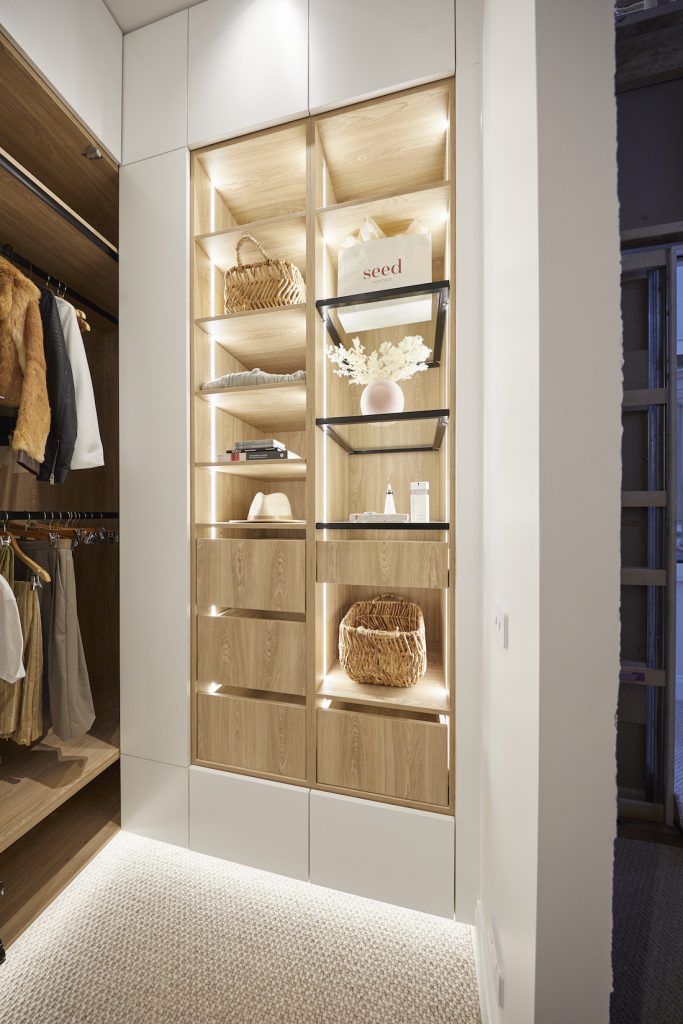
Where they fell down was having their walk-in wardrobe next to their master ensuite, meaning the home owners would have to walk through the bathroom to get to the wardrobe. We agree… not ideal.
Other than the layout though, we were really vibing their bedroom this week. It felt grand and the use of materials was one of the best — spot that knotted carpet over the more standard selections of other couples.
Score: 21.5 / 30 (5th place)
What did you think of the master bedroom reveal for The Block 2020? Did you agree with the judges (or us?!). Tell us in the comment section below!
Be sure to check out The Block Shop if you’ve spied something you love in this week’s room reveals. And you can catch all The Block 2020 goss on the official website.
All imagery by David Cook Photography


