When one of your BFFs goes away for the weekend, you break into their house and give them a surprise room makeover… no? Just me? Well, it’s what I recently did for my friend Naomi who was feeling uninspired by her bedroom. I was on a mission to give her an ultimate master bedroom makeover with a bold feature wall, new curtains, lighting, furniture and decor.
Watch the video below to see the room take shape or keep on reading for all the details!
Related article: Before and after: A dated living room gets a dramatic makeover with Canberra Outlet
Related article: The power of paint: Living room makeover on a budget
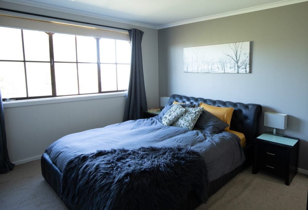
From this…
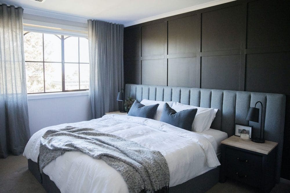
To this…
The biggest changes
Black panel feature wall
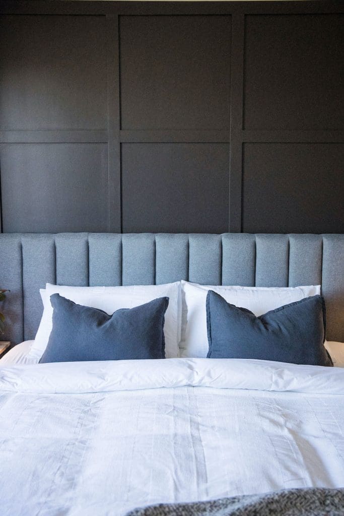
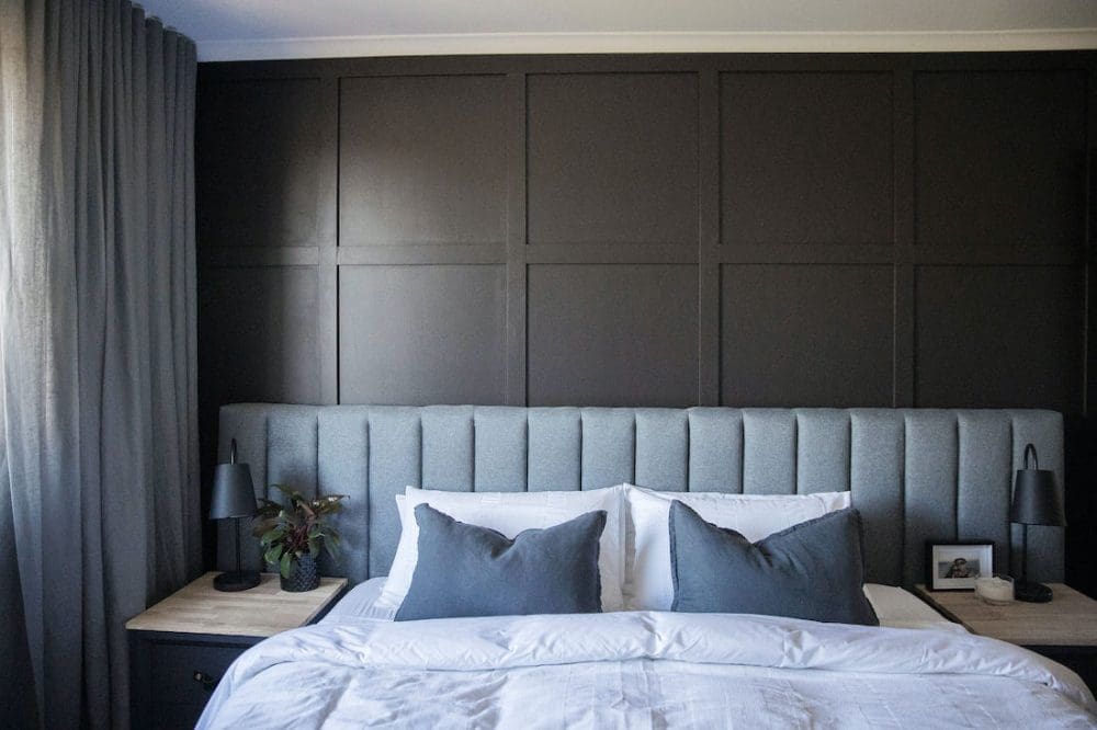
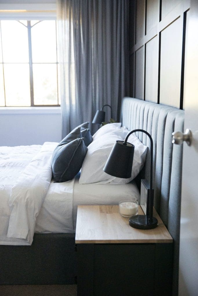
Naomi loves a darker colour palette so I wanted to play to her moody taste by creating a bold, black panel feature wall. Although VJ panel is super popular, I was keen to do something a bit different in here and came up with a large square design that would help to create the illusion of a larger space.
I’ll share a separate article and video that goes into detail about how I created the wall but essentially I just bought primed timber panels from Bunnings that I attached to the wall using liquid glue and a nail gun. To create the flattest paint finish possible, I first painted the wall using a roller, and painted the timber planks with a roller outside on trestle horses. I began the timber panel pattern by creating a border around the wall, then added all of the vertical panels as full pieces, and all of the horizontal panels as cuts that sit between these. The approximate size of each square is around 600mm x 600mm.
It was surprisingly not that difficult to do given I had the right equipment, including a laser level, drop saw and nail gun. Stay tuned for that other video and blog post soon! (Now available here.)
The paint colour I used is ‘Black Felt’ by Dulux, which is a lovely warm black colour.
New curtains and roller blind
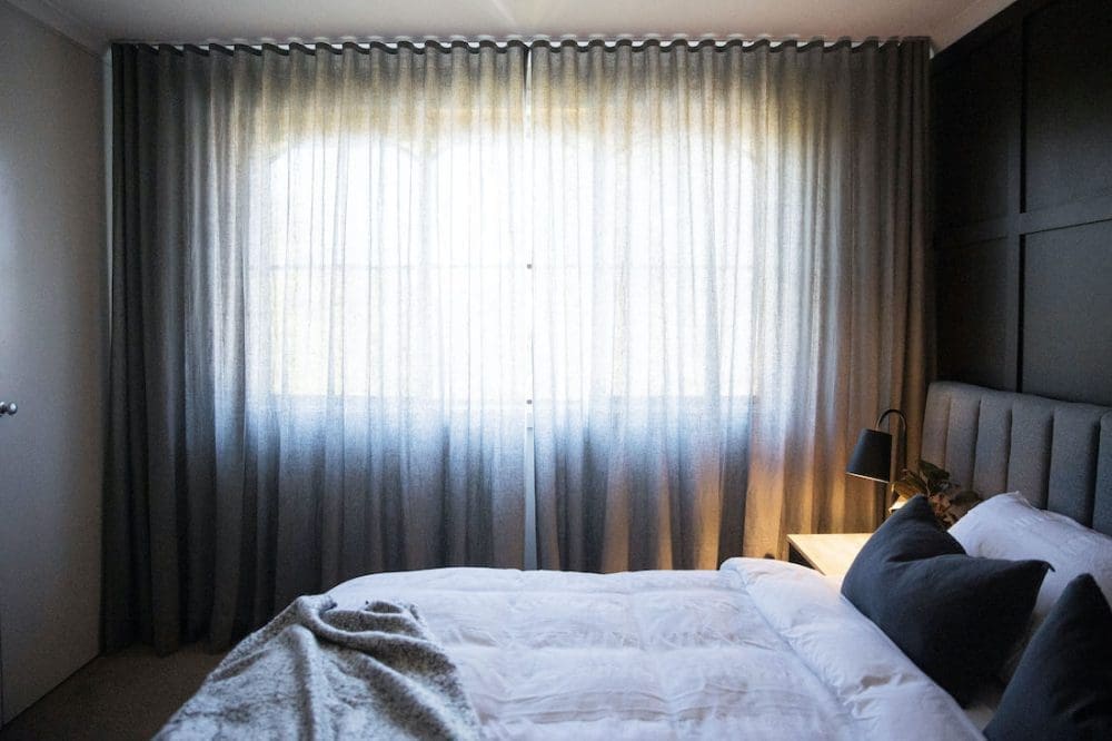
I’m always so blown away the impact new window coverings have on a room. They can create the illusion of a larger space by drawing your eye upwards and across, change lighting in a room (especially when using sheers that diffuse light), and give a space a designer touch.
In this room, there was a curtain rod with eyelet blockout curtains that just hung a bit flat. I replaced these with sheer curtains, using a Warwick fabric ‘Calais’ in colour ‘Pewter’ from DIY Blinds that I mounted to the ceiling. By running the curtain from wall to wall, ceiling to floor, it makes the whole room feel larger and adds to the moody vibes.
Updating the lighting
Lighting is one of the most overlooked elements of design yet it plays such an important role — the amount of light, temperature of light and level of lighting in a space creates ambience and more importantly, makes it possible to do daily tasks.
I hired an electrician to replace the old glass oyster ceiling light with a neutral fabric shade from Bunnings. It can be controlled by an app so they can manage the light and set a light schedule from their mobile device. Pretty clever!
The bedside lamps also got switched out to these black and marble ‘Batisste’ lamps from Freedom. They offer more functional lighting for bedside reading and cast beautiful ambient lighting.
New bed
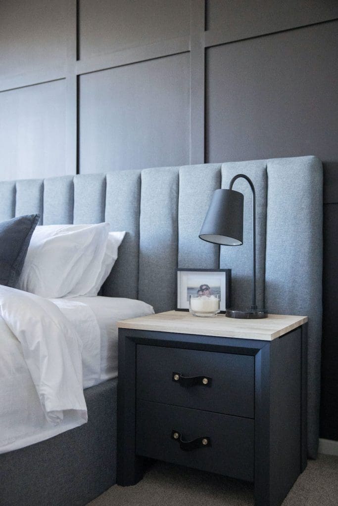
The only new furniture item in this room makeover is the bed. I replaced the black sleigh style bed with an oversized upholstered bedhead and gas lift base from Luxo Living.
The extra-wide bedhead draws the eye along the length of the room, adding to the illusion of a bigger bedroom. I also liked the contrast of the square panel feature wall and linear panel upholstered bedhead, which adds a textural quality to the room.
Upcycling the other furniture
There wasn’t enough budget to replace the bedside tables and chest of drawers so I had to get creative! The black timber veneer and frosted glass tops of these furniture items didn’t fit with my vision for the space.
I’m a big fan of chalk paint as it’s quick and easy to apply (no need to apply undercoat) and instantly gives furniture a whole new look. I painted all these furniture pieces in Dulux chalk effect paint in ‘Vintage charcoal’ colour, replaced the glass tops with timber I had cut to size, and switched the handles to leather-look pull handles. All of these materials are available at Bunnings.
Creating a small gallery wall
As much as I wanted to create a hotel vibe in this master bedroom makeover, it was also important to personalise the space to make it feel homely. And nothing makes a space feel like home more than displaying photos of your happiest memories.
On the wall space between the bedroom door and ensuite, I created a small gallery wall of black and white photos. I used online photo printing service Popic to print the photo posters and placed these in white frames that I bought from Freedom.

Finishing the space with quality bedding and decor
To add that final layer of style, I furnished the room with quality bedding and decor from Canberra Outlet.
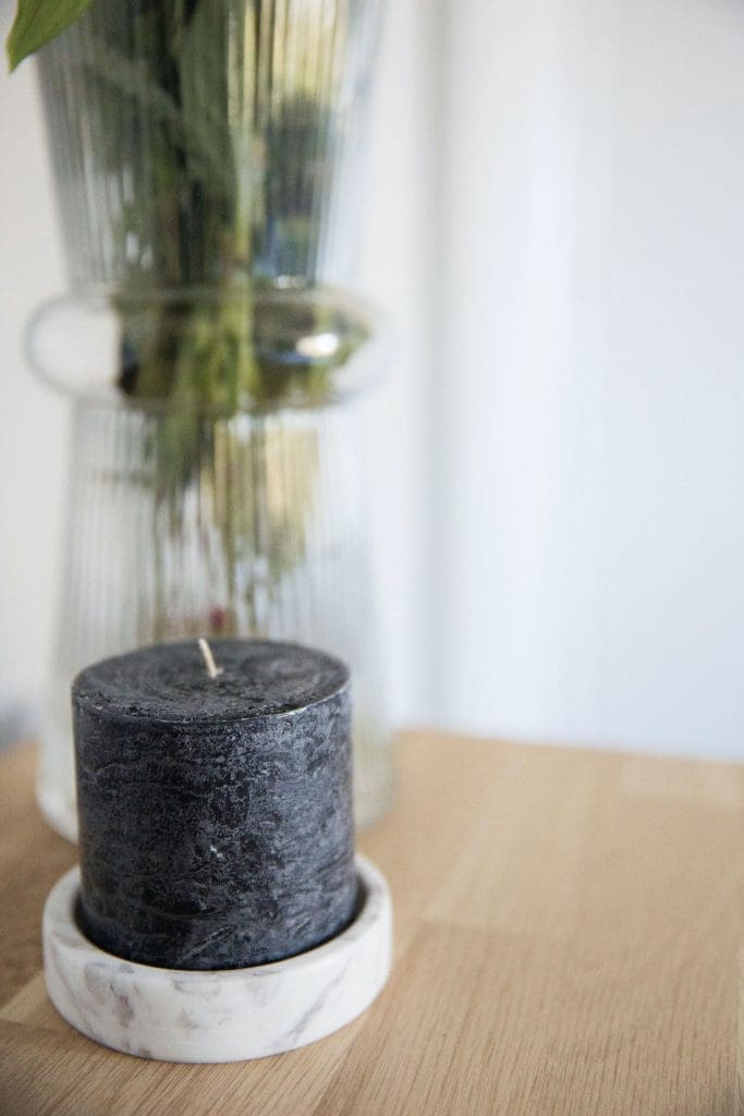
I bought white textured bedding from Adairs and added a pop of colour with two feature cushions (also from Adairs). Then I draped an ultra soft throw from Freedom over the foot of the bed. Finally, I accessorised the room with beautiful candles, photo frames, indoor plants and tall vase.
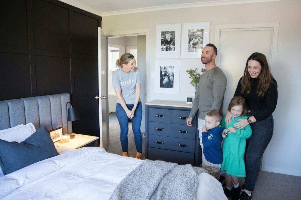
…And the verdict — Naomi loved it!
It’s always risky giving anyone a surprise, especially something as drastic as a room makeover. But I was confident I knew Naomi well enough to pull it off and thankfully she was thrilled, hooray!
She was blown away by the black panel feature wall. It’s exactly what she had envisioned in her dream room! She loved the new bed (especially when she saw the storage space available in the gas lift base). The sheer curtains were a huge yes and thought the gallery wall was so special. Yay, ticks all round!
I hope you enjoyed this master bedroom makeover project and it gave you a few ideas for your home. If you have any questions, pop them in the comments below and I’ll get back to you asap!
More bedroom inspo

Photography by Thorson Photography
Disclaimer: Some of the items featured in this room makeover were gifted but all opinions expressed are my own.


