
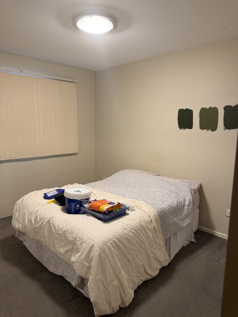
If you follow me on Instagram, you may have seen the dramatic makeover I recently completed for my mum’s bedroom. What started as a bland cream room lacking personality became a cosy, colour drenched sanctuary designed to help her relax, recharge and escape from the stresses of everyday life.
Today I’m sharing all the details behind this bedroom makeover, from the design brief and paint colour selection through to the DIY projects, styling choices and affordable finds that helped bring the room together.
Related article: Ultimate master bedroom makeover: Creating a hotel luxe bedroom
Related article: Styling a masculine bedroom: A dramatic men’s bedroom makeover
The brief: Creating a bedroom sanctuary
Every successful makeover starts with understanding how you want a space to feel.
When I asked my mum what she wanted from her bedroom, her answer was simple: a restful and grounding space.
With that in mind, I knew green would be the perfect foundation for the design. Green is often considered one of the most calming colours in interior design because it’s the colour most commonly found in nature. It evokes feelings of balance, restoration and wellbeing — exactly the mood we wanted to create.
While I could have introduced green through soft furnishings and decor, I decided to take a much bolder approach.
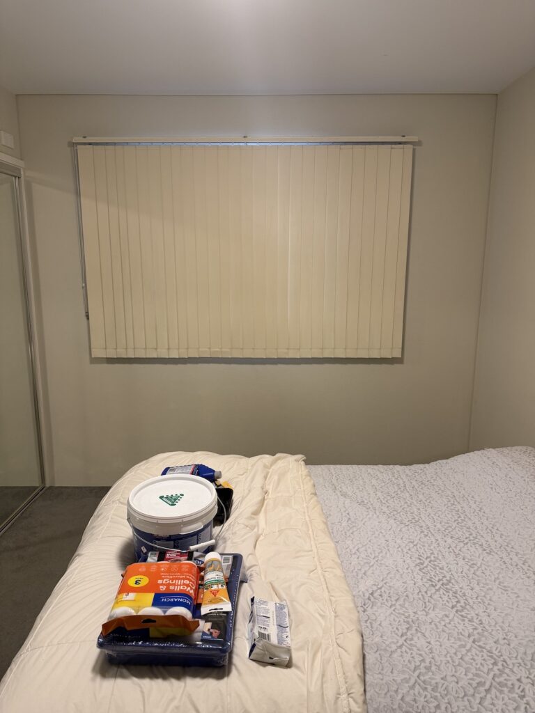
Because this room is naturally dark — it’s south-facing and the window is partially obstructed by a long roofline outside — I knew the usual trick of painting everything white wasn’t going to achieve the result I wanted.
Lighter colours work best when there’s plenty of natural light available to bounce around the room, creating that bright and airy feel. In this space, the limited natural light meant white walls would likely feel flat and uninspiring rather than fresh and expansive.
Instead of fighting the room’s natural characteristics, I chose to embrace them. I leaned into the moodier side of the space, creating a cocoon-like retreat that feels calming, restorative and intentionally cosy. By working with the room rather than against it, I knew I could create something far more interesting and inviting.
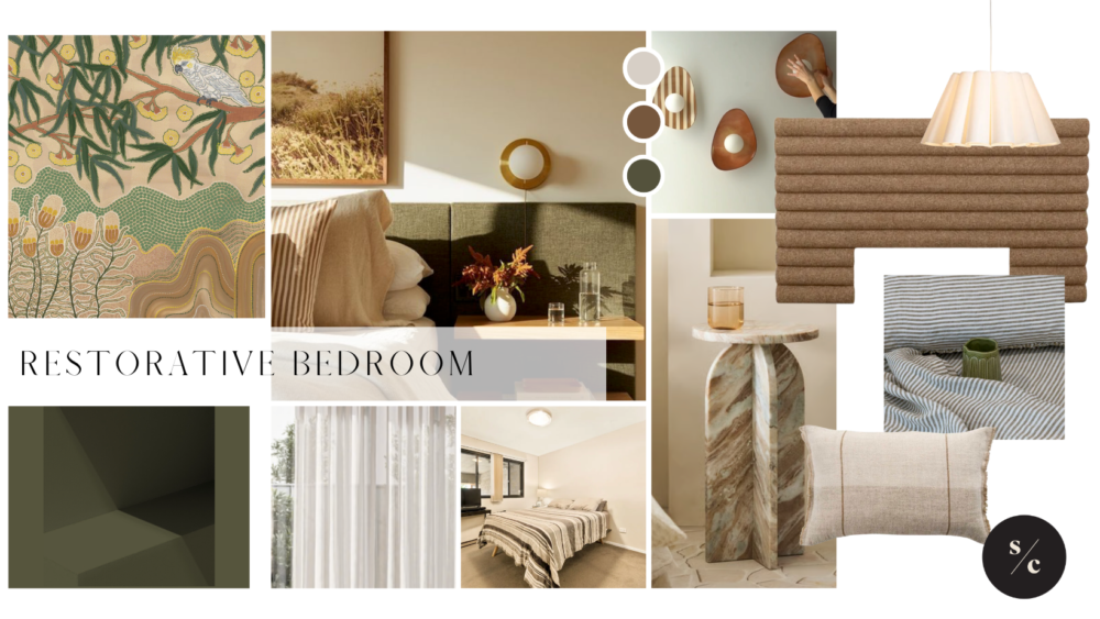
Below is a mood board I created that inspired the overall direction of the makeover.
Choosing the perfect green paint colour
Just like there’s no such thing as “just white paint”, there isn’t simply one dark green paint either.
There are literally thousands of green paint colours available, each with different undertones and levels of saturation. Some lean blue, some lean grey, some have yellow undertones and others, like the colour I eventually chose, have rich earthy brown undertones.
Because colours appear differently in every space depending on natural light, artificial lighting and surrounding finishes, it’s essential to test paint colours before committing.
I always tell my design clients that sample pots are non-negotiable, so of course I followed my own advice.
Because I planned to colour drench the entire room, selecting the right shade of green was especially important. If I got it wrong, there would be no escaping it!
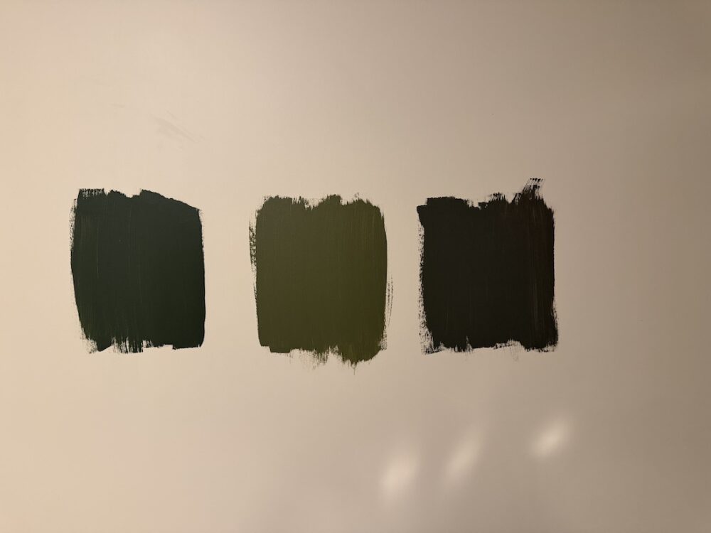
I tested three Wattyl paint colours in the room:
- Racing Car — a rich forest green
- Hanging Gardens — a muted sage green
- Tree of Life — a deep green-brown with earthy undertones.
Dark colours can feel intimidating, but in a bedroom they create a sense of comfort, depth and luxury that’s difficult to achieve with lighter shades.
My top tips for testing paint colours
If you’re trying to choose between paint colours, here’s what I recommend:
Paint large sample swatches
Tiny paint chips simply don’t tell the full story. Paint a sample at least the size of an A4 sheet of paper, or paint onto large pieces of cardboard if you can’t paint directly onto the walls.
Review colours throughout the day
Natural light changes constantly. A paint colour that looks perfect in the morning may feel completely different in the afternoon or evening. Check your samples at multiple times of day before making a final decision.
Compare colours against your other finishes
Paint never exists in isolation. Hold your curtain fabrics, flooring samples, tiles, timber finishes or furniture materials against your paint samples to see how everything works together. In this project, I held my curtain fabric swatches against the painted samples before making a final decision.
Things to remember when choosing paint colours
There are a few design principles worth keeping in mind:
- the more surfaces you paint in a colour, the stronger and more saturated it will appear
- colours always look different depending on the quality and direction of light entering a room
- your lighting plan can dramatically influence how a colour appears once the project is complete
- dark colours visually recede, which means they can sometimes make small rooms feel larger rather than smaller
- while lighter colours reflect more light, they aren’t always the answer. In rooms with limited natural light, white walls can feel flat and lifeless rather than bright and airy.
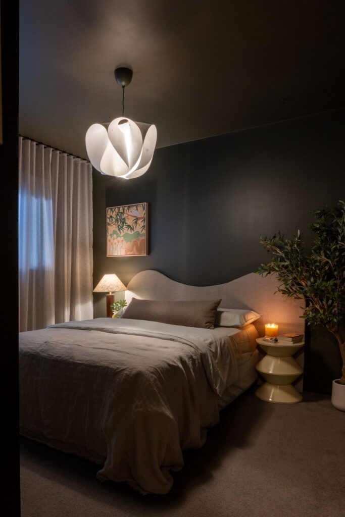
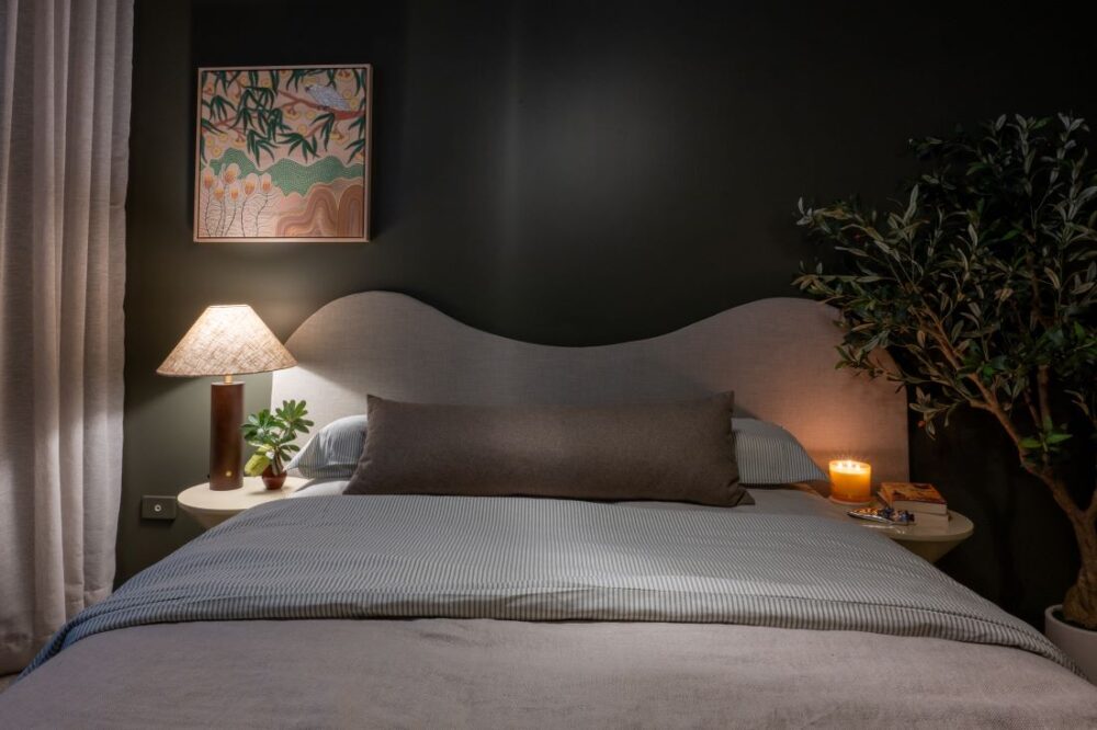
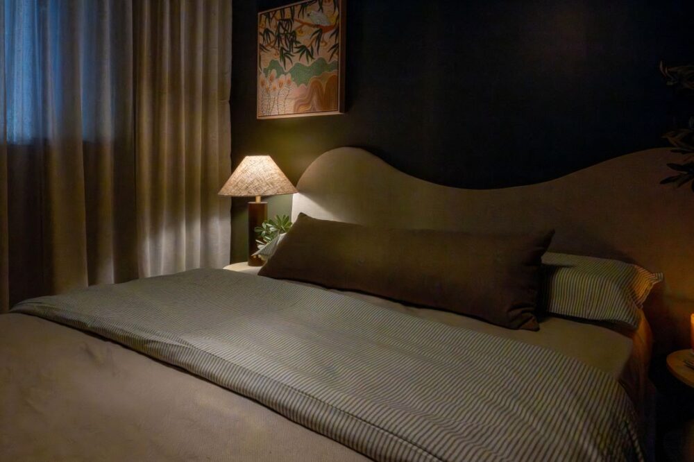
With all of this in mind, I ultimately chose Wattyl’s Tree of Life (pictured far right above).
I was drawn to its earthy brown undertones, which felt softer and more sophisticated than a traditional forest green. It also paired beautifully with the curtain fabric I’d selected, helping create a harmonious and cohesive palette for the entire room.
Why I chose colour drenching
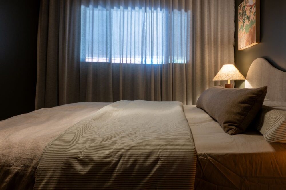
Once I’d settled on the paint colour, I took things a step further by colour drenching the entire room. That meant painting the walls, ceiling, wardrobes, trims and doors all in the same colour.
Colour drenching has become one of the biggest interior design trends in recent years, and for good reason.
Painting every surface the same colour removes visual interruptions and creates a seamless, enveloping effect. It makes a room feel intentional, sophisticated and surprisingly calming.
In this bedroom, colour drenching also helped the built-in wardrobes visually disappear into the background, creating a cleaner and more cohesive look.
The result is a room that feels cosy, elegant and incredibly relaxing.
Softening the space with beautiful window furnishings
Other than paint, I’d argue the biggest bang-for-buck change you can make in a bedroom is updating your window coverings.
The right window furnishings can make a room feel larger, more luxurious and significantly more finished. Hanging curtains high and wide draws the eye upward, creating the illusion of higher ceilings and larger windows, while also improving privacy, light control and insulation.
And while I know Venetian blinds have their fans, they’ve never been my window covering of choice. They tend to collect dust, feel visually heavy and, in this room, the cream blinds against the cream walls simply blended into the background. I knew they had to go!
I’ve installed curtains myself in previous projects and one of the things I love about DIY Blinds is how simple they’ve made the process for renovators.
For this room, I opted for a ceiling-mounted curtain track. Installation was surprisingly straightforward. I just needed to secure a few brackets to the ceiling approximately 500mm apart before clicking the track into place. Once the curtains were hung, the transformation was immediate.
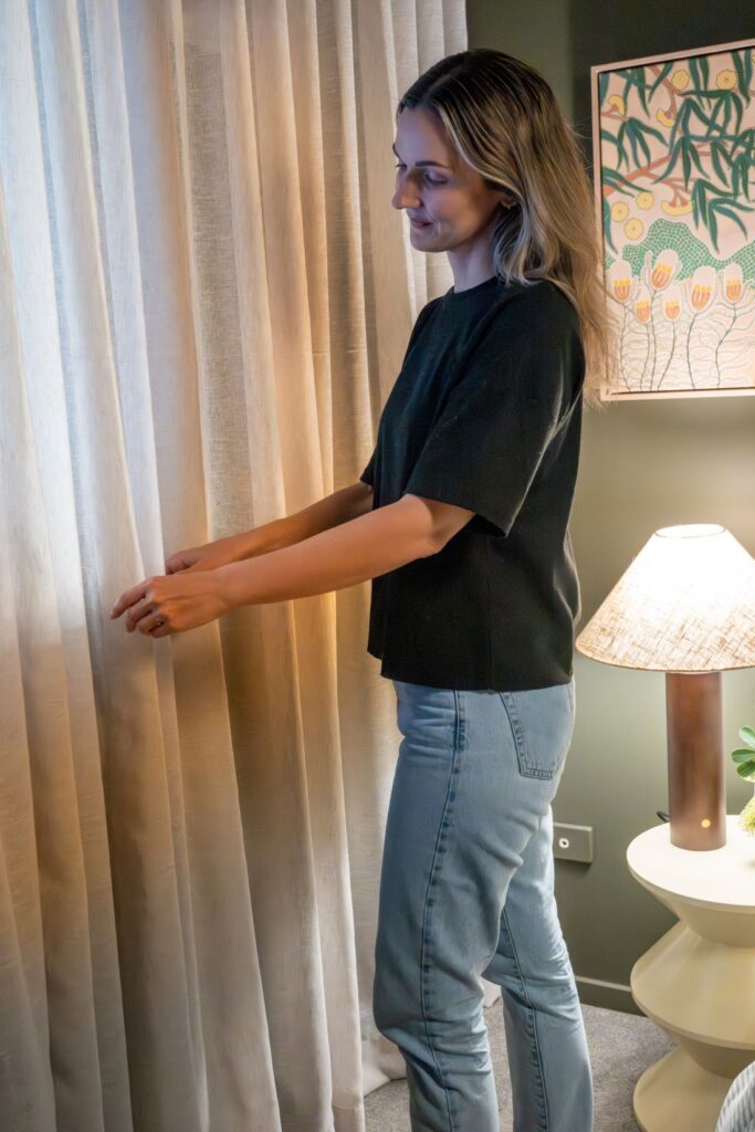
There are dozens of fabric options available on the DIY Blinds website, ranging from ultra-lightweight sheers through to heavier blockout fabrics. After ordering samples and testing them in the room, I selected their Rye sheer curtain fabric in the colour Parchment.
I love this fabric because it captures the relaxed look of linen while offering the practicality of polyester, meaning it won’t shrink, fade or require the same level of maintenance. The lighter earthy tone also creates beautiful contrast against the darker green walls while maintaining the natural, grounded palette I was aiming for.
Rather than choosing between curtains or blinds, I opted for a dual window treatment consisting of wall-to-wall sheer curtains paired with a recess-fitted motorised blockout roller blind behind. This combination gives the room incredible flexibility throughout the day. The sheers soften natural light and create a beautiful sense of warmth and texture, while the blockout blind provides complete privacy and darkness when needed.
And can we talk about motorisation for a moment? Being able to open and close blinds with the touch of a button feels surprisingly indulgent and instantly makes the room feel more high-end. It’s particularly handy in bedrooms where you want to quickly block light at night or let the morning light filter through without climbing over furniture or reaching behind curtains. It’s one of those upgrades that doesn’t seem essential until you’ve experienced it — and then you never want to go back.
DIY Blinds discount code
If you’re considering updating your own window furnishings, DIY Blinds has generously offered Style Curator readers an exclusive discount.
Use code TSCREADER15 to receive 15% off full-priced blinds, curtains, Polylux shutters and motorisation until 30 August 2026.
Explore DIY Blinds range here
Offer excludes the offline range, Polychoice shutters, motorisation accessories and delivery. Cannot be used in conjunction with any other offer or promotion.
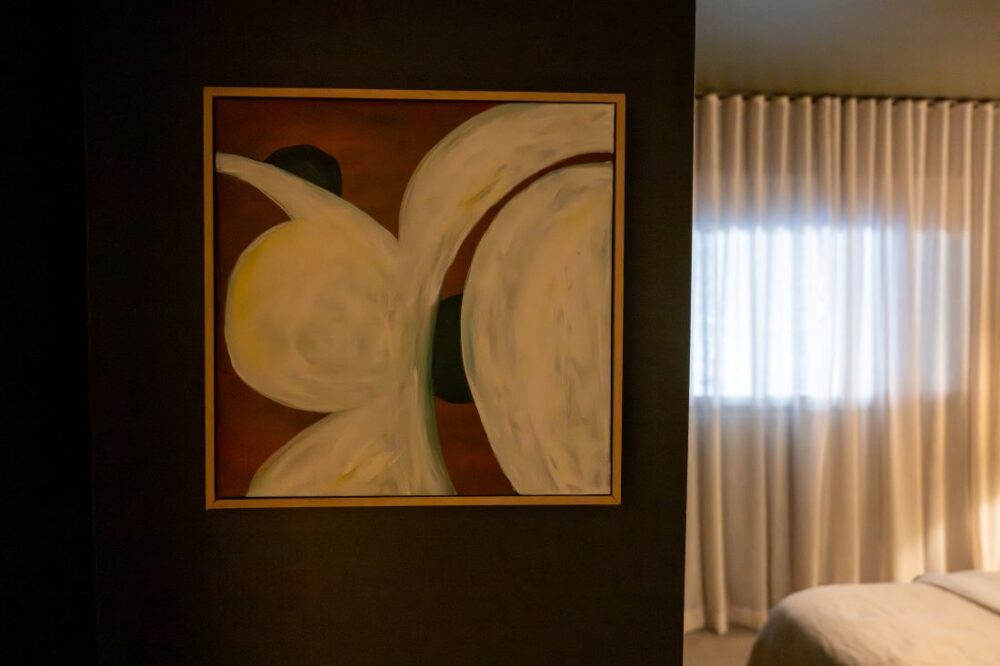
Using artwork to build the colour palette
One of my favourite styling tricks is to choose artwork early in the design process and using it as the anchor for a room. From there, I’ll draw out 3-5 colours to use as the colour palette for the rest of the space. I’ll also use the mood of the artwork to influence the other styling decisions.
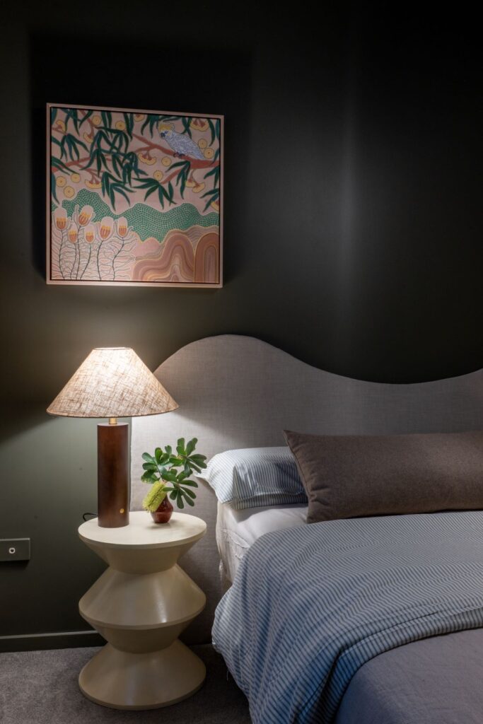
For this bedroom, I selected the stunning artwork Tuka Marri by Indigenous artist Domica Hill from Gioia.
The artwork features beautiful earthy greens, warm browns, creams and natural tones that perfectly complemented the direction I wanted to take the room.
Once I picked out the artwork was chosen, selecting cushions, accessories and styling pieces became much easier because the colour palette was already established.
Get 10% off Gioia artwork using this link
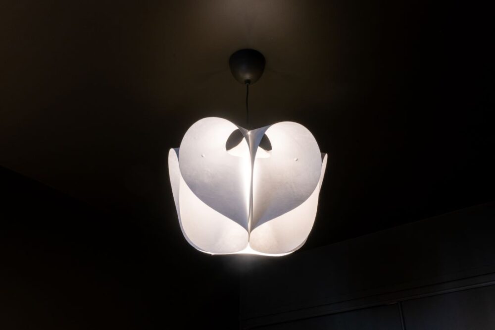
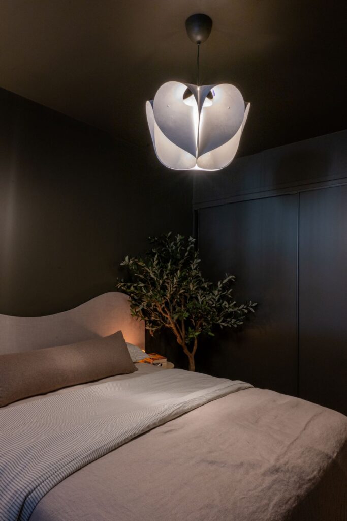
Replacing the outdated oyster light
If there was one feature in the room that absolutely had to go, it was that dated oyster light!
Looking for a budget-friendly upgrade, I headed to IKEA. I’d seen an online hack where someone painted one of their inexpensive pleated shades and transformed it into something that looked designer. I attempted the same thing. Let’s just say it didn’t go to plan.
Thankfully, I’d also picked up a beautiful petal-shaped shade while I was there, originally intending to use it elsewhere in the apartment.
The moment it went up, I knew it belonged in this room. Combined with a simple pendant fitting, the entire fixture cost around $70, plus the cost of an electrician to install it.
I love how the sculptural shape adds softness and interest while casting a more diffused, ambient light throughout the room.
Honestly, the failed IKEA hack may have been the best thing that happened to this makeover.
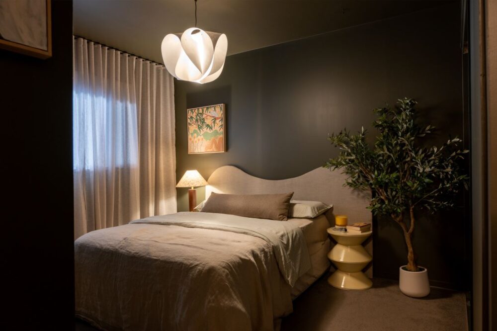
How I made a DIY wave bedhead for around $50
One of the biggest statement pieces in the room is the oversized wave bedhead.
Over the years I’ve created a few DIY bedheads, including my fluted timber and terrazzo bedhead and the pool noodle bedhead that many of you may remember from a previous makeover.
For this room, I initially considered incorporating hidden storage or integrated lighting but ultimately decided to keep things simple.
I fell in love with a wave-shaped bedhead I’d spotted online… but not the price tag.
After a trip to Bunnings, I realised I could recreate something very similar myself using plasterboard. That’s right — no power tools required!
I simply sketched the shape, cut it out using a Stanley knife and covered it with wadding and fabric before securing everything with Liquid Nails.
The entire project took around an hour to complete and cost approximately $50 because I already had the fabric. Not bad for one of the standout features in the room.
The organic curves help soften the space while creating a beautiful focal point behind the bed.
Simplifying the bed styling
When it came to styling the bed, I took a much more modern approach.
Gone are the days of piling fifteen decorative cushions onto a bed only to throw them onto the floor every night. Instead, I opted for a single oversized lumbar cushion.
I actually made this cushion a few years ago as part of a collaboration with Warwick Fabrics and Clark Rubber, and I love how the textured wool fabric picks up the warm brown tones found in the artwork.
The rest of the bedding is affordable IKEA linen layered with a throw blanket I already owned. It’s proof that creating a beautiful bed doesn’t need to cost a fortune.
Budget bedside tables with a custom finish
One of my favourite budget transformations in the room might actually be the bedside tables. These were clearance finds from Kmart that I picked up for just $15 each.
Originally they were a deep maroon colour that wasn’t working in the space at all. So I reached for a can of spray paint.
The finished result is a glossy cream colour which, if you’d told me a few years ago I’d be intentionally adding glossy cream furniture to a room, I probably wouldn’t have believed you. But sometimes you simply need to trust the process.
By pulling lighter cream tones from the artwork, the bedside tables now help brighten the room and create beautiful contrast against the darker walls. Combined with the lighter bedhead, they stop the room from feeling too heavy while adding balance to the overall palette.
Layering warmth through styling
Once the larger pieces were in place, it was time to layer in the finishing touches.
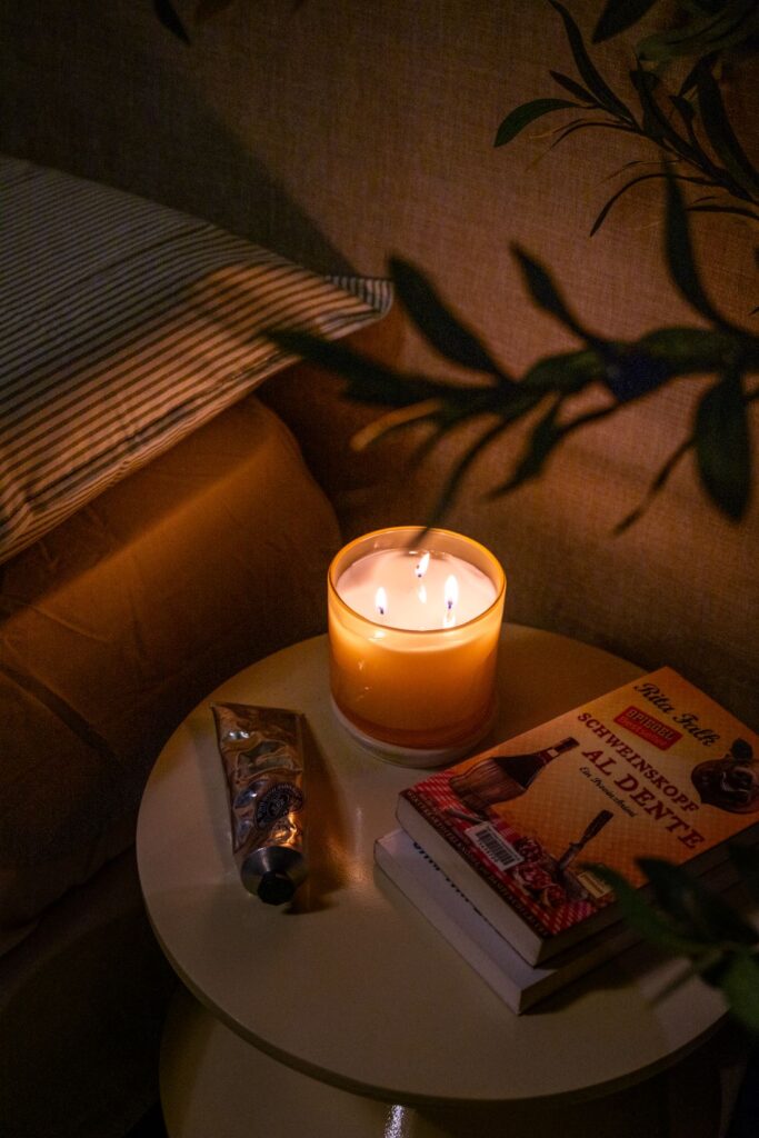
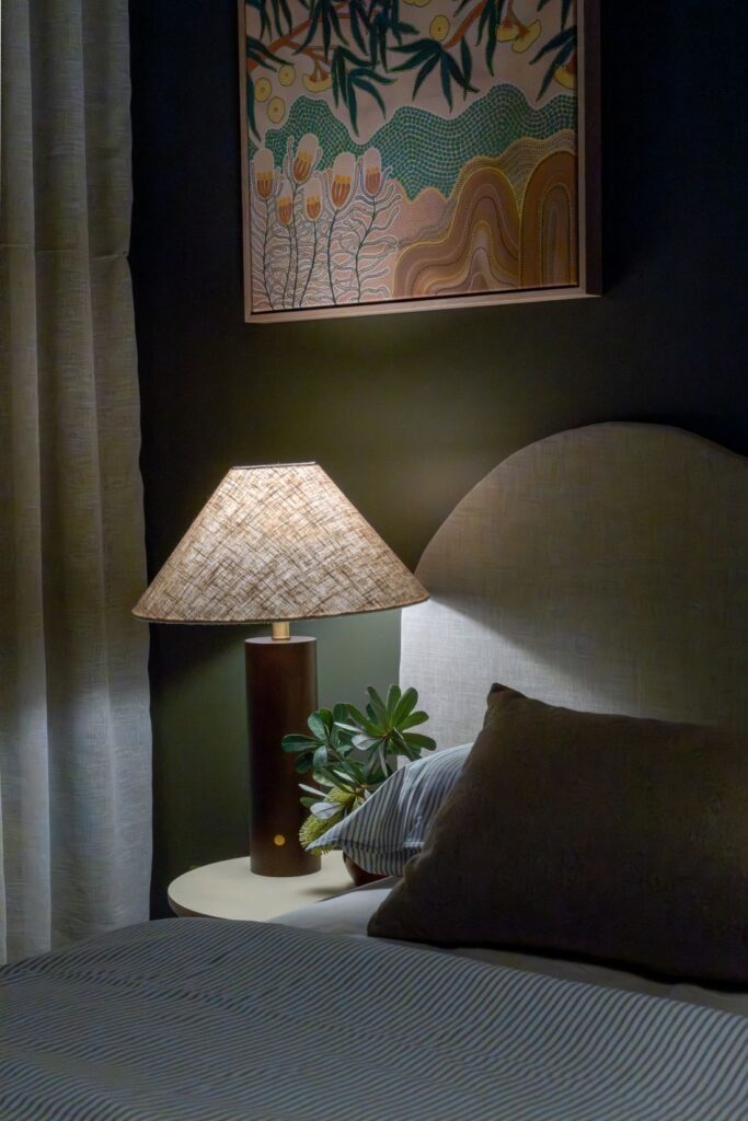
A gorgeous walnut timber table lamp from Homezee adds warmth and character while the touch sensor control introduces another small luxury detail.
A faux olive tree brings additional greenery, texture and height into the room while helping soften an unused corner.
I also created a small DIY artwork near the doorway to disguise an ugly plastic wall plate that was impossible to ignore. Sometimes the best styling solutions start with solving a practical problem.
Together, these finishing touches add layers of texture and warmth that make the room feel complete.
The finished result
This makeover is proof that beautiful rooms aren’t about spending the most money.
They’re about understanding how you want a space to feel and making thoughtful decisions that support that vision.
By embracing the room’s darker natural light, colour drenching every surface, layering texture, introducing softer lighting and incorporating a handful of affordable DIY projects, we transformed a bland cream bedroom into a cosy sanctuary.
Most importantly, my mum absolutely loves it! Seeing her reaction when everything came together made every paint sample, styling decision and DIY project worthwhile.
And while this room may be finished, we’re already planning the next space. The dining room makeover is officially next on the list.
If you don’t already follow along, make sure you’re following Style Curator on Instagram where I’ll be sharing more behind-the-scenes content, DIY projects and styling tips from this makeover and the next room transformation.
More bedroom inspo
Frequently asked questions
Is colour drenching a good idea in a bedroom?
Absolutely. Bedrooms are one of the best spaces for colour drenching because the technique creates a cocooning effect that feels calming and restful. By painting walls, ceilings and trim in the same colour, you remove visual interruptions and create a more relaxing environment.
Does dark paint make a room look smaller?
Not necessarily. While dark colours absorb more light, they can actually help blur the boundaries of a room, making the walls feel less defined. In this bedroom, the colour drenched finish helped create a more cohesive and sophisticated space despite the darker colour palette.
What is the best green paint colour for a bedroom?
The best green paint colour depends on the mood you want to create. Soft sages create a light and airy feel, while deeper greens like Wattyl Tree of Life create a more dramatic and cocooning atmosphere. For this makeover, Tree of Life offered the perfect balance of green and earthy brown undertones.
Can you colour drench a dark room?
Yes — and sometimes it’s actually the best approach. Rather than fighting a naturally dark room, colour drenching allows you to embrace its mood and create a cosy, intentional design scheme that feels luxurious rather than gloomy.
What are the benefits of motorised blinds?
Motorised blinds offer convenience, improved child safety and a more streamlined appearance. Being able to open and close blinds with the touch of a button is one of those small luxuries that quickly becomes difficult to live without. And the ones I used don’t need an electrician to install as the motor is within the roller blind.


