Snooza dog beds

Gina’s home: Guest bedroom reveal

I know I seem say this about every room reveal but the guest bedroom is one of my favourite rooms in our home!

With my family living interstate, I knew this space would get used A LOT and especially so since having baby P. My goal was to create a cosy and inviting guest bedroom and I feel like I was able to achieve this.

Related article: Gina’s home: Guest bedroom refresh
Related article: Hot Autumn bedding to suit any budget
Artwork shelf

Designing the space

During my colour consultation with Erin from Haymes, she suggested a soft grey wall colour called ‘Soothe’. That was the first decision I made when planning the guest bedroom and I love the mood it creates.

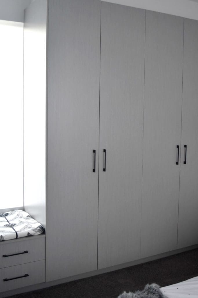
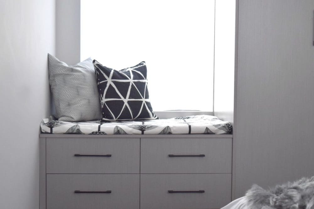
The next big decision was the joinery and I selected a grey timber grain finish called ‘Marosa Milan’ from the Ravine Polytec Evolution range. I designed the wardrobe to go across the full width of the wall with a lower drawer unit below the window to create a little reading nook. Perhaps I went a little overboard with storage in this room but often my guests will stay for a week or longer so it’s nice to give them space to unpack all their things and get settled.

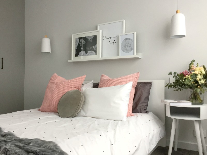
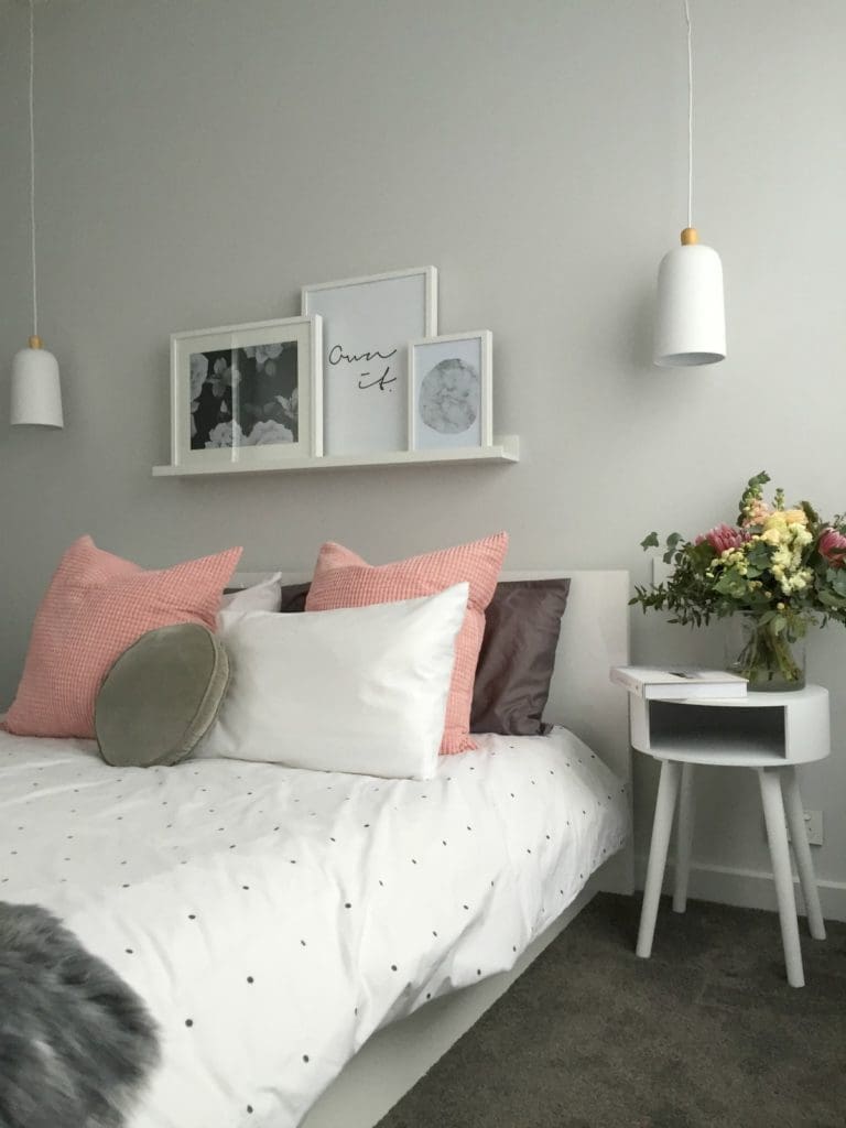
The room layout is simple — a bed centred against the back wall with two pendant lights hanging either side, and a side table on the right of the bed. There isn’t space to have a bedside table on the left side so I bought some light grey Normann Copenhagen wall pockets that can hold magazines, reading glasses etc but in the end I didn’t feel these were needed and used the wall pockets in my study instead.

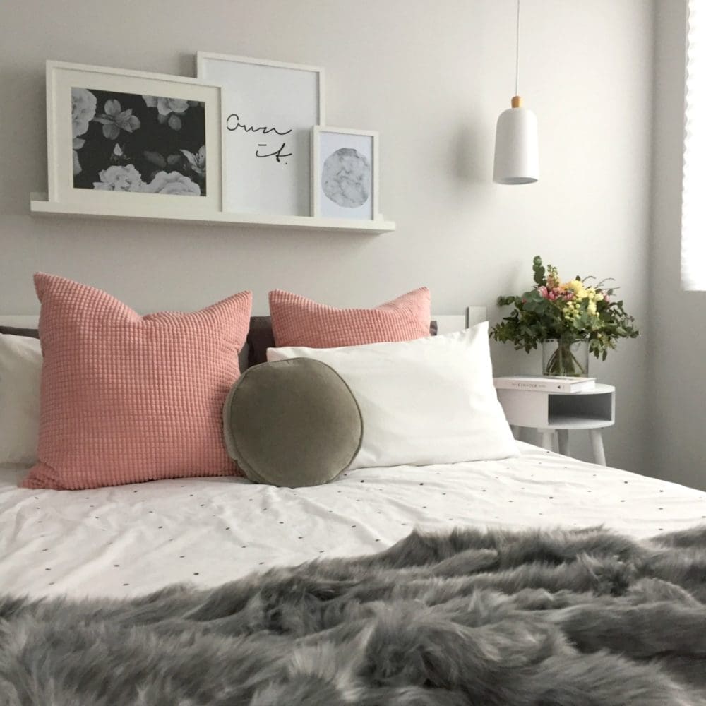
I (my husband) installed a wall shelf above the bed to rest artwork, candles or other pretty things. At the moment I’ve got a collection of prints from Yorkelee Prints on display but I also bought some larger frames so I might play around a bit more with the styling on the shelf.
Pendant lights
Bedside table

Styling

On to my favourite part! With the design and layout decisions made, I could furnish the space.

I’ve selected a colour palette of white, grey and blush pink. The plus side of having a neutral base and just one accent colour is that I can easily update the space depending on my mood. (For example, I recently bought a gorgeous peach wall print and have seen some equally gorgeous peach velvet cushions from Kip and Co, by simply swapping out the pink and incorporating these two items I could give the room a totally different feel.)

To create that cosy feel, I dressed up the room with lots of layers. Those blush pink Euro cushions are new at IKEA and are so velvety soft ♥ The bedding is by Rachel Castle and the large faux fur throw from Adairs.

My mum, who was the inspiration behind this room, loves to read so I created a little reading nook by the window. The bench seat is a little DIY number using fabric from Yulki’s Home Decor and I scattered a few cushions in different geometric prints.

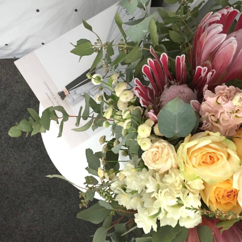
Finally, fresh flowers and a good book finish the space.

Reading nook
Wardrobe

Supplier list:

Wall paint: ‘Soothe’ from Haymes
Bed: Freedom
Bedside table: Kmart
Pendant lights: Lights2You
Wall prints: Yorkelee Prints
Quilt cover and grey penny cushion: Castle and Things
Pink Euro cushions: IKEA
Grey faux fur throw: Adairs
Fabric on DIY bench seat: Yulki’s Home Decor
Black cushion on bench seat: Art Club
Grey cushion on bench seat: IKEA
Flowers: Barton Flower Bar

I hope you like this room reveal. You can see what my guest bedroom looks like now here or if you have any questions about where products are from, just pop a comment below and I’ll get back to you asap 🙂

More from my home
Guest bedroom

Disclaimer: This post contains some affiliate links. This means that when you click on a link and purchase something from that site, we may make a small commission at no extra cost to you.

Gina Beschorner Style Curator

Welcome to Style Curator, your destination for daily interiors inspiration, styling tips, reno advice, home tours and DIY projects!

We're on a mission to help you create a home you love. And with plenty of tips and tricks, tutorials and other home inspo, we give you all the tools to achieve it!

I’m Gina, Founder and Interior Designer, and you can read more about Style Curator here.

Subscribe

Get the best of the blog to your inbox each week PLUS instant access to our free downloads!

    We respect your privacy. Unsubscribe at any time.
    Interior style quiz

    Shop our fave online stores

    Vorsen
    Betta
    Koala Eco

    As seen in

    Style Curator in the media

    Altina

    7 COMMENTS

    1. Gorgeous as per usual, Gina! Absolutely love the Euros and the paint colour is beautiful – so warm and welcoming. The joinery looks fab – I especially love the hardware! Your Mum & any other guests will ADORE this space. Xxx

      • Oh thanks hun! Those Euros were a bargain find from IKEA and I love the texture of them 🙂 I adore your styling too and can’t wait to see your home take shape, so close! xx

    2. Such a sweet room, lucky you like your guests to stay a while 😉 The paint colour is perfection, is that a darker grey than the rest of the house? I totally thieved your wardrobe/window seat configuration for one of our bedrooms btw!

      • He he, glad you got some ideas from this space Jane! I’m lucky I have nice guests so I let them stay a while 🙂 The cabinetry in this space is one of my fave features so hopefully you love how it turns out in your new home too! The paint colour is ‘Soothe’ which is a soft grey colour whereas most of my house is ‘Greyology 2’ which is a crisp white. In our master I used ‘Smokey Silhouette’ though which is a medium grey. Next time I build I think I’ll be more confident using colour… it was a big step for me to lock in these two grey colours, ha ha!

        • The greys are lovely but I think I know what you mean about being braver next time. I am loving all the moody warm colours right now but we will see when it comes to the crunch whether I follow through!

          • I say go for it 🙂 All the ‘risky’ choices I made, like black kitchen and patterned floor tiles, have become my fave features of the house. With paint it’s so easy to change if you decide you want something different down the track. Can’t wait to see what you go with x

    LEAVE A REPLY

    Please enter your comment!
    Please enter your name here