Vignettes or styled arrangements add interest to surface areas of your home. They are a way of displaying some of your favourite objects to create focal points of interest in rooms. Think on your coffee table, sideboard, kitchen bench, bedside table, in a bookshelf… just about anywhere! When used throughout a home, these connecting style threads tell your story, also making them a fab way to personalise your home.
There’s no right or wrong way to style a vignette but let me share with you my top tips to create a more elevated look. Keep on scrolling for my advice on how to style a vignette!
Related article: The tips and tricks to styling your coffee table with ease
Related article: Kitchen shelf styling inspiration: Different ways to style your kitchen shelves
Pick your home decor
In its most simplest form, a vignette has one large, one medium and one small object. For example, a table lamp, photo frame and candle. However, you can create larger and more layered vignettes by using a greater number of home accessories.
The most popular items to use in a styled vignette:
- lamp
- candle
- oil burner
- indoor plant
- photo frame
- small artwork
- crystal
- coral
- sculptural item
- stack of books
- vase of flowers
- ceramic object
- glass decor
- stack of coasters
- glass cloche
- wick trimmer
- candle snuffer
- bead garland.
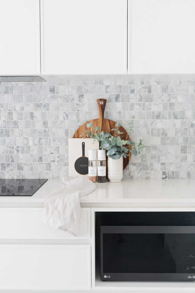
You can also use functional items, like the salt and pepper grinders I used in the kitchen vignette above.
Check out this article on the top 50 items of home decor for even more ideas.
Start with a base
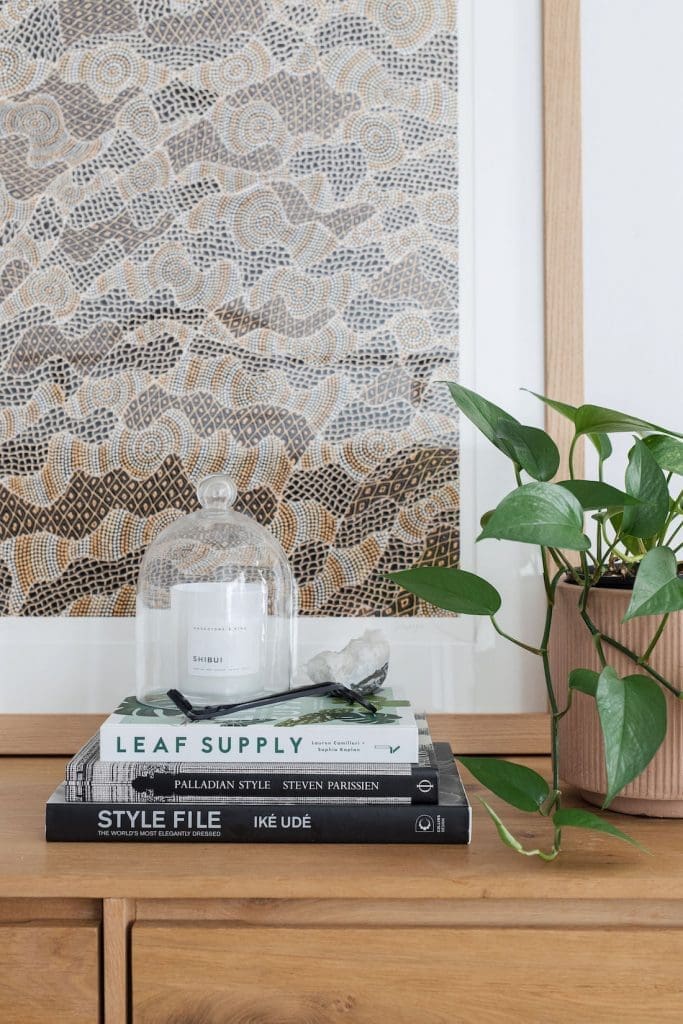
One of my favourite vignette styling tricks is to use start with a base, such as a tray, trivet or stack of books. By placing smaller home decor on a base, it makes the styled arrangement look more intentional, as though the items belong. Otherwise, you can end up appearing as though you’ve just randomly grouped a few items together.
Using a base also adds visual layers to your vignette. And as I’ve said over and over, layering is one of the best ways to elevate your styling. It instantly gives any styling more confidence and sophistication.
It’s also possible to stand your base upright and sit it behind your vignette. For example, in the kitchen vignette above, I placed an upright cutting board behind which anchors the arrangement. Alternatively, you may lean a small artwork behind a vignette on a sideboard.
Mix height and scale
Great vignette styling is all about contrast — tall with low objects, delicate with solid.
Look for a mix of decor in a range of heights and varying visual weights. Visually heavy objects could include a solid stone bowl or chunky table lamp, whereas examples of light objects are slim candlesticks or wick trimmers.
At a minimum, a vignette should have one tall, one medium and one small item. I generally like to use at least 5-9 objects in a vignette… any more than that and it can appear too cluttered.
Work in odd numbers and don’t over-clutter your arrangement. Using 3-9 home accessories is a good rule of thumb.
Incorporate different materials
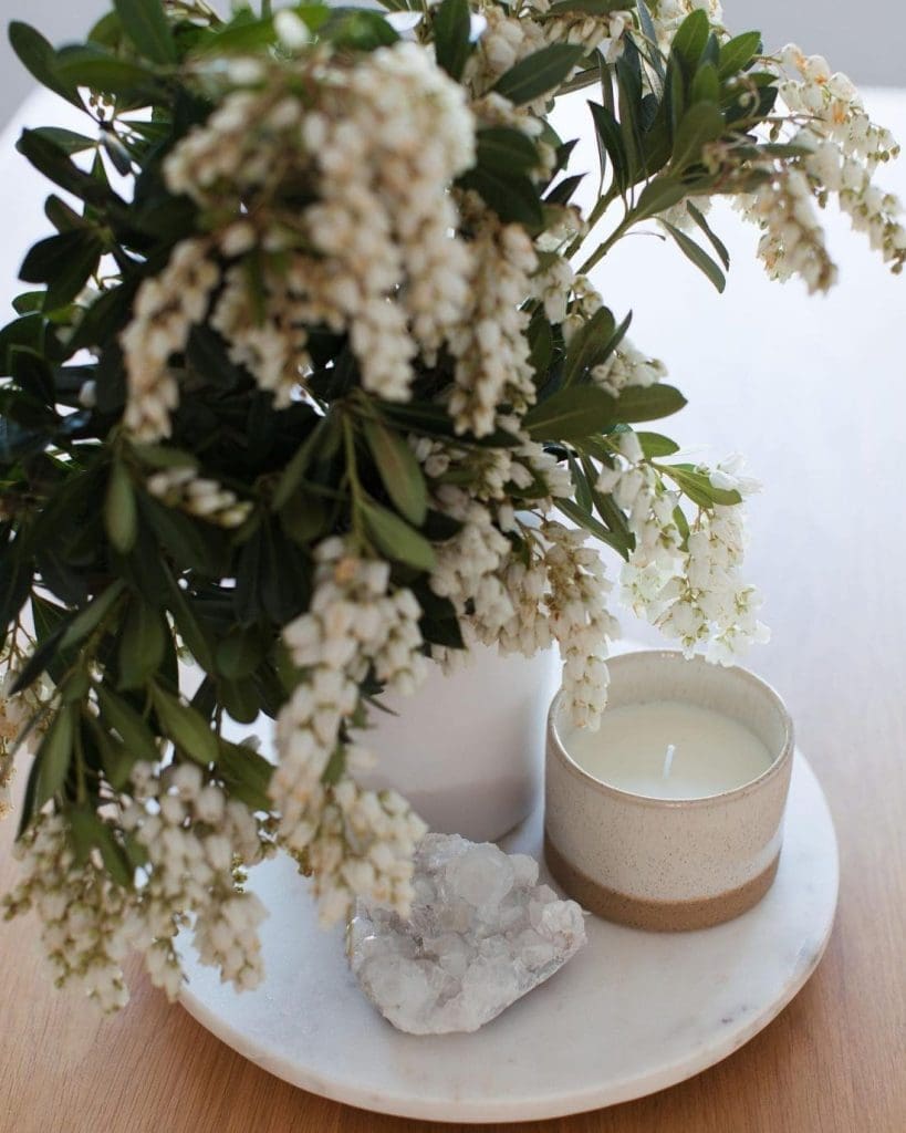
Another way to create contrast is to mix up the materials of the home decor. For example, glass, concrete, ceramic, metal, timber etc.
If all the decor is the same material, your arrangement can appear flat. Or worse, if everything is glass or metal, it can appear cold and hard. Not exactly the feeling we want to create in our homes!
I also suggest including a few tactile objects in the mix, ie not perfectly formed. Some of my favourites include woven baskets, coral, crystal or natural ceramic decor.
Create interest by playing with materials. Combine cold (eg glass or metal) with warm (eg timber and clay) decor for depth.
Inject life
If by this point you haven’t already included an element of life into your vignette, do it!
Using living elements in any area of the home creates a connection to nature, helping to create a more relaxing environment. It also adds visual softness, adding to a sense of ease.
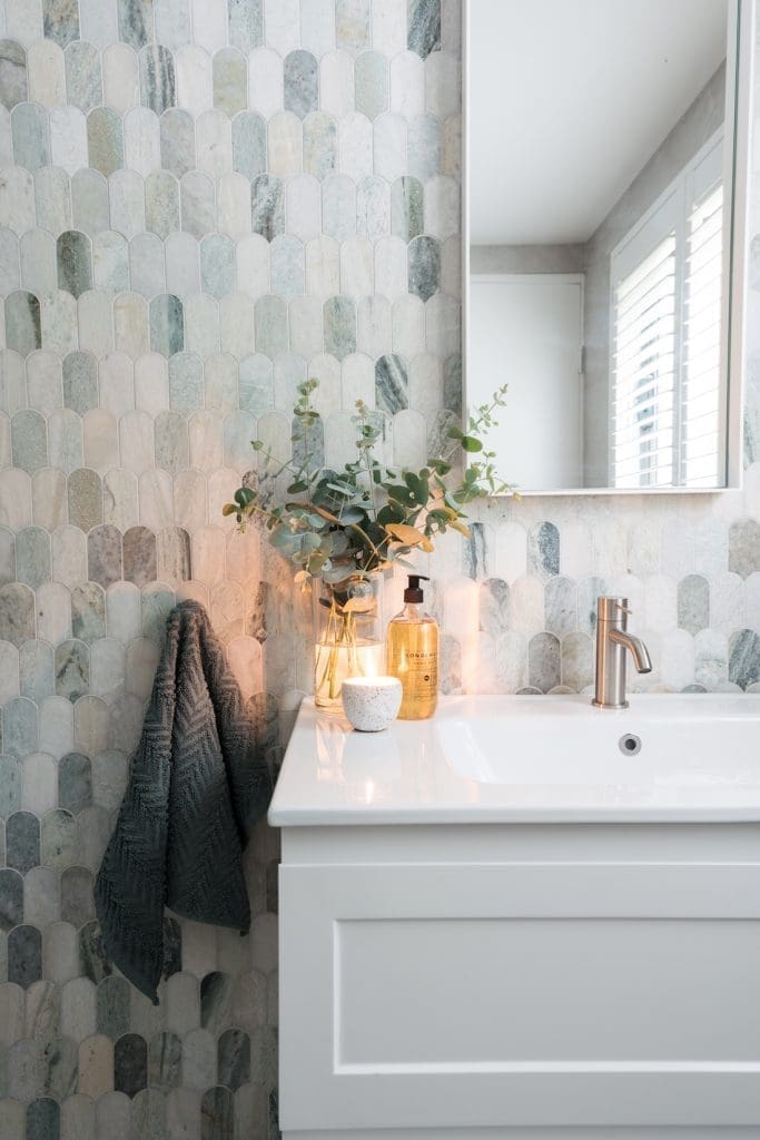
In a vignette, I’ll often use a vase of flowers or foraged branches, indoor plant, coral, or even a burning candle (flame).

Edit and refine
Finally, I always suggest standing back to edit. Ask yourself, is it too busy or bland? Should the items be clustered closer together or further apart? Is anything jarring or sticking out for the wrong reasons?
A tip to help you edit and refine your vignette is to take a photo of it. This might sound weird, but the change of perspective you get from looking at a photo on your phone can help you spot the issue immediately.
I hope my tips on how to style a vignette are useful and help you to add interest to pockets of your home. Do you have any questions on how to create a styled arrangement that I didn’t cover? Pop a comment below and I’ll get back to you asap.
More styling tips
Disclaimer: This post was first published in May 2016 and has been updated with new styling tips and images.

