
Wall art is one of our favourite ways to tie a room together — either as the statement piece that sets the theme or injects bold pops of colour, or a beautiful piece that repeats tonal colours used across the space. Both achieve cohesive room vibes and elevate your interiors. While there are many types of wall art, including original paintings, wall hangings and photography, today we’re focusing on framed prints.
If you’re on the search for the best framed prints for your living room or bedroom, and just haven’t been able to find the right piece, keep reading! We’re offering our top designer tips on colour palettes and framed prints, covering the different ways to build a colour palette and even DIY tips to do it on a budget.
Related article: Personalised home decorating: Tips on how and where to display canvas photos in your home
Related article: 21 decorating hacks for rental properties
Selecting the right colour palette
Colour is one of the most powerful elements of interior design. It can be used to set the mood and tone of a space, and we delve deeper into colour theory in this article. There are various ways you can build a colour palette, let’s discuss the most popular approaches to using colour in interiors.
Monochromatic colour scheme
Despite popular use, monochromatic doesn’t refer to black and white — rather, single hue. So you can have an all green monochromatic colour scheme, or an all pink monochromatic colour scheme etc.
Depending on the colour you select, and the shade and tone (how dark or light), a monochromatic colour scheme could be serene and tranquil or dramatic and moody. For example, an all yellow colour scheme sets an uplifting and cheerful ambience.
Naturally when selecting framed prints for a monochromatic colour scheme, you’ll look for prints that echo your chosen colour. To add interest to a monochromatic colour scheme, play with shade and tone. For example, in a green monochromatic bedroom, you could use a deep forest green wall paint, lighter sage green bedding and an abstract framed print that incorporates various greens to tie the scheme together.
Analogous colour palette
An analogous colour scheme is another way to create your colour palette. This simply involves picking colours that sit next to each other on the colour wheel. For example, blue and green sit next to each other on the colour wheel and when used together in a room they can evoke a serene and balanced atmosphere. Alternatively, yellow and orange sit side by side on the colour wheel and achieve a warm, energetic and vibrant mood.
You may be inspired to create an analogous colour scheme from your wall art. For example, artist Kelsie Rose often uses pinks, oranges and yellows to create her uplifting floral artworks. Many artists offer digital downloads of their original paintings that you can professionally frame to create luxe wall art for less. More on this in our DIY tips below!
Complementary colour palette
If you prefer your interiors to pop, a complementary colour palette is probably for you. Using colours from opposite sides of the colour wheel, such as orange and green, you can create a dynamic space.
The trick to pulling off a complementary colour palette is to NOT use these colours equally. Rather, pick one colour to be your dominant hue and the other to be an accent. Inject some neutrals to balance the look. A popular rule of thumb is the 60-30-10 rule where 60% of your space uses one colour, 30% another colour and 10% is your accent colour.
Neutral colour scheme
Another timeless colour palette is to use neutral tones. Think whites, oatmeal tones and soft browns or greys, a neutral colour scheme achieves calm and crisp interiors.
Minimalist wall art or artwork that features subtle tones fits neutral interiors to a T.
Incorporating framed prints
When it comes to achieving cohesive room vibes, the artwork you select is just as important as the colours. We often get emails from readers asking for tips on how to select art or mistakes to avoid. Let’s cover some of the biggest dos and don’ts to incorporating framed prints.
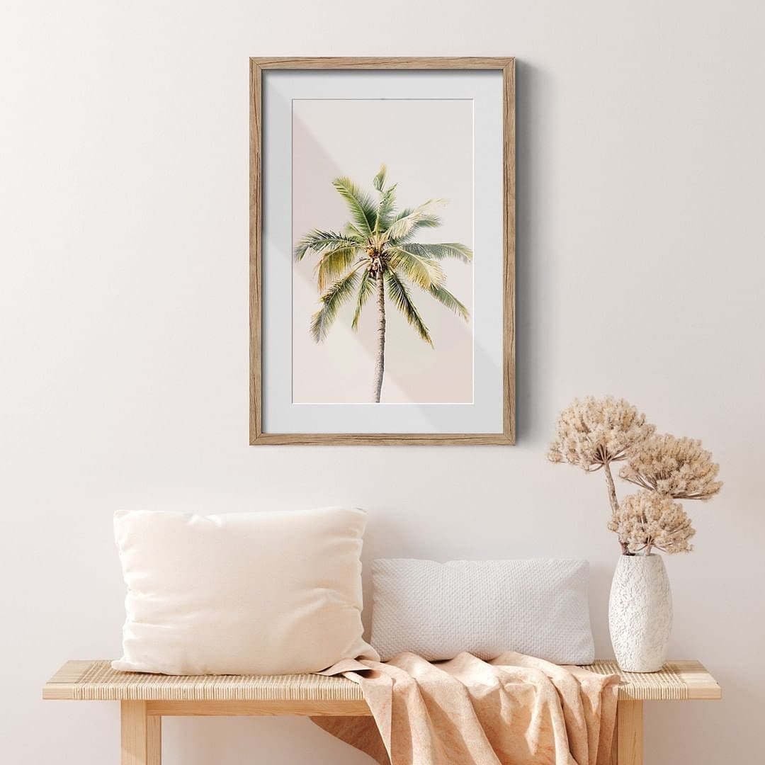
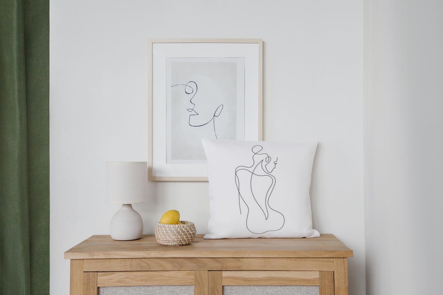
Do pay attention to size
Just like when selecting the right rug, SIZE of artwork is key. Bigger isn’t always better. Rather, pay attention to the scale of the artwork. Larger pieces can serve as focal points, while smaller ones can add accents. We love using a small artwork above a bedside table or in the kitchen, while larger pieces are ideal above a sideboard in the dining room or on a living room main wall.
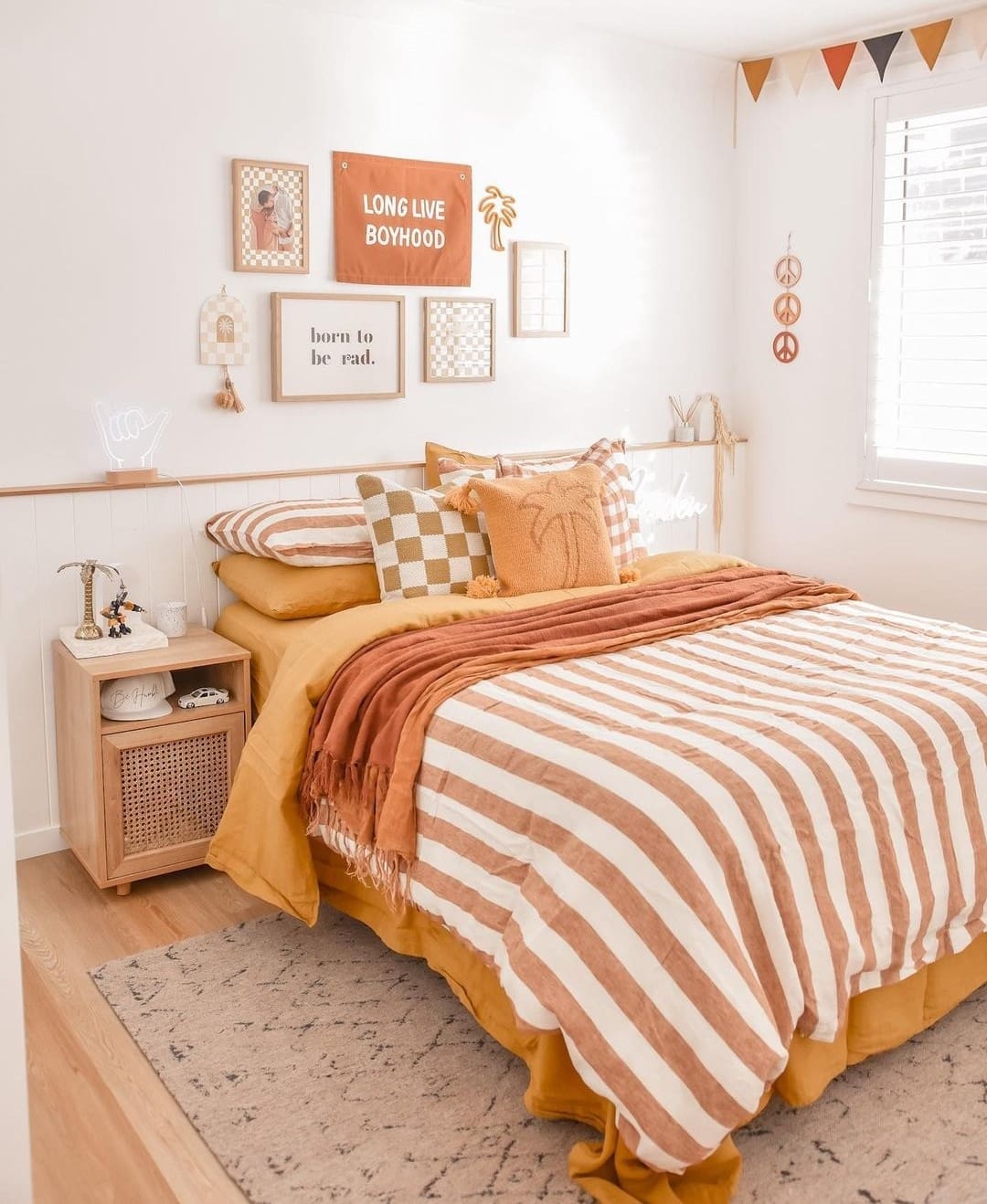
Do consider a gallery wall
Framed prints and gallery walls go hand in hand. Mixing photographic art with abstract prints, family photos and indigenous paintings, you can create a designer-look gallery wall. Arrange them in a grid or asymmetrical arrangement using our gallery wall tips.
Don’t hang the artwork too high
One word: eye-level. The trick to hanging any artwork is to do it at eye level! With the small exception being to consider furniture placement… meaning, if you’re hanging a piece above an item of furniture, you need to take this into consideration.
For example, if you’re hanging a painting above a cabinet, it would look weird to have almost no space between the top of the cabinet and artwork, and a large area of wall space above the artwork. In this instance, you would hang the artwork a little higher than eye level to achieve visual balance.
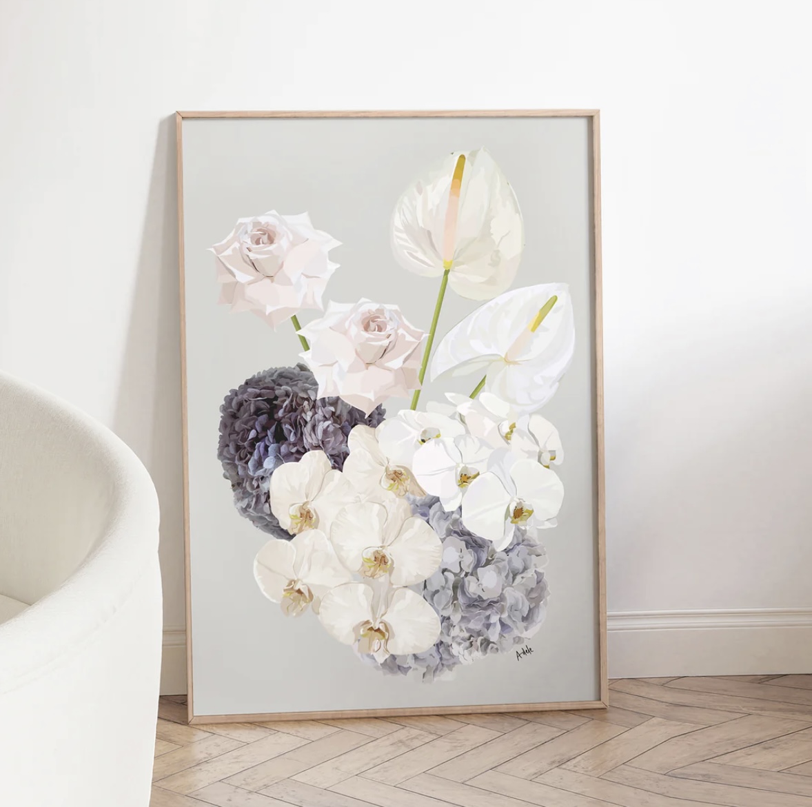
Do select art that fits your colour scheme
We talked about different ways to build a colour palette above and given artwork is often the focal point of a space, getting colours right is crucial. This could involve picking artwork with dominant hues that match or blend seamlessly with your room’s colour scheme.
Do pay attention to the theme of your artwork
Whether it’s through your colour palette or overall theme, artwork should have some cohesiveness so it doesn’t look jarring in your space. And this rings particularly true when creating a gallery wall. While we’re all for expressing your unique personality through decorating, random over-sized wall art that has no connection to your space or style can look… well, terrible!
DIY wall art tips
Crafting cohesive room vibes doesn’t have to break the bank. Here are some savvy, budget-friendly strategies to create DIY wall art that’s worthy of hanging on your walls without the hefty price tag:
- Repurpose and refresh: Look around your home for existing wall art that can be repurposed or refreshed. A coat of paint on the frame or even painting over an old canvas print that you’ve tired of can breathe new life.
- Thrift store treasures: Explore thrift stores and second-hand shops for unique pieces that can add character to your room. You might stumble upon vintage frames or smaller decor that you can incorporate into a gallery wall… because art doesn’t always have to be in a frame!
- DIY art: Get creative and make your own artwork. Even if you’re not a professional artist, abstract and minimalist designs can be visually striking and complement your room’s aesthetic.
- Framed artist prints: Commissioning artwork or even buying limited edition artist prints can get pricey! Thankfully many artists now offer digital downloads — often starting from under $10 — so you can print and frame their work on a budget. Our tip is to get your favourite print framed using online framed photo services to achieve professional wall art without the price tag.
- Textile transformation: Another savvy wall art idea is to use textiles. A tapestry, artist tea towel in a timber hanger or even leftover fabric can make for beautiful wall art. The trick of course is to consider your room’s overall design and select textiles that complement.
- Family photo collage: Create a collage of your favourite family photos. Print them in black and white for a classic look, and frame them in matching or complementary frames. This looks especially great in a mudroom or hallway.
- Travel memories: Frame postcards, souvenirs, or maps from your travels. These not only add a personal touch but also spark conversation and nostalgia.
- Botanical beauty: Press and frame leaves, flowers, or herbs from your garden. They bring a touch of nature and can align with your chosen colour palette.
Have we inspired you to take another look at your walls? Or have our tips on colour palettes and framed prints given you ideas for your next project? We’d love to know what decorating project you’re up to next. Chat with us in the comments below!

