OK people, seriously, tell us what went on with the judging on The Block last night! Were we living in some kind of alternate universe?
For those of you who missed it, master bedrooms and walk-in robes were revealed on The Block Triple Threat last night and it’s safe to say we were talking (yelling) at our TV “really… Really… REALLY?!!” the entire episode! Tell us we’re not mad and share what you thought of the rooms in the comments section below!
Related article: The Block Triple Threat: Week 8 kitchen reveals
Related article: The Block Triple Threat: Week 9 entry and staircase
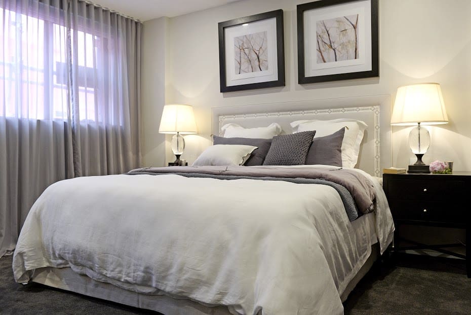
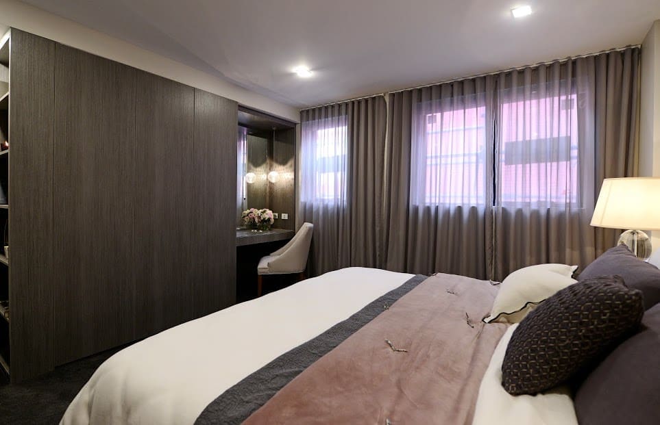
Josh and Charlotte
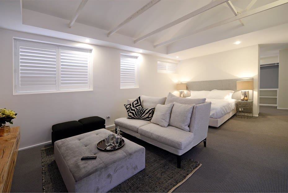
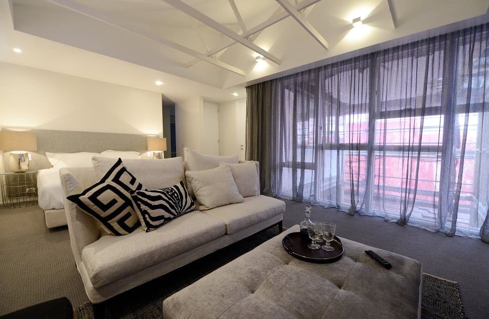
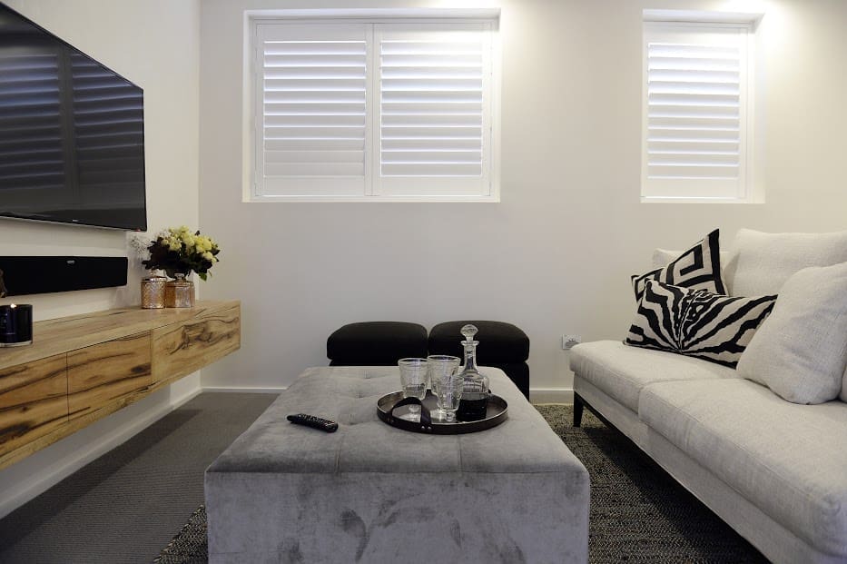
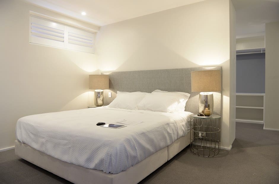
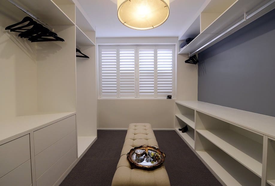
These guys scored straight 10 out of 10s for their super minimalist (so-minimalist-we-felt-underwhelmed) and airy bedroom. But on this occasion winners aren’t grinners as the couple got disqualified for failing to use their bed from that Jimmy Possum challenge a few weeks ago. Ouch but hey, rules are rules. Or are they? We can’t recall any past couples getting disqualified from judging and this decision by the show has got people fired up on social media — do you agree?
Would you have scored this room 10/10? We felt it was crying out for more. On Twitter people were saying it desperately needed colour but we would have been happy with a small area rug (like this one from Armadillo & Co) and a piece of art. Seriously, how did this room score straight 10s with bare walls?
Don’t get us wrong, it’s ‘nice’ but the grey, grey and more grey isn’t exactly what we would call a perfect room. Yes, the ceiling is super impressive but so were the ceilings in many of Chris and Jenna’s rooms and that was never enough to save them.
All we can say on this one is we disagree. What about you?
Darren and Dea
Don’t hate us for saying it but this is a room we can appreciate! As Neale says “Nailed it!”.
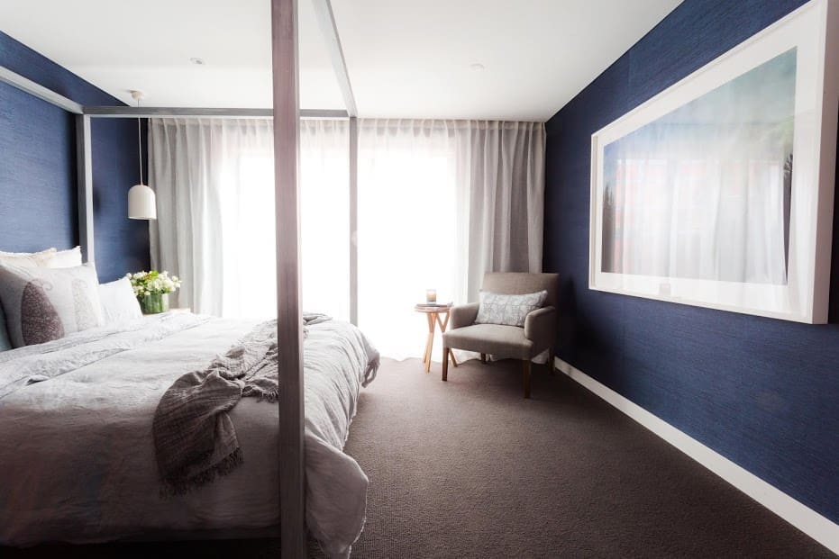
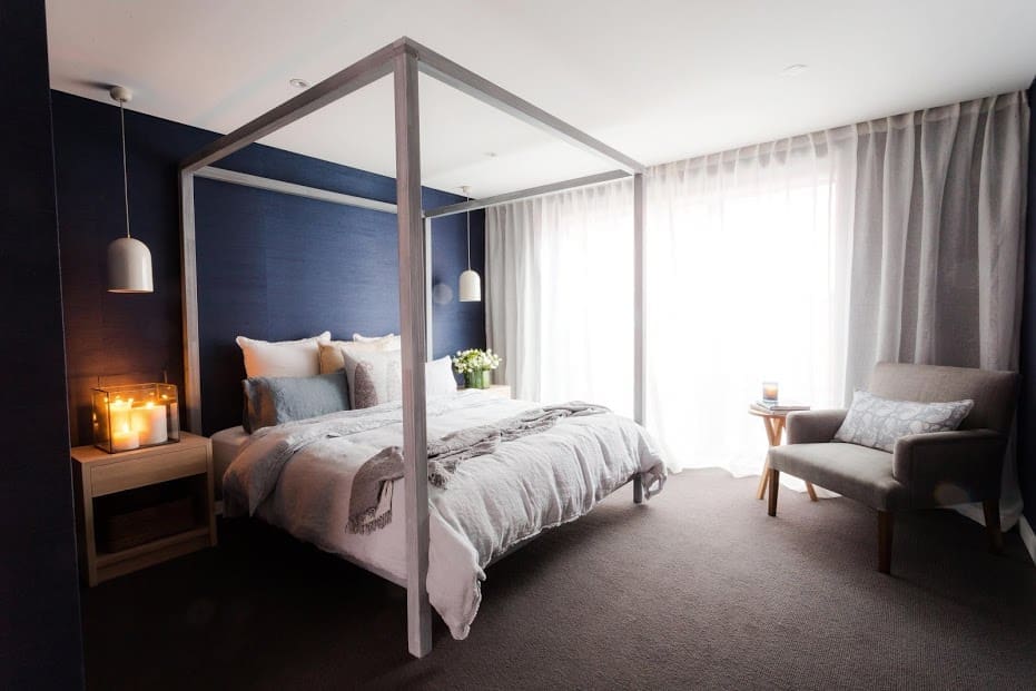
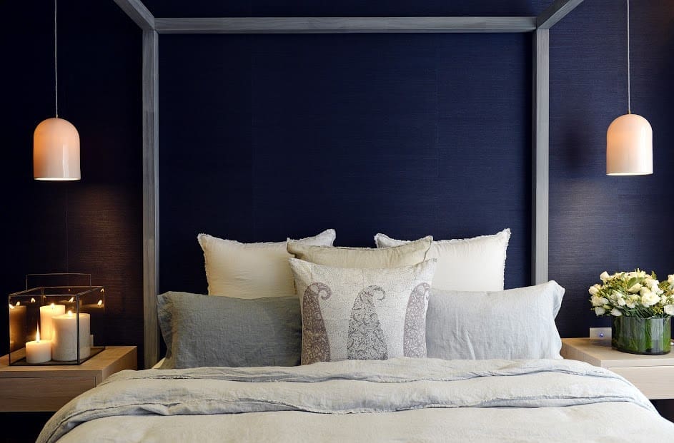
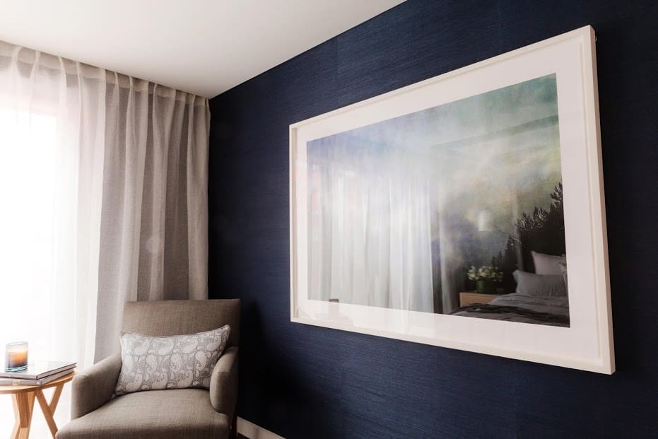
Winners by default this week, the double Ds’ room is warm, inviting and has personality. The deep blue grasscloth wallpaper on all walls envelops you and creates the feeling of a beautiful and luxe sanctuary. Dea can style like nobody’s business and every corner of the room is masterful. Seriously, ah-mahzing!
Standouts for us in this room are the custom-made timber bedside tables by Christian Cole, House of Orange four post bed, and Sophia Szilagi “No Less Than Skies” artwork from James Makin Gallery.
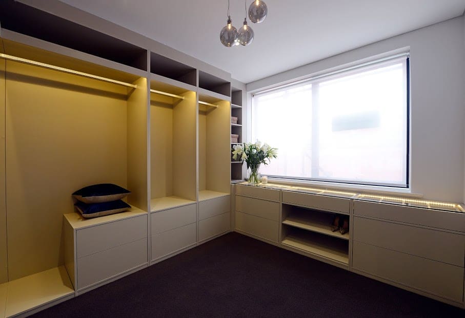
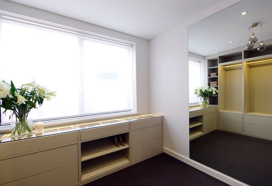
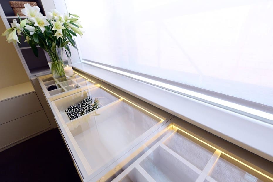
Their walk-in robe is also heaven and despite less than perfect finishes, we’d still love to have it in our home.

Jess and Ayden
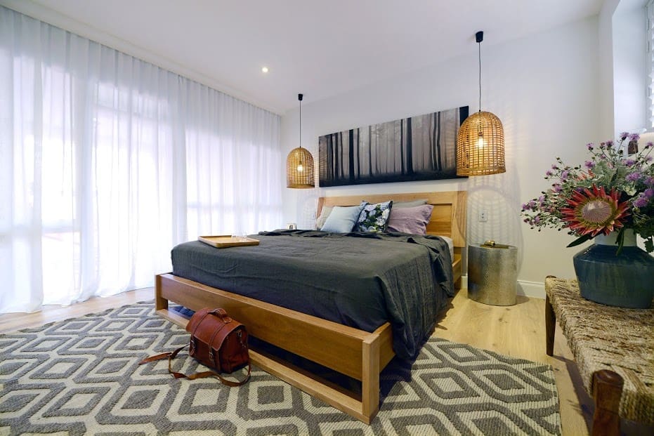
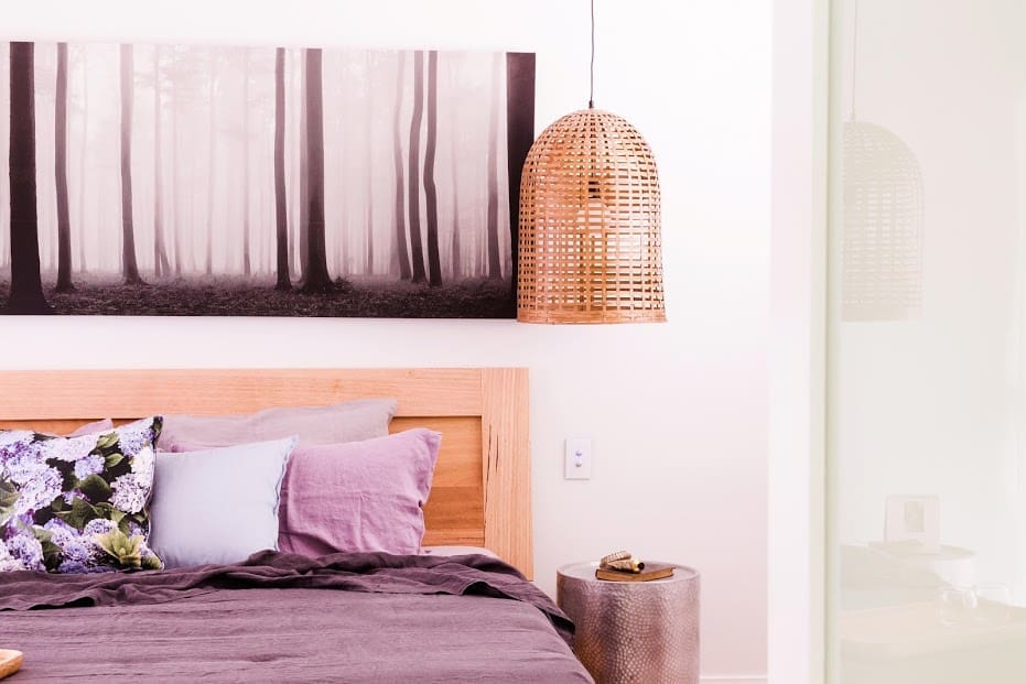
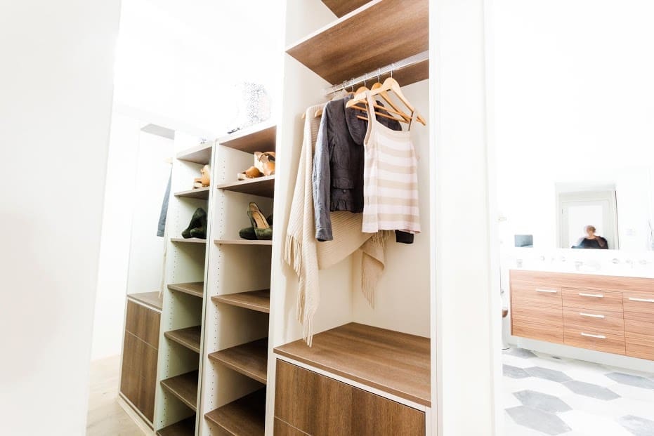
Oh man, these guys try so hard and just can’t seem to break through… Tied in third place (or is that second place with the disqualification?), they took some risks to create a space that’s more youthful and earthy.
Unfortunately, Darren felt that was the wrong move to make for this kind of apartment, in this area and at this price point. He’s right. One of the biggest tips he shared at his recent Q&A was how important it is to know the market you’re selling to — do your research, look at what’s selling, understand what buyers want — otherwise you won’t be able to get the premium price.
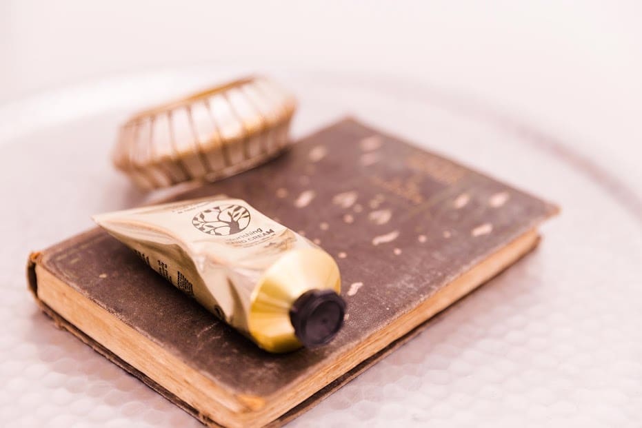
While this room does have a lovely warm feel about it and there is a good mix of textures, sadly we don’t feel many of them fit together or are the best choice for the space. As Darren pointed out, the bedside tables have zero storage and many of the choices need to be more sophisticated. And don’t get him started on that artwork.
Tim and Anastasia
Now this is where we really lost it at the TV. This room is an EXACT copy of the last bedroom they delivered!!
We couldn’t believe it when the judging was just rolling on as usual and none of them pointed out this massive elephant in the room. Eventually Darren did say this room feels very similar to the last bedroom and a master bedroom should feel special.
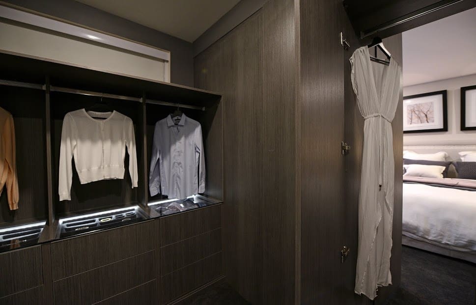
The double door to the walk-in robe was pretty nifty but not enough to sway us into liking this space. Neale took it one step further and said the grey laminex doesn’t make him feel good — ha ha, he always knows how to make us laugh!
We’re not even sure why we’re bothering to publish photos of this room when you can just look at their last bedroom…
What did you think of the master bedroom and WIR room reveals this week? Do you have a favourite space or pick up any ideas you might use?





Do you know what product and colour exactly the seagrass in D & D’s Master Bedroom is please.
Hi Megan
Absolutely love that seagrass wallpaper! It’s called ‘Schumacher Wallpaper – Haruki Sisal Charcoal’ and you can find it at Grant Dorman 🙂
Thanks for your positive remarks about our four poster bed in Deanne and Darren’s Master .
This bed is different from the one we made for them in the Glass house series. Slimmer posts, different structure but just we’re just proud that we’re able to maintain and grow our local manufacturing business and our clients obviously like what we’re doing!
Thanks again
You guys should be proud! Such stunning products and even better that they’re locally made #supportlocal 🙂
Do you know what the exact flooring Ayden and Jess used in the master bedroom?
Hi Claire
Yes we do 🙂 It’s “Regal Oak in Dover” by Carpet Court. Have a great day!
I must seem like a pain. How I found the page was I googled Dee and Darrens house is on the market. That in turn took me to Katrina Chambers page. She had all of their rooms along with the floor plan. There was only one bedroom with an ensuite, and it also had the fireplace in it. I could remember there was a small balcony off it which you can see on the plan.
Not a pain at all Gillian! And thinking about it overnight, we think we figured it out 🙂 Darren and Dea were never happy with their original master bedroom (the one we linked to the first time)… it was the week they had to rush to hospital because their daughter was unwell so the other contestants put their room together. From memory, they redid their master bedroom as their ‘redo’ room where they removed the the fabric wall panels, moved the art and changed the bed to a four post bed, hooray mystery solved! So yes, they did use a four post bed last season just not for the room reveal. For anyone reading this who wants to see that bed, we found it here: http://www.katrinaleechambers.com/stunning-sunday-darren-dees-house-maket/
Ha ha, glad we got to the bottom of it Gillian 🙂
The bedroom you refer to was a guest bedroom, if you check Katrina Chambers blog you will see that her main bedroom has a four poster identical to what she used this time. I think the rooms are very similar
Hey Gillian, we’re so confused, ha ha. We had a look at Katrina Chambers blog but couldn’t see the bed you’re referring to? Could you share the link to the blog post?
We blogged about every room on The Block last season and the closest bedroom that had a bed with posts was this one with the canopy… http://stylecurator.com.au/the-block-glasshouse-3/ Is that the one you mean? Would love it if you could share a direct link to the post because now we’re super curious! 🙂
This is the master bedroom post Katrina wrote about The Block last season http://www.katrinaleechambers.com/the-block-glasshouse-master-bedroom-wir/ 🙂
Personally I would sooner have a room that may be a bit understated. I believe it gives you the chance to add what you would like to make it your own. So Josh and Charlottes room would appeal to me far more than say Deanne and Darren. I don’t like the wallpaper on all four walls or even if it wasn’t wallpaper and only paint I would personally rather see less of it. Anastasia room was certainly similar to her last but then D and D was very similar to last years main bedroom. The only real difference in both is seagrass wallpaper. I definitely don’t like the reality side of this show but feel it’s bring heading that way for a while. I also can’t help but feel the judges hands are tied at times because of the contradictions they make!
Totally get what you mean Gillian about wanting a room that’s a little more understated so you could make it your own – we just thought it’s strange the judges rewarded that type of room when all season they have been preaching about needing to create rooms with ‘warmth’ and ‘personality’ and this room was lacking that for us.
Maybe you’re right and the judges’ hands are tied because that episode felt full of contradictions 🙂
Did you find D&D’s master similar to their one last year? It had that textured panel wall and fabric pendant lights… http://stylecurator.com.au/block-glasshouse-week-4-room-reveal/ ?
It’ll be so interesting to see how auction goes! All these apartments have such a different feel about them.
Thanks for sharing your comments!
Only similarity is the bed. And really in a room that has bed table and a chair well…there isnt a lot of choice. Anastasias room was an exact copy of her last, which was a copy of her room redone by Darren Palmer. I am in complete agreement with Neale on this one – i would rather look at art or a tv than a grey wall of melamine and walk two more feet to my robe.
So true Kate! Especially in a master bedroom which should feel like a retreat. We wonder if they will have a ‘redo’ room week this season on The Block and whether Tim and Anastasia will have the chance to make some changes to the bedroom before auction…?
They font know how to use colour…that’s why u Dont see it…I wish they would have some edgy interior designers…instead its bad design every time…wish they would try some of the TV formats HGTV use…
Such an interesting idea Narelle, to mix up the format like that… seems to us though that this season the show has been more focused on the ‘reality’ side and less on the ‘design’ side, or at least that’s what we feel is getting the most air time.
Colour can be such a hard thing to master which is why we were really hoping Luke and Ebony made it on this season 🙁 Sigh. There are still three more rooms though!
Tim and Anastasia’s master bedroom looked like a bad knock-off of their previous effort, and went firmly into hotel room territory.
I think Josh and Charlotte’s minimalism has been slowly wearing the judges down week by week. Because their apartment is coming together so cohesively (all white, every fixture or furniture really carefully chosen) it’s positively influencing the judges’ view of each new room these two present.
I love Dea’s styling, but the things I really covet are the amazing features in Josh and Charlotte’s rooms like the ottoman in their bedroom and the chairs in the lounge and dining areas.
Man I feel for Jess because the master bedroom should be sophisticated, but her budget is limiting her choices to Freedom.
Thanks for sharing, Julia! Totally agree with your comments about T&A’s room, why bother.
And that’s an interesting point about Josh and Charlotte’s apartment. Maybe now that the judges are seeing the way it all works together, they are liking it more? We were a big fan of their dining area and those chairs in the living room, ah-mazing!
Fingers crossed Jess and Ayden can win a challenge soon and get the boost they need to be back in the competition!
Why do Jess and Ayden get picked on for no storage in their bedsides but Josh and Char have just as little storage and they get 10s? They need new judges.
Hmmm that’s a good point Rach! We didn’t even notice the bedsides in Josh and Charlotte’s room until you mentioned it 🙂 Very strange indeed.
I agree. If Dea had delivered bedside tables with no storage and lamps that left no space for water/tissue/kindle etc she would have been crucified.
i also wondered how they were allowed to add the “retreat” space when others weren’t allowed to work on it yet. No hue and cry here about changing architects plans. So biased.
So right! And interesting points about the ‘retreat’, we weren’t aware they got to work on it ahead of the other contestants??
judging so off last night. so wrong and unfair to disqualify josh and charlotte never happened in past seasons. so rigged
Glad it wasn’t just us who thought things seemed off last night! We feel bad for Josh and Charlotte for being disqualified but if they weren’t disqualified we don’t think it deserved straight 10s. It was just weird all round!