
Supported by Canberra Outlet
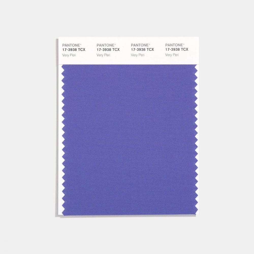
Each year, the world of design looks to Pantone to predict the colour that will set trends. And in 2022, the colour of the year is ‘Very Peri’! Unlike last year’s ‘Ultimate Grey + Illuminating’ — which was perhaps a bit too yellow for most interiors — we’re seeing a fab range of purple-coloured products for the home hitting stores.
Very Peri is a dynamic periwinkle blue hue with a vivifying violet red undertone, blending the faithfulness and constancy of blue with the energy and excitement of red.
Over the past couple of years, we’ve come to understand the value of our homes as a place of comfort. ‘Very Peri’ represents the new perspective that resonates with us as we step into a hopeful future.
As a vibrant colour that’s rare in Aussie homes, we found some subtle homewares available at Canberra Outlet to incorporate pops of the colour and more muted hues into your home. Along with our top tips to help your embrace the Colour of the Year, elevate your home styling with this ‘happiest and warmest periwinkle blue.’
Related article: 3 interior design trends set to hit big in 2021
Related article: Our 5 most popular round up articles
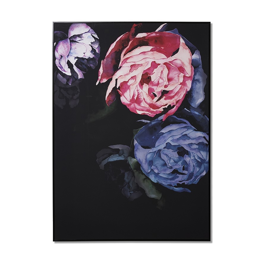
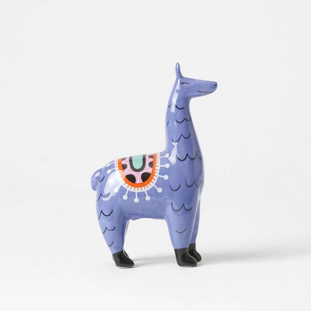
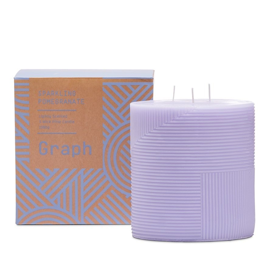
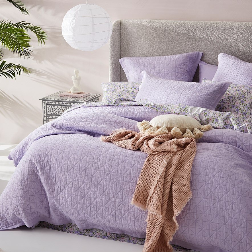
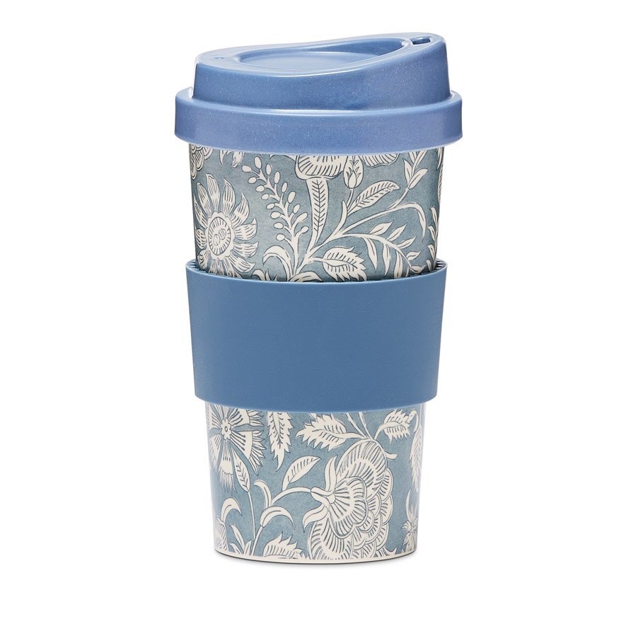
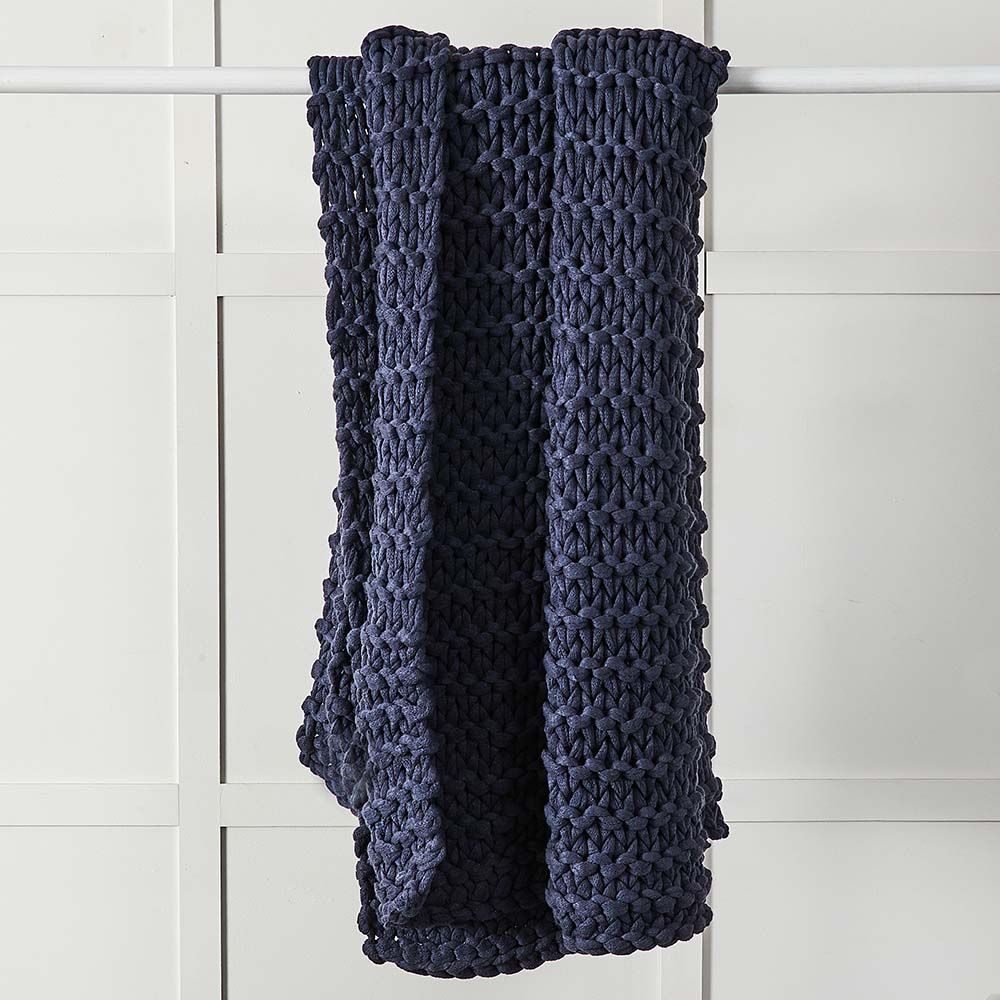
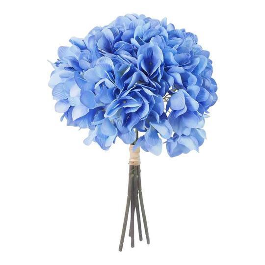
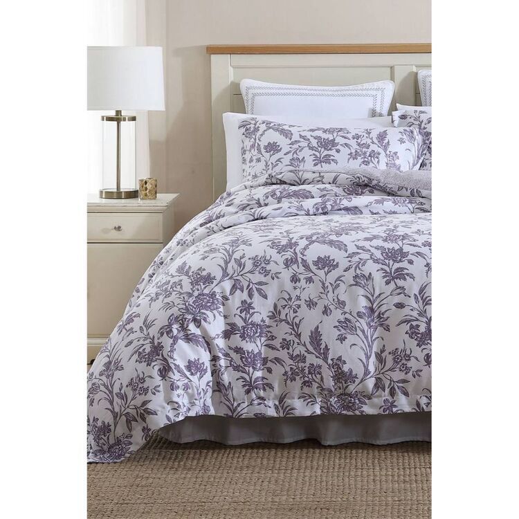
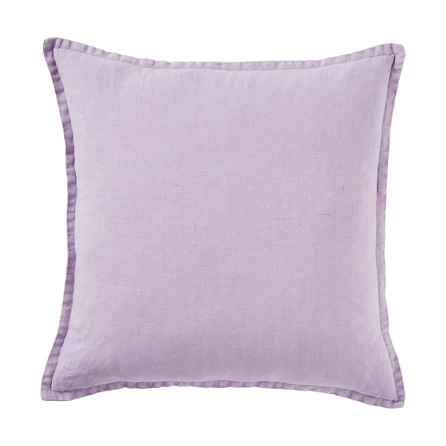
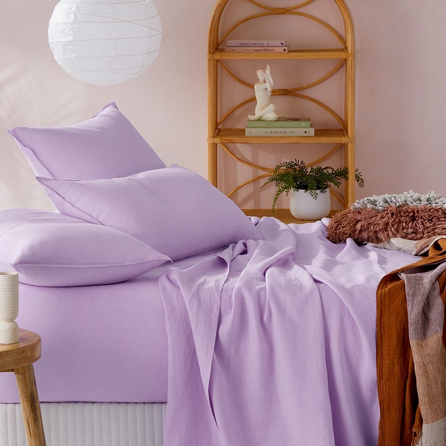
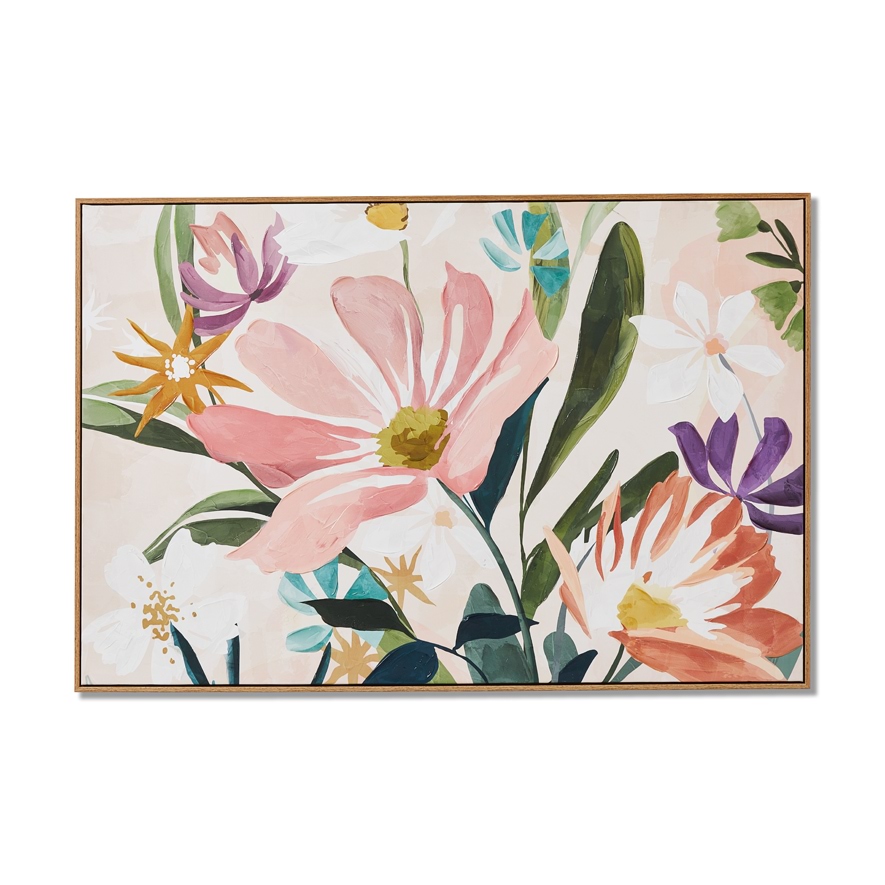
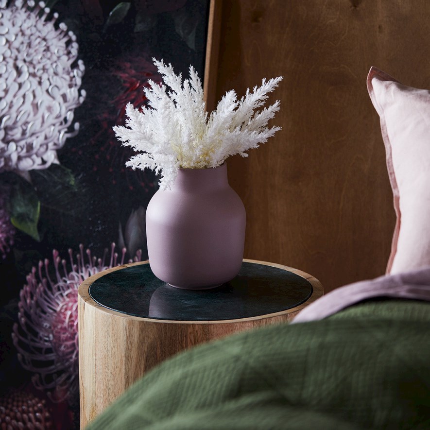
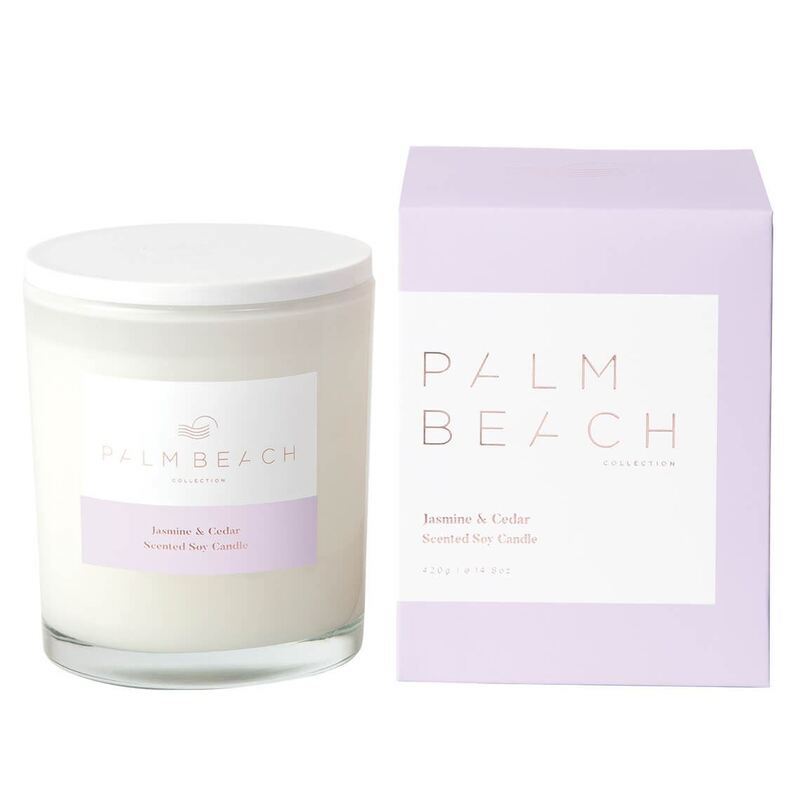
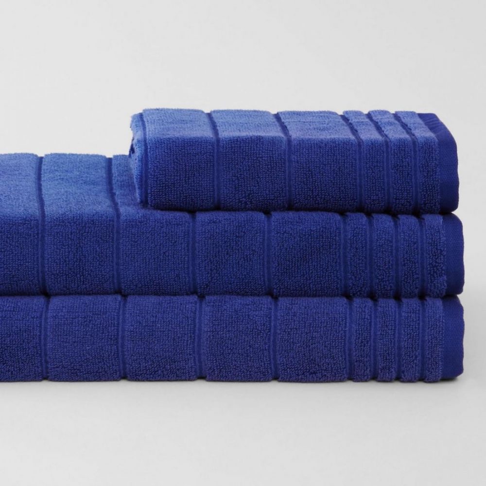
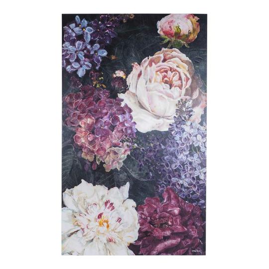
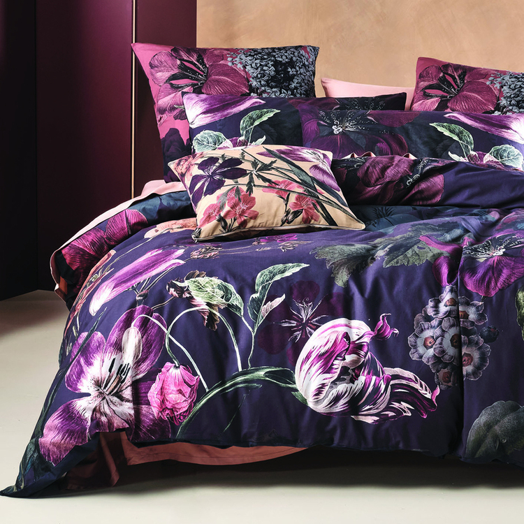
Our fave ‘Very Peri’ homewares
How to embrace ‘Very Peri’
Has our shopping edit got you inspired to introduce this accent colour into your home?
We often get asked how to introduce a new colour into the home or refresh rooms without having to buy too many new pieces. Our advice is always the same.
1. Add 3-5 pops of your accent colour
You don’t have to go overboard when introducing a new colour — particularly when it’s as vibrant or bold as ‘Very Peri’.
Just 3-5 pops of colour across a room will set the tone and create interest in the space. For example, in your living room you may want to select a cushion from our round up above, a candle or decorative item on the coffee table in a styled arrangement, and either artwork with accents of purple tones or a throw rug.
Scattered across a room, our eye will naturally look for these pops of colour.
2. Play with shades
You’ll notice in our list of hottest homewares that there are so many shades of purple available — from vibrant violet to muted lavender.
Play with tone and shade to introduce this colour in a sophisticated and confident way.
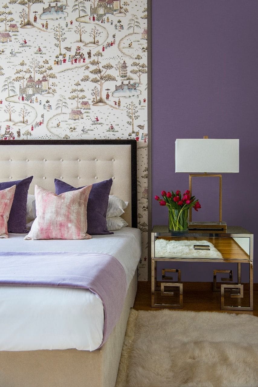
3. Contrasting materials work best
Our final tip is to look for ways you can pick up this colour using a range of materials. It will look more inviting if you can embrace purple-coloured items in a mix of soft and hard materials.
By that we mean soft textiles like a cushion or throw rug. And hard materials like decor items made from glass or metal.
Do you think ‘Very Peri’ might become your accent colour this spring/summer? We’d love to know if you spot any other fab products in this trending hue.

